A few years ago I visited a friend’s newly renovated apartment. She’d spent real money on it — good furniture, quality materials, everything chosen carefully. But something was wrong. The living room felt unsettled, slightly agitating, like the room was trying to make several arguments at once. She knew it too. She kept saying she wasn’t sure what was missing.
Nothing was missing. Something was present that shouldn’t have been: color conflict. The warm terracotta sofa against the cool gray walls, with yellow curtains introduced as an accent, and a rug that pulled green — four colors with no relationship to each other, each one perfectly fine in isolation, collectively creating a room that felt like it couldn’t decide what it wanted to be.
That’s the absence of color harmony. And once you understand what it is, you start seeing it — and its presence — everywhere.
What color harmony actually means
Color harmony is the principle that colors in a space should have a logical, intentional relationship to each other — one that the eye can follow and the brain can process without effort. When colors are in harmony, a room feels coherent. The eye moves through the space without snagging on anything. You feel settled rather than stimulated.
When colors are out of harmony, the opposite happens. The eye jumps from one color to another without finding a resting place. The brain registers the conflict without necessarily identifying it consciously. You feel vaguely uncomfortable in the room without knowing why. You start rearranging furniture or changing accessories looking for the problem, when the problem is actually the relationship between the colors on the walls, the sofa, and the rug.
Color harmony doesn’t mean everything matches. Matching is not the same as harmony, and confusing the two is one of the most common mistakes in interior design. A room where everything is the same shade of beige matches perfectly. It also has no harmony in the interesting sense — no tension, no movement, no life. True harmony is more like music than monotone: different notes, intentionally related, creating something that feels resolved.
Where it comes from — the color wheel, briefly
Color harmony has roots in color theory that go back centuries, formalized in the ways artists and designers have studied how colors interact. The color wheel — the circular arrangement of hues from red through orange, yellow, green, blue, and violet and back to red — is the tool that makes those relationships visible.
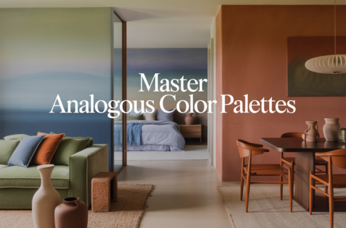
Colors that sit next to each other on the wheel are called analogous. They share undertones and create rooms that feel cohesive and calm — a palette of blue, blue-green, and green, for instance, or a range from warm yellow through orange into rust. The eye moves easily between them because they’re essentially variations on a theme.
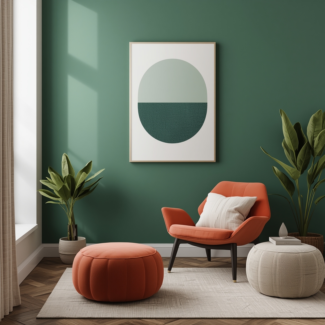
Colors that sit directly opposite each other on the wheel are called complementary. Blue and orange. Red and green. Yellow and violet. These combinations create contrast — high energy, visual tension, presence. In interior design, complementary colors used at full saturation can feel overwhelming. Used thoughtfully — a muted version of one, a deeper version of the other, with careful attention to proportion — they create rooms with genuine dynamism.
Colors evenly spaced around the wheel — three of them — are called triadic. Red, yellow, and blue. Orange, green, and violet. These palettes are inherently balanced and lively, but they require careful management in a room. All three at equal intensity is visual chaos. One dominant, one secondary, one accent — that’s the structure that makes triadic palettes work.
Understanding these relationships doesn’t require memorizing color theory. It requires looking at the colors in your room and asking: do these have a reason to be together, or did they just end up here?
Why it matters more than individual color choices
Most people approach color in a room one decision at a time. They choose a wall color, then they buy furniture, then they add accessories, each choice made somewhat independently of the others. The result is often a room where every individual element is perfectly acceptable and the overall effect is somehow wrong.
Color harmony requires thinking about the whole room as a single color decision rather than a series of separate ones. The wall color, the sofa, the rug, the curtains, the art — all of these are colors in a palette, and they need to be considered in relationship to each other, not just in isolation.
This is harder than it sounds because we often make choices at different times, in different stores, under different lighting conditions. A sofa chosen in a showroom under fluorescent light looks different in your living room under natural light. A rug that looked warm in isolation looks orange next to your already-warm sofa. Color is relational — it always looks different next to something else than it does alone — and color harmony is the practice of accounting for those relationships rather than being surprised by them.
The temperature question most people miss
One of the most common sources of color conflict in rooms has nothing to do with hue — the specific color — and everything to do with temperature. Every color is either warm (pulling toward red, orange, and yellow) or cool (pulling toward blue, green, and violet). Colors that share a temperature tend to harmonize. Colors that mix temperatures without intention tend to fight.
A warm beige wall with a cool gray sofa and warm wood floors and cool blue curtains — that’s four temperature signals pulling in different directions. None of those choices is wrong in isolation. Together they create the ambient unease that makes a room feel unresolved.
Deciding on a temperature direction for a room — warm overall, or cool overall, or intentionally contrasted — and then making individual choices within that direction is one of the most effective ways to achieve color harmony without getting deep into color theory. It doesn’t require knowing what “analogous” means. It just requires looking at each element and asking: is this warm or cool, and does that fit the temperature of the room I’m building?
Proportion matters as much as the colors themselves
Even colors that are theoretically harmonious can fail in a room if the proportions are wrong. Too much of a strong color overwhelms the others. Too little of an important color makes it feel like an accident rather than a choice.
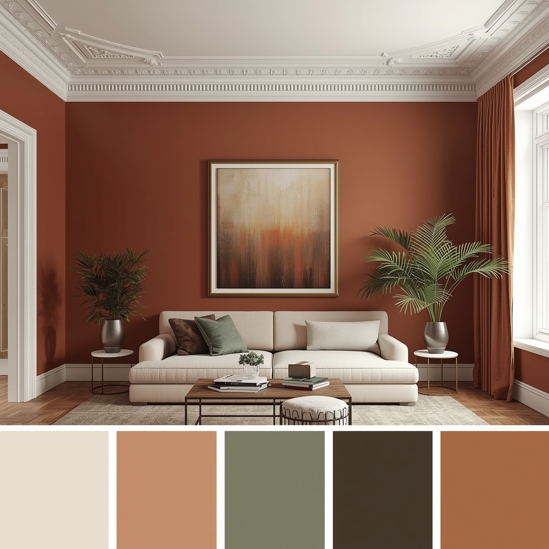
A widely used framework is the 60-30-10 rule: 60 percent of the room in a dominant color, 30 percent in a secondary color, and 10 percent in an accent. The dominant color is usually the walls or the largest piece of furniture. The secondary color is the next most prominent element — often the sofa or the rug. The accent color appears in smaller doses — cushions, art, a lamp, a plant pot.
This framework is not a rigid law. Plenty of beautiful rooms break it. But it exists because it captures something real about how color harmony works in three-dimensional space: one color needs to lead, one needs to support, and one needs to punctuate. When all three compete for dominance, the room loses its hierarchy and the eye doesn’t know where to settle.
Harmony is not the same as safe
A common misunderstanding is that color harmony means playing it safe — neutrals, muted tones, nothing surprising. That’s not harmony. That’s caution dressed up as design.
The most striking rooms are often the most harmonious — a deep green room with terracotta accents and warm brass hardware, or a charcoal bedroom with cream linen and rich walnut furniture, or a white kitchen with navy island and unlacquered brass fixtures. These combinations are bold and they work precisely because the colors have been chosen with intention. The boldness is organized. The contrast is controlled. The eye knows where to go.
What harmony prevents is not ambition — it’s accident. Rooms that feel wrong are almost always rooms where color choices were made without considering how they’d relate to each other. Rooms that feel right are rooms where someone, consciously or intuitively, made choices that created a coherent whole.
How to develop the instinct
Color harmony is partly learned and partly intuitive, and the intuition develops faster than most people expect once you start paying attention to it. The practice is simple: when you walk into a room that feels good, stop and identify why. What colors are present? What’s the temperature? What’s the dominant color, the secondary, the accent? How do they relate on a color wheel?
Do the same with rooms that feel wrong. Not to criticize — to understand. A room that feels off is a color harmony lesson in reverse. What’s conflicting? What temperature signals are fighting? What color has no relationship to the others?
Over time this becomes automatic. You walk into a space and you feel its color logic — or absence of it — before you consciously identify any specific element. That’s the instinct. It’s the same thing designers develop over years of practice, and it’s available to anyone willing to look at rooms with intention rather than just reaction.
Back to my friend’s apartment
I told her what I saw. Not diplomatically — honestly. The terracotta sofa was the problem. Or rather, the terracotta sofa in a room with cool gray walls was the problem. Everything was pulling in different directions and nothing was winning.
She didn’t repaint. She bought new cushions — cooler toned, a dusty blue that related to the gray walls — and replaced the yellow curtains with something in warm cream that bridged the sofa and the walls rather than introducing a fourth color entirely. She moved the green rug to another room.
Same furniture. Same apartment. The room stopped arguing with itself.
That’s what color harmony does. It doesn’t require starting over. It requires understanding what’s there and making the relationships intentional. The room that feels right isn’t always the room with the most expensive things in it. It’s the room where everything has a reason to be next to everything else.