Before I knew what an analogous palette was, I was already using one. My living room had olive green walls, a mustard yellow sofa, and rust-colored cushions. People always said the room felt warm and coherent. I said thank you and privately wondered why it worked when other rooms I’d tried felt confused.
Then someone explained that olive, mustard, and rust are analogous colors — they sit next to each other on the color wheel, they share warm undertones, and the eye moves between them without friction because they’re essentially variations on a theme. I hadn’t designed the room with that framework in mind. I’d just picked colors that felt related. Turns out that instinct has a name and a reason behind it.
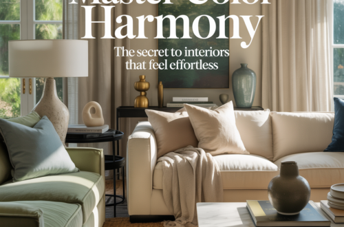
Understanding analogous palettes doesn’t make decorating more complicated. It makes it easier — because once you know why certain color combinations feel right, you can replicate that feeling intentionally instead of hoping you stumble into it.
What analogous actually means
On the color wheel — the circular arrangement of hues that color theory uses as its organizing tool — analogous colors are any group of colors that sit directly next to each other. Blue, blue-green, and green are analogous. Red, red-orange, and orange are analogous. Yellow-green, yellow, and yellow-orange are analogous. The defining quality is adjacency: they share a parent hue and transition smoothly from one to the next.
Most analogous palettes in interior design use three to five colors from a segment of the wheel rather than the full spectrum. The closer together the colors are on the wheel, the more cohesive and calm the palette feels. The further apart — still adjacent but spanning a wider arc — the more varied and dynamic the palette becomes while still maintaining harmony.
What makes analogous palettes feel harmonious is that they reference something real. Nature is almost entirely built on analogous color relationships. A forest in autumn moves through yellow, orange, and red. A shallow tropical sea moves through turquoise, green, and teal. A sunset moves through pink, coral, and amber. The eye is trained from a lifetime of exposure to find these transitions natural and restful. When you bring them indoors, the room inherits that quality.
Why it works better than most people expect
The common anxiety with analogous palettes is that they’ll be boring. If all the colors are related, won’t the room just look like one color? Won’t it be monotonous?
In practice, the opposite tends to happen. An analogous palette creates depth precisely because the colors are related but not identical. Your eye can read the differences — this green is slightly more yellow, this blue is slightly more green — and that subtle movement creates a richness that a single-color room never achieves. The room looks layered rather than painted.
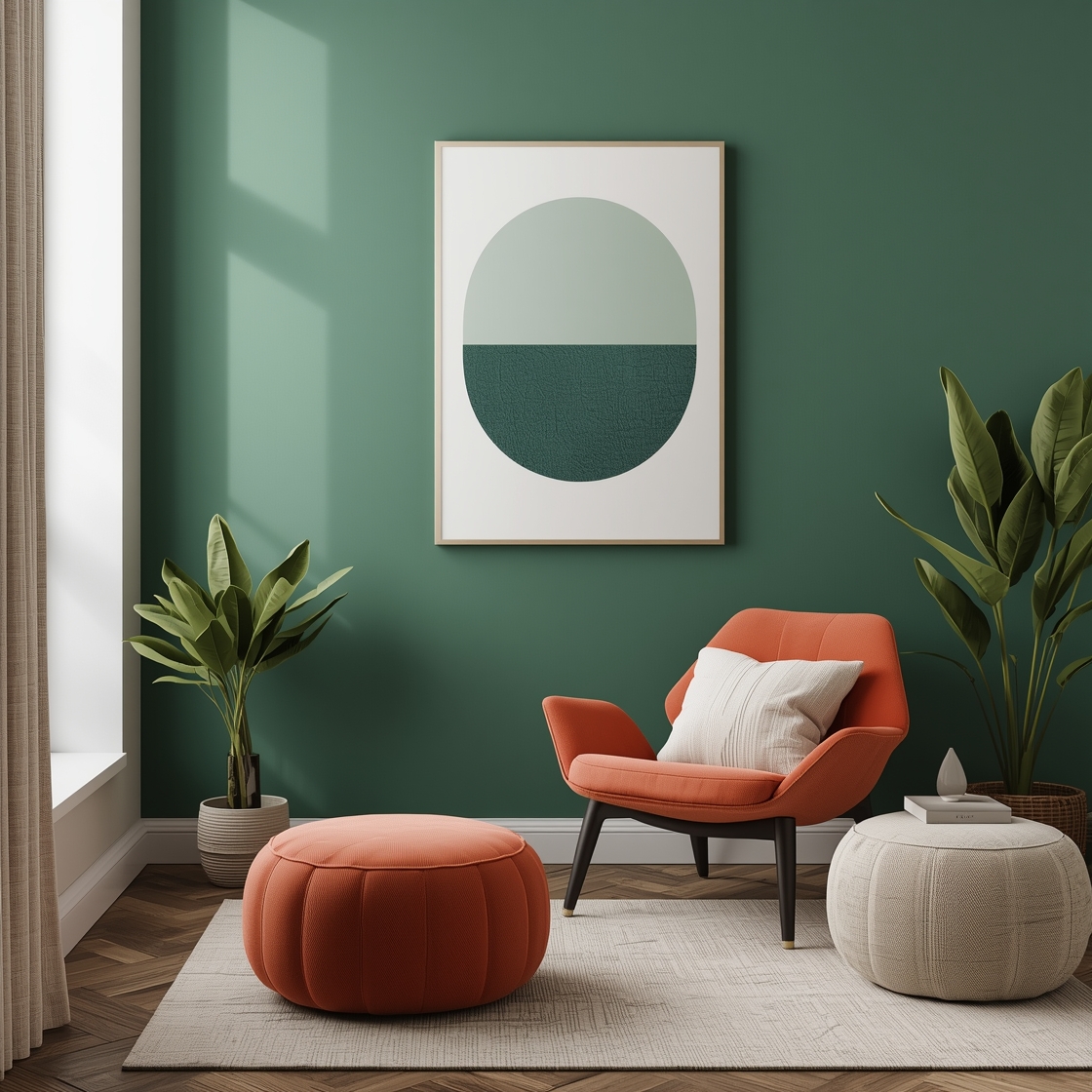
Contrast, which people often reach for to add interest, introduces tension into a room. That tension can be exciting or it can be exhausting, depending on how it’s managed. Analogous palettes replace tension with movement — a gentler kind of interest that doesn’t require the room to be working hard to hold together.
The result is rooms that feel effortlessly put-together. The kind of room where guests can’t identify any single element that makes it work — they just feel settled and comfortable without knowing exactly why.
Using analogous palettes in a living room
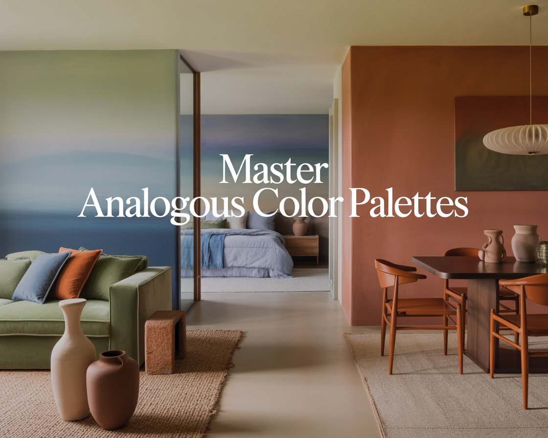
The living room is where analogous palettes have the most impact because it’s the largest space and the one with the most color decisions: walls, sofa, rug, curtains, cushions, art. Getting all of those into a coherent relationship without making the room feel like a single overwhelming color block is exactly the problem analogous palettes solve.
The approach that works consistently is to choose the widest span of the palette for the largest elements and concentrate the color at smaller scales. Walls in a muted, mid-toned version of the palette’s dominant color. Sofa in a slightly adjacent hue — different enough to be distinct, close enough to belong. Rug in a darker or richer version of one of those colors, which grounds the room. Cushions and smaller accessories in the most saturated or different version of the palette, used sparingly.
A specific example that’s hard to get wrong: sage green walls, a dusty blue-green sofa, a teal rug, and olive and eucalyptus accents in cushions and plants. Every color in that list sits within a roughly 60-degree arc of the color wheel between green and blue. The room has variety — nobody would say it’s just one color — but everything belongs to the same family and the overall effect is calm and considered.
Bedrooms — where analogous palettes are most forgiving
Bedrooms are the easiest room to use an analogous palette because the goal — calm, restful, settled — aligns perfectly with what analogous color relationships naturally create. You’re not fighting the palette’s tendency toward harmony. You’re relying on it.
Warm analogous palettes in bedrooms — amber, terracotta, rust, warm brown — create rooms that feel cocooning and deeply restful. Cool analogous palettes — various blues into blue-green into soft teal — create rooms that feel serene and spacious. Either direction works. The choice depends on whether you want warmth or coolness as the dominant quality of the room.
The one adjustment bedrooms need that living rooms don’t is the introduction of neutral. A fully analogous bedroom with no neutrals — every surface in some variation of the palette — can feel slightly immersive in a way that some people find overwhelming for sleep. Adding cream, warm white, or natural wood as a neutral element that doesn’t belong to the palette gives the eye a resting point and prevents the room from feeling intense.
Kitchens — the room where people least expect it
Kitchens are harder to apply analogous palettes to because so many elements are fixed — appliances, tile, countertops chosen at different times under different constraints. But the principle still applies, even when you’re working around existing elements rather than starting from scratch.
If your kitchen has warm wood cabinets, beige countertops, and cream tile — that’s already an analogous palette in the warm neutral range. The way to extend it rather than disrupt it is to add accessories and paint in colors that continue the range: warm terracotta for a small accent wall or open shelf styling, mustard yellow in a plant pot or tea towels, olive green in herbs on the windowsill. Every addition reinforces the existing palette rather than introducing something that fights it.
The mistake most people make in kitchens is adding an accent color that’s complementary rather than analogous — a pop of teal against warm wood, a bright red against cream tile. These contrasts draw the eye but they also create tension in a space where most people want to feel comfortable and focused. An analogous accent deepens the palette. A complementary accent interrupts it.
Bathrooms — small spaces where it matters most
Small spaces are where analogous palettes do their most important work. In a bathroom — typically the smallest room in the house — introducing colors with no harmonic relationship to each other creates a space that feels cluttered and confused even when it’s physically clean and tidy. Too much happening in too little space.
An analogous palette in a bathroom creates visual simplicity without requiring everything to match. Soft blue-gray walls, a dusty teal towel, a blue-green plant, white fixtures that float above it all as a neutral — that bathroom feels cohesive and spacious regardless of its actual dimensions. The colors are all saying the same thing in slightly different ways, and the room doesn’t feel like it’s trying to do too much.
The warm version works just as well in the other direction: warm white walls, sand-toned towels, natural wood shelving, a terracotta soap dish. Each element is in a different material and a slightly different tone, all within the warm neutral arc. The bathroom feels deliberate and calm without any single element shouting for attention.
How to build one from scratch
Start with a single color you’re certain about. A color you’ve been drawn to consistently — in rooms you’ve liked, in clothes you wear, in places that have felt right. That’s your anchor.
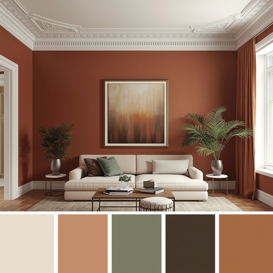
Then look at what sits on either side of it on the color wheel. If your anchor is a warm terracotta, the colors adjacent to it are rust (more red) on one side and warm amber (more orange-yellow) on the other. Your palette lives in that range — anywhere from that rust through the terracotta to the amber, in whatever depths and saturations suit the room.
Assign the colors to the room by scale. The most muted, least saturated version of the palette for the largest surface — usually the walls. A mid-toned version for the largest furniture. The richest or most saturated version for small accents only. That structure keeps the palette from overwhelming the space while still giving every color in it something to do.
Then add one neutral that lives outside the palette entirely — cream, warm white, natural wood, linen. This is the element that prevents the room from feeling like a single color that has been slightly varied. The neutral gives the palette something to breathe against.
What my living room taught me
I didn’t plan that olive, mustard, and rust combination. I chose each piece because I liked it and it seemed to go with what was already there. That instinct — choosing things that seem to go — is analogous color thinking in its most intuitive form. It works because we’ve all been trained by a lifetime of natural color relationships to recognize adjacency as harmony.
Knowing the name and the principle behind it doesn’t change the instinct. It just makes it available more deliberately, in rooms where you’re starting from scratch or trying to fix something that isn’t working. Instead of hoping you stumble into a palette that feels right, you can build toward one.
The rooms that feel effortlessly coherent are almost always the rooms where someone — consciously or not — chose colors that belonged to the same family. Analogous palettes are just the formal version of that instinct. The same thing, with a reason attached.