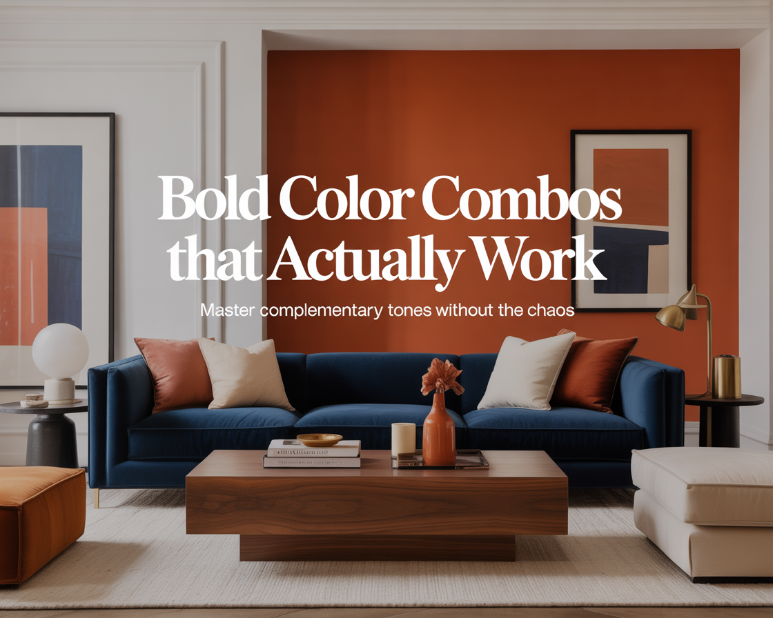
The first time I tried a complementary color scheme in a room, it looked like a fast food restaurant. Orange and blue — which sounds sophisticated when you describe it, and looks unhinged when you execute it without understanding the rules. The orange was too saturated, the blue was too bright, and the room vibrated in a way that made it genuinely unpleasant to sit in for more than twenty minutes.
I repainted within a month. But I didn’t abandon complementary colors — I learned to use them properly. The rooms I’ve been most proud of since then have all used complementary relationships at their core. When they work, they work in a way that no other color strategy matches: alive, confident, impossible to ignore.
Here’s what separates the rooms that work from the ones that look like they’re trying too hard.
What complementary actually means
On the color wheel, complementary colors sit directly opposite each other. Blue and orange. Red and green. Yellow and violet. Purple and yellow. These opposites share no common hues — they’re as different from each other as colors can be while still existing on the same wheel. That difference is the source of their power and their risk.
When two complementary colors sit next to each other, they intensify each other. Each one makes the other look more vivid than it would beside any other color. That mutual intensification is what creates the vibrancy that complementary schemes are known for. It’s also what creates the vibrating, clashing effect when the colors are too saturated or too evenly matched in the room.
The goal of using complementary colors in a room is to harness the intensification without triggering the clash. Every technique for doing that comes down to controlling one thing: the balance of power between the two colors.
The rule that makes everything else work
In any complementary color scheme, one color dominates and one color accents. This is not optional. Equal amounts of two complementary colors in a room is the formula for visual chaos — the room has no hierarchy, no resting point, nowhere for the eye to land without immediately being pulled somewhere else.
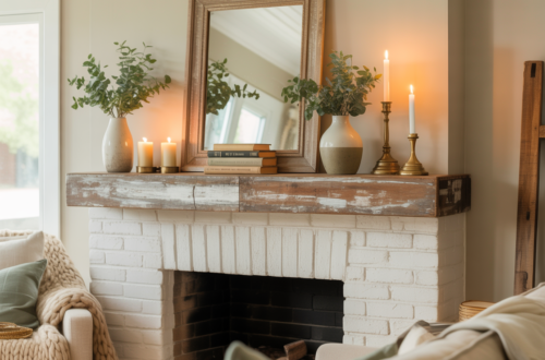
The dominant color takes roughly 60 to 70 percent of the room’s color. It appears on the walls, the largest piece of furniture, or both. The accent color appears in smaller doses — cushions, a single chair, artwork, a plant pot, a lamp. It punctuates rather than competes.
When this balance is right, the accent color feels like the most exciting thing in the room. The eye is drawn to it because it contrasts with everything around it. When the balance is wrong — when both colors are fighting for equal territory — neither wins and the room feels exhausting.
Muting is not compromising — it’s the technique
The other essential rule: at least one of the two complementary colors, and usually both, needs to be muted rather than fully saturated. This is what I got wrong with the orange and blue room. Both colors were at full intensity. The eye had no relief.
Muting means adding gray, brown, white, or black to a pure hue until it loses some of its intensity while retaining its identity. A muted orange becomes terracotta, rust, or amber. A muted blue becomes slate, dusty blue, or denim. A muted green becomes sage or olive. A muted red becomes burgundy or brick.
Muted complementary pairs are recognizably bold without being aggressive. Terracotta and slate blue. Sage green and dusty rose. Burgundy and olive. These are combinations that appear in the best-designed rooms precisely because they carry the energy of complementary contrast while the muting makes them livable.
The more saturated the dominant color, the more muted the accent needs to be to prevent the room from feeling intense. The more muted the dominant color, the more the accent can push toward saturation. They need to be calibrated against each other, not chosen in isolation.
Blue and orange — the combination most people get wrong
Blue and orange is the most popular complementary pairing in interior design, and the one with the highest failure rate. The reason is that “blue” and “orange” each contain enormous variation — there are dozens of blues and dozens of oranges, and only some combinations of them actually work together.
The version that works consistently: deep dusty blue walls with terracotta accents. The blue is muted and cool, the terracotta is muted and warm, and the contrast between them creates a room that feels rich and considered rather than vibrant and loud. Navy with burnt orange in cushions and a rug achieves a similar effect — the navy is dark enough to anchor the room, the burnt orange is warm and complex rather than bright.
The versions that don’t work: bright cobalt with bright orange, or medium blue with medium orange. Both of those sit at a saturation level where neither color can dominate the other, and the room vibrates. If you’re working with blue and orange and the room doesn’t feel right, the solution is almost always to go darker or more muted on one or both sides.
Green and red — subtler than it sounds
Green and red sounds like a Christmas color scheme, and at full saturation it is. But muted versions of this pairing are among the most sophisticated in interior design — they just require enough transformation of both colors that the association disappears.
Sage green and dusty rose is green and red — the rose is a heavily muted, pink-shifted red, and the sage is a heavily muted, gray-shifted green. Together they create a room that feels soft, grown-up, and distinctly contemporary. Nobody walks in and thinks Christmas. They think carefully chosen.
Olive and burgundy is another version — both colors muted toward brown and gray until they lose the cartoon-primary quality of their parent hues. An olive green sofa against a burgundy wall sounds unlikely. In practice, with cream as a neutral and warm wood on the floor, it’s one of the richest combinations a living room can have.
The transformation required for green and red to work in a room is more extreme than for blue and orange. Both colors need to be pushed quite far from their pure hues before the combination stops triggering association. But once they get there, they arrive somewhere that feels original rather than derivative.
Yellow and violet — the riskiest pair and the most rewarding
Yellow and violet is the complementary pair that appears least in interior design and has the most potential to be extraordinary when handled well. The challenge is that yellow is a very powerful color — even small amounts of it draw the eye — and violet has strong associations that can tip into theatrical or dated depending on the shade.
The combination that works: deep plum or eggplant (a very muted, dark violet) as the dominant color, with warm mustard yellow as the accent. The plum is moody and rich, the mustard adds warmth and life without being assertive. Together they create a room with real presence — not the kind that announces itself immediately, but the kind you keep noticing.
Soft lavender walls with golden yellow accents is a lighter version of the same pairing — fresher, less dramatic, more appropriate for rooms that receive good natural light. The lavender needs to stay cool and muted; if it warms up toward pink, it stops being violet and the complementary relationship dissolves.
This is a pairing that rewards commitment. Half-measures — a slightly violet wall with slightly yellow cushions, both insufficiently distinctive — produce a room that looks confused rather than bold. If you’re going to use yellow and violet, commit to both colors being clearly themselves.
Where to introduce the accent color
The placement of the accent color matters as much as the color itself. A small amount of a complementary accent in the wrong place creates a visual interruption. The same amount in the right place creates a focal point.
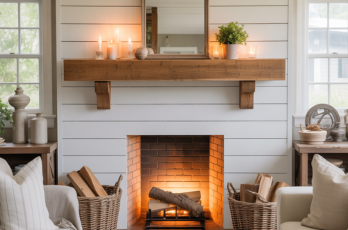
Accent colors belong on elements the eye naturally moves toward: cushions on a sofa, artwork above a fireplace or headboard, a single chair or stool in a corner, plants in a distinctive pot, a lamp on a side table. These are positions where the eye arrives anyway as part of moving through the room. The accent color rewards that arrival.
Accent colors work less well on elements the eye moves past: baseboards, side walls, low furniture that sits below eye level. Placing the accent color in these positions wastes its energy on surfaces that don’t receive attention and removes it from surfaces that do.
One large element in the accent color is more effective than the same color spread across many small elements. A single statement chair in terracotta against blue walls is stronger than terracotta candles, terracotta cushions, and a terracotta plant pot — the same total amount of color, distributed until it becomes visual noise rather than a focal point.
Neutrals are what make it livable
Every successful complementary color scheme has a significant proportion of neutral — white, cream, natural wood, stone, linen, concrete — that separates the two complementary colors from each other and gives the eye somewhere to rest between them.
Without neutral, even a well-balanced complementary scheme can feel relentless. The eye moves constantly between the two poles with no pause. Neutral is the pause. It’s the space between the notes that makes the music rather than noise.
In practical terms: cream walls with terracotta and blue accents rather than blue walls with terracotta accents. Or blue walls with cream as the dominant furniture color and terracotta appearing only in accessories. The neutral does the heavy lifting of holding the room together while the complementary colors provide the interest.
The room after the orange and blue failure
The room I repainted over the orange-and-blue disaster became one of the quietest rooms in the house — warm white walls, very little color at all. I overcorrected, the way you do after something goes wrong.
The room after that one was dusty blue with terracotta accents. Same complementary pairing. Completely different outcome. The blue was muted and sat on three walls. The terracotta appeared in two cushions, a ceramic lamp base, and a woven basket. Cream linen sofa. Wood floor. The room had the energy that the orange-and-blue room was trying for and failing — but quietly, confidently, without effort.
Same colors. Muted, balanced, supported by neutral. That’s the entire difference between a complementary scheme that looks like a design decision and one that looks like a mistake.
The bold part was never about using both colors at full intensity. It was about having the confidence to use colors with real contrast at all, and the patience to use them with enough restraint that the room could actually be lived in.