When I moved into my first place that was entirely mine — no roommates, no inherited furniture, nothing I hadn’t chosen myself — I did what most people do: I spent three weeks looking at inspiration images online and ended up completely paralyzed. Every room I saved looked different. Cool, minimal, almost Nordic. Warm, layered, slightly Mediterranean. Bright and airy. Deep and cocooning. I couldn’t find a thread connecting what I was drawn to because I hadn’t asked the right question yet.
The question wasn’t “which rooms do I like?” The question was “how do I want to feel when I’m home?” Those are different questions with different answers, and the second one cuts through the paralysis of endless inspiration images faster than anything else.
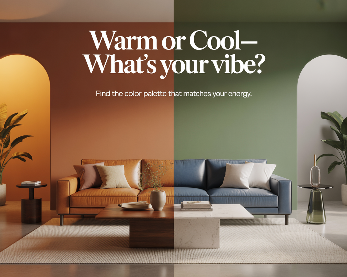
Temperature — warm or cool — is the single most powerful lever in that decision. It shapes how a room feels before any specific color choice, before furniture, before accessories. Get the temperature right and everything else falls into place. Get it wrong and no amount of beautiful individual choices will make the room feel like yours.
What warm and cool actually mean
Every color sits on a spectrum from warm to cool. Warm colors pull toward red, orange, and yellow — the colors of fire, earth, autumn, late afternoon sun. Cool colors pull toward blue, green, and violet — the colors of water, sky, shadow, early morning light.
But temperature isn’t just about hue. It exists within individual colors too. There are warm whites and cool whites. Warm grays and cool grays. Warm beiges that pull toward yellow and cool beiges that pull toward pink or gray. A room’s temperature is determined not just by which colors are present but by which direction every color in the room is pulling.
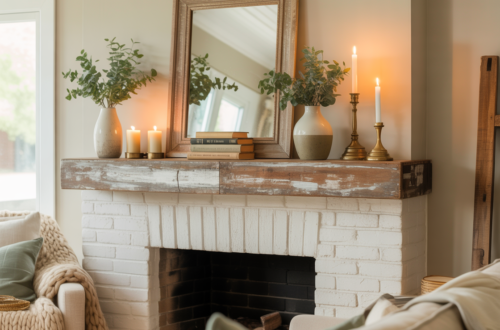
A room where even the neutrals are warm — cream rather than white, wheat rather than gray, amber wood rather than pale ash — reads as warm overall even without a single obviously warm color like orange or red. The reverse is equally true: a room where the neutrals are cool — cool white, blue-gray, bleached light wood — reads as cool even without a single obviously cool color like navy or sage.
This is why temperature is such a foundational decision. It governs the whole room, not just the colors you think of as colors.
What warm palettes feel like to live in
Warm rooms feel different in the body than cool rooms. That’s not poetic — it’s physiological. Warm colors are associated with higher alertness, raised temperature perception, and a sense of proximity. A warm room feels closer, more intimate, more like an embrace than a space.
This has practical implications for how you use a room. Warm rooms feel more social — they encourage conversation, gathering, staying. A kitchen or dining room in warm tones becomes a place people drift toward and linger in. A bedroom in warm tones feels cocooning and sleep-ready. A living room in warm tones feels like the center of the home in the best sense.
The downside: warmth can become heaviness if it isn’t balanced. A room that is uniformly warm — every surface, every material, every textile pulling toward orange and yellow and brown — can start to feel dense and slightly airless. Warm palettes need light — natural or artificial — to breathe, and they need at least one neutral that leans toward cream or white to give the eye somewhere to rest.
Warm palettes also read as less current than cool ones in the contemporary design conversation — there’s a reason the minimal, cool, Scandinavian aesthetic dominated interior design for most of the past decade. If being of-the-moment matters to you, cool palettes will generally feel more aligned with what’s in design publications. If timelessness matters more, warm palettes have centuries of interior history behind them.
What cool palettes feel like to live in
Cool rooms feel spacious. The psychological effect of cool colors — blue especially — is to push walls back and create the perception of more space than actually exists. A small room painted in cool tones feels larger than the same room painted warm. This is one of the most consistent and well-documented effects in color psychology, and it has obvious practical value in apartments and smaller homes.
Cool rooms also feel calmer in a particular way — less intimate than warm rooms, more like an open field than a fireside. This suits people who find warmth slightly oppressive, who prefer space over closeness, who want their home to feel uncluttered and easy rather than rich and layered.
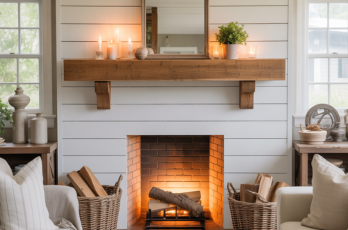
The risk with cool palettes is that they can tip into coldness — literally and psychologically. A room that is all cool blues and grays with no warmth introduced anywhere can feel clinical, unwelcoming, like a space that tolerates you rather than receives you. Cool palettes need warmth somewhere — a natural wood floor, a cream textile, warm-toned lighting at 2700K — to feel inhabited rather than designed.
Cool palettes photograph exceptionally well, which is part of why they dominate design media. They’re easy to light for photography, they don’t compete with natural light the way warm rooms can, and they read as clean and intentional on a screen. In person, a great warm room often outperforms a great cool room in terms of how it actually feels to be in. Photography flatters cool; daily life often favors warm.
The questions that actually reveal your preference
Personality quizzes for interior design are almost universally useless — they ask about lifestyle and end up recommending styles rather than addressing the fundamental question of how you want to feel. Here are the questions that actually work:
Where in the world have you felt most at home? If the answer involves sun, dry heat, earthy landscapes, Mediterranean coasts, or autumn forests — warm palette. If the answer involves cool ocean air, northern light, misty mountains, Scandinavian summers, or clean open skies — cool palette.
When you’re tired and stressed, what do you want to come home to? A room that wraps around you like a blanket — warm. A room that gives you space to decompress and breathe — cool.
What do you wear most often, and what colors dominate your wardrobe? People rarely live consistently in one color temperature at home and another on their body. Warm wardrobe — earthy tones, rust, mustard, olive, camel — almost always signals a warm-palette home. Cool wardrobe — navy, gray, white, sage, dusty blue — typically signals cool.
What time of day do you feel most yourself? Morning people who love bright early light and clean starts often prefer cool palettes. Evening people who come alive after sunset, who love candles and low lighting and the feeling of night settling in, tend to prefer warm ones.
None of these are definitive. They’re indicators. But collectively they usually point clearly in one direction, and that direction is more useful than any style quiz.
Different rooms, different temperatures
The choice doesn’t have to be all-or-nothing across the whole home. In fact, some of the most interesting homes use temperature strategically — cool in rooms that benefit from spaciousness and calm, warm in rooms that benefit from intimacy and energy.
Kitchens often work better warm. The activity of cooking, the smells and heat and social energy of the room, is amplified by warm tones rather than cooled by them. A warm kitchen feels like a place things happen. A cool kitchen can feel more like a laboratory than a place to cook dinner for people you love.
Bedrooms often work better in whichever temperature you find most restful — which is personal rather than universal. Some people find cool blues and grays genuinely sleep-inducing. Others find them slightly sterile and prefer the cocooning quality of warm terracotta or deep amber.
Home offices and workspaces have the clearest case for cool palettes. Cool tones increase perceived alertness and focus — the opposite of what makes them difficult in deeply relaxing spaces. A cool home office signals to your brain that this is a place for thinking rather than resting.
Living rooms are the most individual. They serve the most uses — relaxing, socializing, watching, reading, hosting — and the temperature choice should reflect what you primarily use the space for and how you primarily want to feel in it.
The trap of choosing what looks good on screens
This is the mistake I almost made before I stopped looking at inspiration images and started asking the right question. The rooms that looked most beautiful on my phone were almost all cool — clean, minimal, bathed in diffuse gray-white light that photographs as effortlessly serene. I kept saving them and they kept making me feel something closer to admiration than desire.
The rooms that made me feel something warmer — something like wanting to be in them rather than just look at them — were almost all warm. Earthy, layered, slightly imperfect. They didn’t photograph as cleanly. But the feeling they evoked was closer to what I actually wanted from home.
I chose warm. Terracotta and cream and warm wood and amber light. The apartment doesn’t look like the rooms I was saving online. It looks like mine. People come over and say they don’t want to leave.
That is the point of getting the temperature right. Not to create a room that looks impressive on a screen. To create a room that feels like somewhere you actually want to be — every day, in ordinary life, when nothing particular is happening and you’re just home.
That feeling is temperature. Everything else is detail.