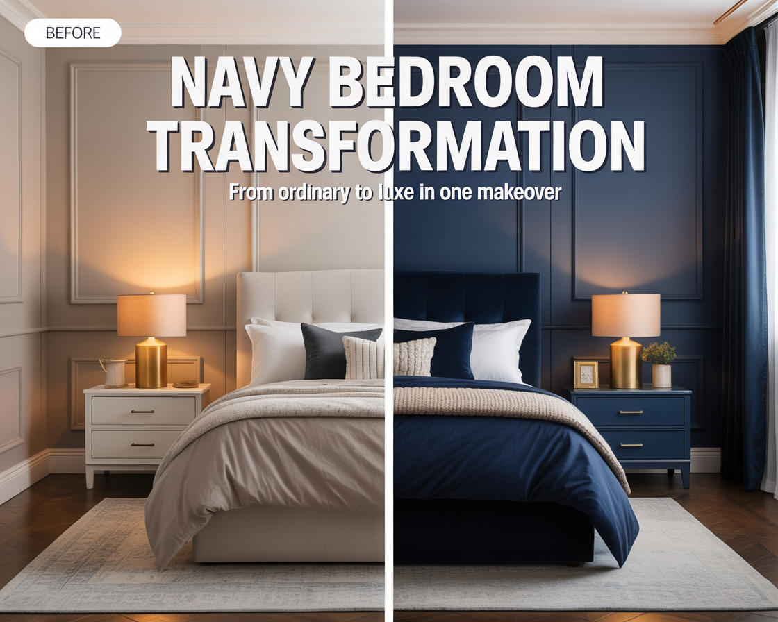
The bedroom before the makeover was beige. Not warm beige, not interesting greige — flat, builder-grade, apologetic beige. The kind of color that gets chosen when nobody wants to make a decision. The furniture was a mix of things accumulated over years rather than chosen: a dark espresso bed frame from one decade, two mismatched nightstands, a dresser that worked but had no particular relationship to anything else in the room.
It wasn’t ugly. It was just nothing. A room that existed but didn’t quite live.
I’d been looking at navy bedrooms online for about a year before I actually committed. Every time I got close to deciding, I’d talk myself out of it. Too dark. Too dramatic. What if I hate it in six months. What if it makes the room feel smaller. What if the furniture looks wrong against it.
Eventually I decided that a room that felt like nothing was worse than any of those risks. I bought the paint on a Saturday morning. By Sunday evening, the room was unrecognizable.
The before: what was actually wrong
Looking back at photos of the room before the makeover, the problem is obvious in a way it wasn’t when I was living in it. The beige walls made everything in the room feel equally unimportant. The bed didn’t stand out. The furniture didn’t stand out. Nothing had any presence or weight. The room was a collection of objects with no organizing idea behind it.
The other problem was light. The room has two windows — good ones, east-facing, which means strong morning light and softer afternoon light. That natural light was doing nothing in the beige room except making the walls look slightly yellow by midday. The room never felt bright. It just felt washed out.
The furniture, assessed honestly, wasn’t bad. The espresso bed frame had good bones — clean lines, solid construction. The nightstands were too small and slightly cheap-looking, but not irreplaceable. The dresser was fine. The real problem wasn’t the furniture. It was that the room gave the furniture no context, no backdrop, nothing to be seen against.
Choosing the navy — not all navies are the same
This took longer than the actual painting. I tested four navy shades before settling on one, and the differences between them were significant enough to matter.
The first sample was too purple — it had a violet undertone that made it look almost blue-black in the evening light, which was striking but felt more like a statement than a bedroom. The second was too green — a naval blue that pulled toward teal in the morning light and felt slightly nautical in a way I wasn’t going for. The third was too flat — a matte navy with no complexity that looked exactly the same in every light, which sounds neutral but actually feels lifeless.
The fourth was right. A navy with a very slight gray undertone — deep and rich but not dramatic, dark enough to have real presence but with enough gray to stay calm rather than intense. In morning light it looked almost soft. In evening light with warm lamps it looked like something from a boutique hotel. The sample on the wall told me within two days.
I used a satin finish rather than matte. Matte paint on dark walls shows every mark and can’t be wiped clean. Satin has just enough sheen to reflect a small amount of light — which matters enormously on dark walls — and holds up to cleaning. Eggshell is the other option that works. Flat or matte is the wrong finish for a dark bedroom wall.
The painting process — what actually takes time
Dark paint over light walls requires more coats than the other way around. I did primer first — a tinted primer in a dark gray, not white — which made a significant difference in how many finish coats I needed. Over the tinted primer, two coats of navy was enough. Over white primer, dark colors often need three or four coats to look even, which adds hours to the job.
The cutting in — the careful edging along the ceiling, baseboards, and window trim — took about as long as rolling the walls. This is where most DIY paint jobs go wrong. Rushed edges show. A steady hand and a quality angled brush, taken slowly, make the difference between a room that looks professionally done and one that looks like someone painted their bedroom over the weekend. Both are true. Only one should be obvious.
The ceiling stayed white. This was a deliberate choice and the right one for this room — the ceiling height isn’t exceptional, and a navy ceiling would have made the room feel lower and heavier than it needed to. The white ceiling also reflects the morning light in a way that balances the darkness of the walls. The trim, also white, creates a clean border that makes the navy look intentional rather than overwhelming.
The after: what changed without buying anything new
This is the part that surprised me most. Before buying a single new piece of furniture or decor, I put everything back in the painted room to see what the navy alone had done. The transformation was larger than I expected.
The dark espresso bed frame, which had looked heavy and slightly oppressive against the beige walls, looked completely at home against the navy. Dark furniture against a dark wall creates a tonal layering rather than a contrast that fights — the frame receded slightly into the room and the bed itself, the mattress and bedding, became the focal point. Which is exactly what a bedroom needs.
The morning light through the east windows, which had looked washed out against beige, now looked golden. Navy walls in morning light do something remarkable — they make the light that falls on them look warmer and more dramatic than the same light hitting a neutral wall. The room that had never felt bright suddenly had a quality of light that was worth waking up for.
The dresser looked better. The mismatched nightstands looked worse — now that the room had a real backdrop, the things that didn’t quite work became obvious. Which turned out to be useful information.
What I changed after the paint dried
The nightstands were the first thing. Against navy walls, small cheap nightstands read as afterthoughts — the contrast with the richness of the wall color makes them look inadequate. I replaced them with something simple in natural oak — slightly larger, open shelf rather than enclosed, warm wood against the dark wall. The difference was immediate.
Bedding was next. The bedding I’d had before — a gray duvet, mid-toned, nothing wrong with it — disappeared against the navy walls. Gray on navy reads as a single dark mass. I switched to cream linen. The bed immediately became the brightest thing in the room, which gave the navy walls something to contrast against. That contrast — the dark richness of the navy and the warm brightness of the linen — is the visual engine of the whole room.
Lighting was the third change and the one with the most outsized impact relative to cost. I added two bedside lamps with warm-toned bulbs — 2700K — replacing the single overhead fixture I’d been using as the primary light source. Overhead lighting in a navy bedroom is the wrong choice. It lights the ceiling and creates flat, even illumination that makes the walls look dark rather than rich. Bedside lamps at lower height cast warm pools of light that make the navy glow. Same room, same walls, completely different atmosphere.
One brass floor lamp in the corner — the darkest part of the room after sundown — completed the lighting setup. That corner, which had been a visual void in the evening, became a warm lit zone that gave the room depth and dimension. Navy absorbs light, which means you need more light sources than you’d need in a lighter room, positioned lower and warmer than you might think.
The small things that finished it
A large mirror on the wall opposite the windows. Navy walls don’t reflect light the way light walls do, so a mirror serving as an additional light source matters more in a dark room than in a light one. The mirror also creates the impression of more space — the reflection shows a room receding beyond the wall, which prevents the navy from feeling enclosed.
A cream wool rug over the wood floor. The floor needed to stay light for the same reason the ceiling did — dark above, dark below, and the room would have felt like a box. The cream rug creates a warm base that connects to the bedding and balances the weight of the walls.
One plant on the dresser. Green against navy has the same natural logic as green against blue sky — it belongs there without needing to be justified. The plant also introduced a living, organic element into a room that is otherwise very composed and deliberate. It loosened things up in exactly the right way.
What the room is now
It’s been eight months since the makeover. I still notice the room when I walk in — the navy still does something to the quality of light and atmosphere that I don’t take for granted. Friends who visit always say something about it. Not always about the color specifically. Usually something like “this room feels good” without being able to say why.
That’s the thing about a room that works. The specific decisions — the paint shade, the linen bedding, the warm bulbs, the oak nightstands — become invisible. What remains is just a room that feels like it was made rather than assembled. A room with a point of view.
The whole transformation, including the new nightstands, bedding, lamps, mirror, rug, and plant, came to less than what a single piece of designer furniture would have cost. The paint itself was under fifty dollars. Most of the work happened on that first weekend.
The year I spent talking myself out of it was the expensive part. It cost me twelve months of sleeping in a room that felt like nothing.