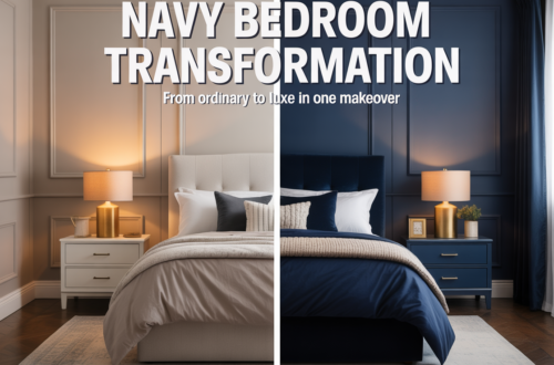
When I moved into my current place, I inherited a bedroom full of warm oak furniture — a bed frame, two nightstands, a dresser — from the previous tenant who left it behind. Not exactly my style, but solid pieces and free is free. I’d already decided on blue walls. My first instinct was that the two things wouldn’t work together. Orange-toned wood and cool blue walls seemed like they’d fight.
They didn’t. They did something better. The warmth of the wood made the blue feel intentional rather than cold, and the blue made the wood feel rich rather than dated. The room had tension in the good sense — the kind that makes a space feel alive.
That combination, blue and warm wood, is one of the oldest pairings in interior design for a reason. It references something real: sky and earth, water and shore, the colors that occur together naturally more than almost any other combination. The eye recognizes it as right even before the brain does.
But making it work in an actual bedroom requires more thought than just pushing blue walls and wood furniture into the same room and hoping. Here’s what actually matters.
Match the intensity of the blue to the warmth of the wood
This is the rule nobody states clearly, and it’s the one that explains most failures. Blue and wood exist on spectrums — blue from pale and muted to deep and saturated, wood from blond and cool to orange and dark. The relationship between them needs to be balanced. When it isn’t, one overpowers the other and the room feels off in a way that’s hard to diagnose.
Light, golden wood — pine, light oak, bamboo — pairs best with muted, mid-toned blues. Dusty blue, slate blue, soft denim. The wood isn’t strong enough to stand against navy, and navy against pale wood creates a contrast that’s too stark for a bedroom. It reads as dramatic when you want calm.
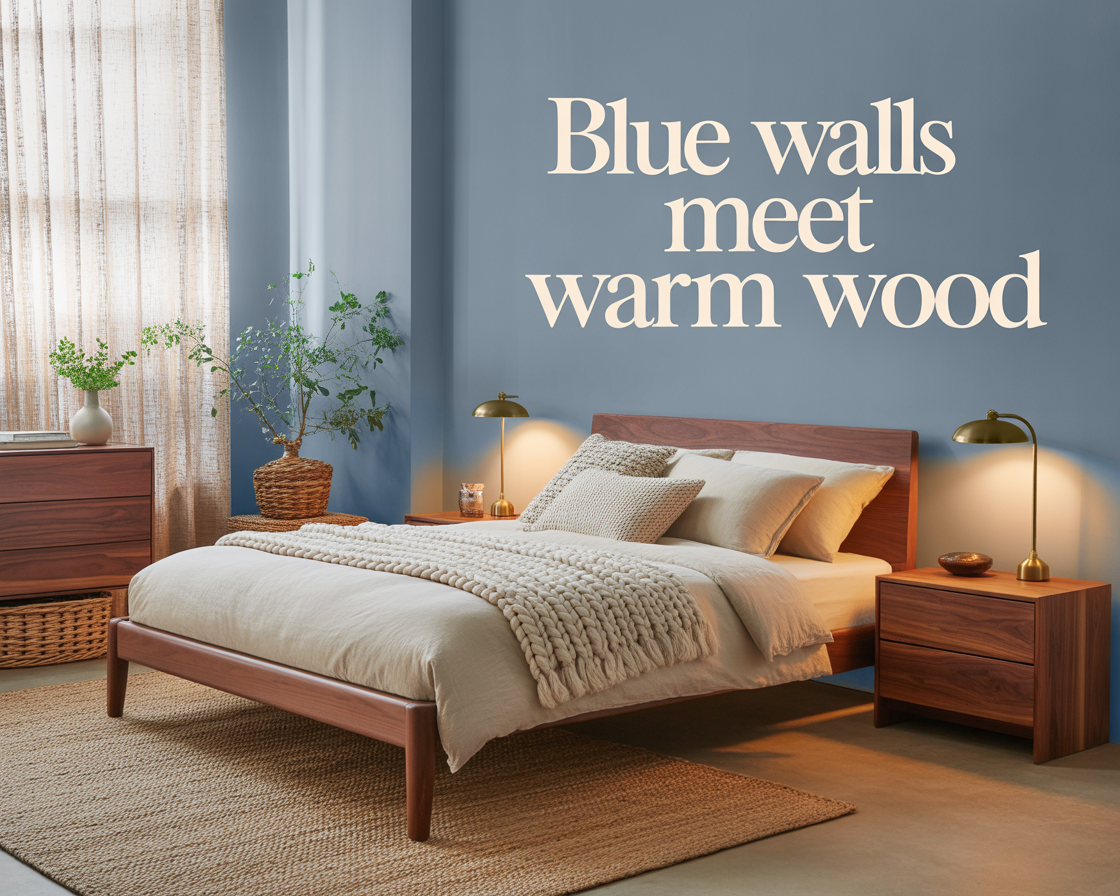
Medium-toned warm wood — honey oak, teak, medium walnut — is the most versatile and works across the widest range of blues. From soft slate all the way to proper navy, medium warm wood handles the contrast without either element dominating. This is the combination most people are working with when they talk about blue and wood bedrooms, and it’s why the pairing has such a broad reputation for working.
Dark wood — deep walnut, mahogany, ebonized oak — needs a blue that’s strong enough to stand next to it. Pale or muted blues get swallowed by dark furniture. Navy or a deep dusty blue holds its own. The result is a bedroom that leans dramatic and rich — beautiful if that’s what you’re after, heavy if it isn’t.
Don’t match the wood — mix it
One of the things that makes blue and wood bedrooms feel designed rather than assembled is variation in the wood itself. A bedroom where every piece of furniture is identical oak — same tone, same grain, same finish — reads as a matched set bought from a single store. Even against beautiful blue walls, it feels flat.
Mixed wood tones, within a range, create depth. A walnut bed frame with lighter oak nightstands. A rattan chair against a wood dresser that’s slightly darker. Exposed wooden floorboards that are a different tone than the furniture. These variations make the room feel collected rather than coordinated — like it came together over time through actual choices rather than a single shopping trip.
The range matters. Too much variation — very dark wood next to very light, with medium tones also present — becomes chaotic. But two or three tones that are clearly in the same warm family give the room movement and richness. Against blue walls, that layering of warm tones is what creates the feeling that the room is genuinely finished.
The blue undertone changes everything
Not all blues cooperate equally well with warm wood. The undertone of your blue — whether it pulls toward green, violet, or gray — determines how it sits against the warmth of the furniture.
Blue with green undertones — teal-blue, eucalyptus blue, some versions of slate — pairs most naturally with wood. Green and brown are adjacent in nature, and the combination has an organic quality that feels immediately coherent. This is probably the easiest version of blue-and-wood to get right.
Blue with gray undertones — dusty blue, blue-gray, French gray — works well with wood but creates a slightly cooler effect. The room doesn’t feel as warm as the green-blue version, but it feels more refined and contemporary. Whether that’s preferable depends entirely on what you want the room to feel like.
Blue with violet undertones — periwinkle-adjacent shades, some muted purplish blues — is the trickiest pairing with warm wood. The violet and the orange-warmth of the wood can create a slight tension that isn’t quite harmony and isn’t quite contrast. It can work, but it requires more careful calibration of everything else in the room to hold together.
Textiles are the bridge between the two
Blue walls and warm wood are two strong visual elements sitting at opposite ends of the warm-cool spectrum. What prevents them from feeling like they’re in different rooms is everything in between — the textiles, the bedding, the rug, the curtains — that bridge the gap between the two.
Cream and warm white are the workhorses here. Cream bedding sits between the cool of the blue and the warm of the wood without fully belonging to either. It softens the contrast, keeps the room from feeling like a showdown between two strong colors, and adds the brightness that makes the whole combination feel considered rather than heavy.
Linen is the texture that does this job best. Raw linen in natural tones has an organic quality that relates to wood without copying it, and a softness that relates to the calm of the blue without being blue. A linen duvet, linen curtains, even a linen throw — any or all of these in the room help the two strong elements coexist rather than compete.
A rug is where you can introduce pattern if you want it. A simple stripe in blue and cream, a geometric in warm tones, even a Persian or vintage rug that contains both warm and cool notes — these work on the floor of a blue-and-wood bedroom in ways that would feel overwhelming on the walls. The rug grounds the room and gives the eye a place to rest that isn’t purely one thing or the other.
Hardware and metal finishes: warm all the way through
When wood and blue are the two primary elements in a bedroom, the metal finishes — hardware on the furniture, light fixtures, curtain rods — should almost always lean warm. Brass, bronze, unlacquered gold. These metals echo the warmth of the wood and prevent the cool of the blue from taking over as the room’s dominant quality.
Chrome and cool silver in a blue-and-wood bedroom pulls the room further toward cold. It makes the blue feel cooler and the wood feel less warm, which is the opposite of what you want. There are exceptions — a very muted, warm blue paired with very warm wood can tolerate cool metal finishes if they’re used sparingly — but the default should be warm metal unless you have a specific reason to go otherwise.
Matte black hardware is the interesting middle case. It doesn’t add warmth, but it also doesn’t add cold — it adds contrast, a visual punctuation that works well against both blue and wood if the rest of the room is warm enough to carry it. A matte black light fixture above a warm wood dresser against a dusty blue wall is a complete, considered combination. But it needs the warmth of cream bedding and warm linen to stop the black from tipping the room toward cool.
Plants — the detail that makes it feel natural
Blue and wood together already reference the natural world. Adding actual plants completes the thought. A trailing plant on the dresser, a small potted something on the nightstand, a larger plant in the corner — greenery in a blue-and-wood bedroom doesn’t feel like a design accessory. It feels like it belongs there, because green is what connects blue sky to brown earth in the palette that the room is already building.
This is not a mandatory element. Plenty of blue-and-wood bedrooms are beautiful without a single plant. But if you’re looking for the detail that makes the room feel genuinely alive rather than just well-arranged, plants are the most efficient thing to add.
What I’d tell myself before I moved in
The oak furniture and the blue walls worked better than I expected because the oak was warm enough to stand against the blue I chose — a dusty, gray-blue that had just enough warmth in its undertone to meet the wood halfway. The cream linen bedding I added did the rest.
If I’d gone navy, the pale oak would have felt overwhelmed. If I’d gone sky blue, the warm wood would have made it feel slightly confused. The shade I picked sat in the range where the contrast was interesting rather than jarring, warm rather than cold, alive rather than deliberate.
That’s the balance the combination is always looking for. Not blue that ignores the wood, and not wood that overpowers the blue. Two strong things in the same room, each making the other look better than it would alone.
When it lands there, it’s one of the most satisfying combinations a bedroom can have.