My bedroom was white for six years. Safe, clean, perfectly inoffensive. I slept fine. But I never felt like the room had any real personality — like it was waiting for something to happen to it.
Then I painted two walls a deep, dusty blue. Not navy, not sky blue — something in between, with a gray undertone that kept it from feeling too saturated. The room immediately became a place I wanted to be. Not just sleep in. Actually be in, with a book, in the afternoon, doing nothing in particular.
That’s what the right blue does to a bedroom. It creates a quality of calm that other colors struggle to replicate. But getting there requires more thought than just picking a shade and rolling it on the walls. Here’s what actually makes a blue bedroom feel calm and luxurious rather than cold and flat.
The shade is everything — and most people choose wrong
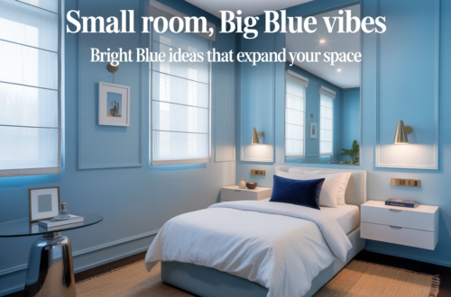
The most common mistake in a blue bedroom is going too bright or too saturated. Bright blue walls feel energetic, even agitating — the opposite of what a bedroom needs. Heavily saturated navy can feel oppressive without enough light to balance it. The blue that creates genuine calm is neither of these things.
What you’re looking for is blue with complexity. Blue that has gray in it, or a touch of green, or even a slight violet undertone — something that prevents it from reading as a single flat note. These are the blues that shift with the light throughout the day, that look different in the morning than they do at night, that give the room a living quality rather than a painted-wall quality.
Dusty blue, slate blue, denim blue, French blue, muted teal-blue — all of these work in bedrooms. What they share is restraint. The color is present without being insistent. It creates atmosphere rather than making a statement.
Test your blue sample on the actual wall for at least four days before committing. Blue shifts more dramatically under different lighting than almost any other color. What looks serene in afternoon daylight can turn cold and institutional under overhead lights at night. You need to see it in both conditions before you decide.
Warm it up — this is the step most people skip
A blue bedroom that feels cold is a blue bedroom where nothing warm was introduced to balance the color. Blue on its own, on four walls, with no warmth anywhere, will make a room feel chilly regardless of the actual temperature. This is the most common failure mode in blue bedrooms, and it’s entirely avoidable.
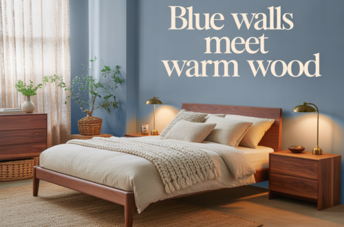
The warmth can come from almost anywhere. Natural wood — a bedside table, a wooden bed frame, exposed floorboards — is the most effective counterbalance to blue walls. Wood and blue together reference something deeply natural: sky and earth, water and shore. The combination feels right at an almost instinctive level.
Warm textiles do the same work. Linen in cream or sand, wool throws in camel or rust, cotton bedding in warm white rather than stark white — all of these soften the blue and prevent the room from tipping into coldness. The texture matters as much as the color. Rough linen against a smooth painted wall creates a tactile richness that makes the room feel layered rather than flat.
Lighting is the third source of warmth and arguably the most powerful. Warm-toned bulbs — 2700K to 3000K — make blue walls glow in the evening rather than recede. Cool bulbs turn blue rooms stark. This is not a subtle difference. The same room with warm versus cool lighting looks like two completely different spaces. Always use warm bulbs in a blue bedroom.
Bedding: where luxury actually lives
In a blue bedroom, the bed is the focal point — and the bedding is the focal point of the bed. This is where the luxurious feeling either appears or fails to appear, regardless of everything else in the room.
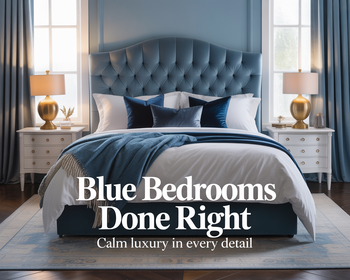
Luxury in bedding is not about matching sets or coordinated colors. It’s about quality and layering. A high thread-count fitted sheet in cream or warm white, topped with a duvet in a slightly different texture — linen rather than cotton, or a waffle weave rather than smooth percale — and then a throw draped across the foot of the bed. That layering is what makes a bed look like it belongs in a hotel rather than a furniture catalog.
Against blue walls, bedding in warm neutrals — cream, oatmeal, sand, soft white — creates the most refined combination. Pure white can work but reads as more graphic and less soft. Dark bedding against dark blue walls collapses the contrast and makes the room feel heavier than it should. The goal is for the bed to feel like a bright, warm center in a calm, blue room.
Pillows are where people tend to overcomplicate things. More than four pillows on a standard bed starts to look like a display rather than a place to sleep. Two sleeping pillows in quality cases, two decorative pillows in a fabric that references something else in the room — a texture, a pattern, a warm color — is enough. Restraint in pillow arrangement reads as more luxurious than abundance.
Furniture: what works and what fights the blue
Blue walls are more demanding of furniture choices than most other wall colors. The wrong furniture makes a blue room feel confused. The right furniture makes it feel inevitable.
Natural wood in medium to warm tones is the most reliable furniture choice for a blue bedroom. Oak, walnut, teak, rattan — all of them provide the warmth the room needs and reference materials that feel at home next to blue. Very dark wood can work in larger rooms with good light. Very light, bleached wood can feel slightly cold against blue walls unless the rest of the room is very warm.
Upholstered furniture — a bed frame with a fabric headboard, an armchair in the corner — works beautifully in blue bedrooms when the fabric is chosen carefully. Boucle in cream or camel, velvet in a warm neutral, linen in sand — all of these add texture and warmth while keeping the color palette cohesive. A velvet headboard in a slightly deeper shade of the wall color creates a tonal richness that looks deliberately considered.
Metal furniture and hardware should lean warm — brass, bronze, or gold rather than chrome or cool silver. This follows the same logic as the warm bulb recommendation: blue is already cool, and adding cool metal finishes throughout the room pushes it further in a direction that works against calm.
The ceiling question
Most people paint the ceiling white when they paint the walls blue, and most of the time that’s the right call. A white ceiling reflects light into the room and prevents the blue from feeling enclosed. It also creates a natural stopping point for the color that the eye accepts without question.
But there’s a more ambitious option worth considering: painting the ceiling the same blue as the walls, or a shade or two darker. This creates what designers sometimes call a wrapped or enveloping effect — the color surrounds the room rather than just lining it. Done well, it feels immersive and genuinely luxurious. Like sleeping inside a sky.
This only works if the room has enough natural light and enough warm elements to prevent it from feeling dark or cave-like. In a room with good windows and warm wood and layered lighting, a blue ceiling is extraordinary. In a small room with limited light, it will feel heavy regardless of how carefully everything else is done.
Art and objects: less than you think
Blue walls have a strong visual presence. They do not need to compete with busy or colorful artwork. The art and objects in a blue bedroom should support the calm rather than interrupt it.
Simple framed prints, abstract work in muted tones, photography in black and white or warm sepia — all of these work against blue walls without fighting them. Large-scale artwork in a single frame reads more luxuriously than a gallery wall of smaller pieces. The gallery wall trend, however appealing in other contexts, tends to make blue bedrooms feel restless rather than calm.
One or two well-chosen objects on a bedside table — a good lamp, a small plant, a ceramic piece in a warm earth tone — are enough. The impulse to fill surfaces should be resisted in a blue bedroom more than almost anywhere else. The restraint is part of what makes the room feel luxurious rather than decorated.
What the room should feel like
A blue bedroom done well should feel like somewhere you exhale when you walk in. Not a showroom, not a design statement, not a carefully curated Instagram backdrop. A room that settles you down and makes the rest of the day recede.
My bedroom has been blue for three years now. I still notice it when I walk in — the quality of light in there is different from the rest of the house, quieter somehow. The room looks the same at midnight as it does at noon, just differently lit. It’s the most rested I’ve slept since I moved in.
That’s not coincidence. Blue, done right, does something to a bedroom that no other color quite manages. It makes rest feel like the natural state of the room rather than something imposed on it.
That’s the goal. Everything else is just figuring out how to get there.