I lived in my apartment for four years before I noticed the problem. The living room was warm — terracotta and cream and amber light. The bedroom was cool — dusty blue walls, gray linen, pale wood. The kitchen was white, aggressively neutral, belonging to neither world. Walking from room to room felt like visiting three different homes that happened to share a front door.
None of the individual rooms were wrong. Each one, considered on its own, worked. But the home as a whole had no through-line, no logic connecting one space to the next. Guests would comment on the living room or the bedroom separately. Nobody ever said anything about the home. Because the home, as a unified thing, didn’t quite exist.
Fixing it didn’t require repainting everything. It required understanding what a cohesive home palette actually is — and what it isn’t.
What cohesive doesn’t mean
Cohesive does not mean every room is the same color. That’s uniformity, and it produces homes that feel like hotel chains — consistent in the least interesting way. Cohesive also doesn’t mean every room uses colors from a single rigid palette, as if you picked six colors at the start and nothing outside those six is permitted.
Cohesive means that moving through your home, room to room, feels like reading chapters of the same book rather than switching between unrelated stories. The rooms are different — different moods, different functions, different color emphasis — but they share an underlying logic. A temperature direction. A recurring neutral. A set of values about what materials belong and what don’t. Something that connects them without making them identical.
The difference between a cohesive home and a matched home is the difference between a wardrobe that expresses a consistent personal style and a wardrobe where every piece is the same brand. One feels like a person. The other feels like a uniform.
Start with temperature and commit to it
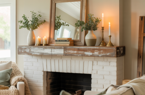
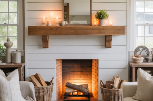
Every color is either warm — pulling toward red, orange, yellow — or cool — pulling toward blue, green, violet. The single most effective thing you can do to create a cohesive home palette is choose a temperature direction and apply it consistently across every room, including the neutrals.
A home with a warm temperature direction uses warm whites rather than cool whites, cream rather than stark gray, amber wood rather than bleached ash, warm bulbs throughout. Even in rooms that are functionally cool — a blue bedroom, a sage bathroom — the specific shade of blue or sage pulls warm rather than cool. The blues have a slight green or gray-green undertone rather than a pure or violet-blue undertone. The greens pull toward yellow rather than blue. Everything is warm in its orientation even when the hue itself is a cool color.
A home with a cool temperature direction does the reverse. Cool whites, blue-gray neutrals, pale or ashy wood tones, cool bulbs, and even the warm-seeming colors — terracotta, mustard — are chosen in versions that pull slightly grayer and less orange than their warmest expressions.
This sounds like a small thing. In practice, it’s what separates homes that feel unified from homes that feel like they were decorated by several people with different instincts. Temperature is the thread. Pull it consistently through every room and the home coheres even when the colors are very different from space to space.
Choose one or two recurring neutrals
After temperature, the most powerful cohesion tool is a recurring neutral that appears in every room of the home. Not the same paint color on every wall — a material or finish that travels consistently through the spaces.
In practice this is often the floor. A wood floor in a consistent tone throughout the home — even if some rooms have rugs that cover most of it — creates a visual continuity that holds everything above it together. Walking through a home with consistent flooring feels different from walking through one where each room has a different floor material and color. The consistent floor is a baseline that all the rooms share, even when everything above knee height is different.
If your floors vary — different rooms, different materials, different decisions made over years — find a neutral elsewhere. A consistent white or cream on all ceilings. A consistent trim color on all door frames, window frames, and baseboards throughout. These architectural elements run through every room and when they’re consistent, they stitch the rooms together in a way that’s subtle but immediately felt.
The trim color is underestimated almost universally. Homes where trim changes from room to room — white in one room, off-white in another, cream in a third — feel subtly disconnected in a way that’s hard to diagnose but impossible to ignore once you see it. Consistent trim, even in a home where everything else varies, creates a backbone of cohesion.
Build a palette of six to eight colors — then use only some in each room
A cohesive home palette is not a single palette that appears in every room. It’s a larger palette — a set of colors that belong to the same family and feel related — from which each room draws a subset.
Think of it as a shared vocabulary. The home has ten words in its vocabulary. Each room speaks a sentence using three or four of those words. No room uses all ten — that would be overwhelming. But every room uses words from the same list, and so the rooms sound like they’re speaking the same language even when they’re saying different things.
A practical version: a home palette might contain warm cream, soft terracotta, dusty sage, warm amber, deep rust, muted olive, warm charcoal, and natural wood. The living room uses cream, terracotta, and warm amber. The bedroom uses cream, dusty sage, and muted olive. The kitchen uses cream, natural wood, and warm charcoal. The bathroom uses cream, dusty sage, and terracotta in small doses.
Every room is different. Every room contains cream and draws from the same warm, earthy palette. Moving through the home feels like the rooms know each other — because they do, in the sense that they share a vocabulary even when they’re saying different things with it.
The transition spaces matter more than people think
Hallways, entryways, and staircases are the connective tissue of a home’s color story. Most people treat them as afterthoughts — paint them a safe neutral and move on. That’s a missed opportunity and, more importantly, a missed responsibility.
A transition space that doesn’t relate to the rooms it connects creates a visual interruption every time you pass through it. You step out of the warm living room, through a cool gray hallway, into the bedroom, and your body registers the disconnect even if your brain doesn’t name it.
Transition spaces should anticipate and mediate. The hallway between a warm living room and a cool bedroom should contain elements of both — warm in some materials, cool in others — so the transition feels graduated rather than abrupt. Or it should commit fully to the neutral that both rooms share, providing a pause between the two moods rather than a conflict.
The entryway specifically sets the expectation for the entire home. It’s the first color statement a visitor encounters, and it creates the frame through which they interpret everything that follows. An entryway that relates clearly to the rest of the home’s palette makes the home feel considered from the first moment. One that doesn’t creates a slight dissonance that colors the experience of everything beyond it.
Materials are colors too
Wood, stone, metal, fabric, ceramic — every material in a home has a color and a temperature, and they need to be part of the palette thinking rather than treated as separate decisions.
A home where the wood tones are consistent — not identical, but in the same warm or cool family — feels more cohesive than one where dark espresso furniture sits next to pale Scandinavian ash next to orange-toned pine. The materials are telling different stories, and the home has to work harder to hold them together.
Metal finishes are the detail that most often disrupts cohesion in otherwise well-considered homes. Brass kitchen hardware with chrome bathroom fixtures with matte black bedroom hardware — three metal temperatures in a home that is otherwise warm — creates micro-interruptions that accumulate into a general feeling that something is slightly off, even when nothing specific can be identified as wrong.
Consistent metal throughout the home — or at minimum, consistent within zones (all warm metals in the living and kitchen area, all cool in the bathrooms) — removes those interruptions and allows the intentional color decisions to do their work undisturbed.
How to audit what you already have
Before buying anything new, stand at the entrance of your home and walk through every room slowly. In each room, identify: the dominant color temperature, the neutrals, and any colors that feel like they belong exclusively to that room and have no relationship to anything adjacent.
Then look at the transitions. Does moving from one room to the next feel natural or abrupt? Is there a color or material that appears in multiple rooms and quietly connects them? Is there a color in one room that appears nowhere else in the home and creates an island of disconnection?
The answers usually reveal a few specific problems rather than a whole-home failure. A sofa in a color that relates to nothing else in the home. A bathroom painted in a tone that pulls the wrong temperature. A floor that changes material in one room and creates a visual break. Fixing those specific problems — often without repainting or buying much that’s new — can transform a home that felt like separate rooms into one that feels like a home.
What my apartment taught me
The problem in my apartment was temperature. The living room was warm, the bedroom was cool, and the kitchen was neutral in a way that didn’t belong to either. The fix wasn’t repainting the bedroom — it was finding the warm version of the blue I’d chosen. A blue with a slight green undertone rather than a violet one. Slightly more teal than pure blue. Still clearly blue, still clearly a bedroom color, but pulling warm rather than cool.
I replaced the bedroom’s pale ash nightstands with warm oak. Changed the cool gray bedding to warm cream linen. The walls stayed. The temperature shifted. The bedroom went from feeling like a different home to feeling like a quieter, more restful version of the same home.
The kitchen got a warm cream on the walls rather than its previous bright white. Warm-toned bulbs replaced the cool ones. A terracotta plant pot on the windowsill that appeared nowhere in the kitchen before — but appeared throughout the rest of the home.
Total cost: two cans of paint, a set of bulbs, two nightstands bought secondhand, new bedding, and one plant pot. The home, after those changes, felt like a home rather than a collection of rooms. People stopped complimenting individual rooms and started saying things about the whole place — how it felt, how it held together, how it seemed like somewhere someone actually lived rather than somewhere someone had decorated.
That’s what a cohesive color palette does. Not impress. Connect. Make the home feel like it came from one mind and one set of values rather than from a series of separate decisions that happened to end up under the same roof.
It’s a quieter achievement than a beautiful individual room. It’s also the more lasting one.