A friend of mine is a graphic designer. She uses triadic color schemes constantly in her work — the visual balance of three evenly spaced hues is a tool she reaches for when she needs something that feels energetic and complete at the same time. When she moved into a new apartment two years ago, she decided to apply the same logic to her living room.
The first attempt looked like a flag. Red sofa, yellow walls, blue rug — all at full saturation, all at roughly equal visual weight. It was technically triadic and practically unwearable. She sat in it for two weeks before admitting it wasn’t working.
The second version — same three colors, completely different approach — became the best room I’ve ever been in. Warm, layered, full of energy that didn’t exhaust you. The difference between the two wasn’t the palette. It was understanding what a triadic palette actually requires to work in three-dimensional space rather than on a flat screen.
What triadic means and why it’s different
A triadic palette uses three colors spaced equally around the color wheel — each one 120 degrees from the others. The primary triad is the most familiar: red, yellow, and blue. The secondary triad: orange, green, and violet. There are also tertiary triads — red-orange, yellow-green, and blue-violet, for instance — that are less obvious but often more usable in interiors because they carry less primary-color baggage.
What makes triadic palettes feel balanced is geometric: three equidistant points on a circle create perfect symmetry. No color is closer to any other. The relationship is mathematically even, which is why triadic palettes feel inherently complete — nothing is missing, nothing is redundant.
That same balance is what makes them difficult. Analogous palettes forgive imbalance because the colors are already so similar that variation in proportion doesn’t create conflict. Complementary palettes have two colors that naturally establish a hierarchy — dominant and accent. Triadic palettes have three colors of roughly equal visual weight, and if you treat them as equal in the room, the room has no hierarchy and no resolution.
The entire art of triadic interior design is creating hierarchy from inherently balanced material.
The 60-20-10 structure — and why it’s non-negotiable
Every successful triadic room follows some version of a proportion rule. One color dominates, one supports, one accents. The specific numbers vary — 60-20-10, 70-20-10, 65-25-10 — but the principle is consistent: the three colors cannot be equal. The moment they approach equality, the room loses its organizing logic and becomes visual competition.
The dominant color — roughly 60 percent of the room’s color — appears on the largest surfaces. Usually the walls, or the largest piece of furniture if the walls are neutral. This is the color that defines the room’s identity. When someone describes the room later, they’ll use this color.
The secondary color — roughly 20 to 30 percent — appears on the next largest elements. The sofa if the walls carry the dominant. The rug. Large curtains. A significant piece of furniture. This color supports the dominant and creates the first layer of interest.
The accent color — roughly 10 percent — appears in small doses only. Cushions, a throw, a single armchair, artwork, plant pots, a lamp. It’s the color that makes the room feel complete rather than like two colors looking for a third. It should feel like a discovery when someone notices it — not an announcement.
My friend’s first attempt gave each color roughly equal weight. The second gave the dusty terracotta 60 percent, the muted sage green 25 percent, and the soft gold 15 percent. Same three colors. The hierarchy was the difference.
Muting is mandatory
The primary triad — pure red, pure yellow, pure blue — works in graphic design, in children’s playrooms, and nowhere else in adult interior design. At full saturation, all three colors demand attention simultaneously and the room has no place to rest.
Every triadic palette that works in a living room uses muted, shifted, or deepened versions of the three hues rather than their pure form. The transformation can be significant — the color may need to be pushed quite far from its pure parent hue before it becomes livable — but it retains the essential relationship. Muted terracotta, muted sage, and muted gold are still red, green, and yellow in their relationships to each other. The triadic harmony is intact. The visual aggression is removed.
How much to mute depends on the dominant color and the room’s natural light. A room with excellent natural light can handle more saturation — the light softens colors that would feel intense under artificial light. A room with limited natural light needs more muting to prevent the colors from feeling heavy and aggressive after dark.
The general direction: mute toward brown and gray rather than toward white. Adding white to a pure hue produces a tint — lighter but still saturated in a way that reads as pastel. Adding brown or gray produces a tone — deeper, more complex, more useful in interiors. Tinted triadic palettes often feel like a nursery. Toned triadic palettes feel sophisticated.
Choosing which triad — this matters more than execution
The primary triad is the hardest to use. The colors carry too much cultural weight — red means urgency, yellow means caution, blue means corporate — and even in muted form they resist the transformation required to feel domestic and personal.
The secondary triad — orange, green, violet — is more flexible. These colors have less cultural programming attached to them and they mute into more versatile interior colors. Muted orange becomes terracotta or rust. Muted green becomes sage or olive. Muted violet becomes lavender, dusty plum, or warm gray-purple. These are colors that appear constantly in well-designed interiors.
The tertiary triads are where the most sophisticated results live. Red-orange, yellow-green, and blue-violet — muted into brick, moss, and periwinkle — is a triadic palette that almost nobody would identify as triadic on sight. It just looks like an exceptionally well-chosen set of colors that happen to feel complete together. That invisibility is the goal. A room should feel right, not look like a color theory exercise.
Neutral as the fourth element
Every triadic living room needs a neutral that doesn’t belong to the palette — cream, warm white, natural wood, linen, stone, concrete. This neutral is not the fourth color in a palette of three. It’s the air the palette breathes in.
Without neutral, a triadic room feels relentless. Three colors constantly present, constantly in relationship, constantly requiring the eye to process. Neutral is the pause between phrases. It’s what allows each of the three colors to be seen distinctly rather than blending into visual noise.
Cream and warm white are the most versatile neutrals in triadic rooms because they reflect all wavelengths of light and don’t add a fourth color temperature to the mix. Natural wood works particularly well with warm triads — terracotta, sage, gold — because it shares their warmth without competing. Cool triads benefit from stone or concrete neutrals that share their temperature without belonging to any of the three hues.
The proportion of neutral in a triadic room is often larger than people expect. A room that is 40 percent neutral, 35 percent dominant color, 15 percent secondary, and 10 percent accent will feel more balanced and livable than a room where the three palette colors are trying to fill 90 percent of the space. The neutral is not a concession — it’s load-bearing.
A practical example from scratch
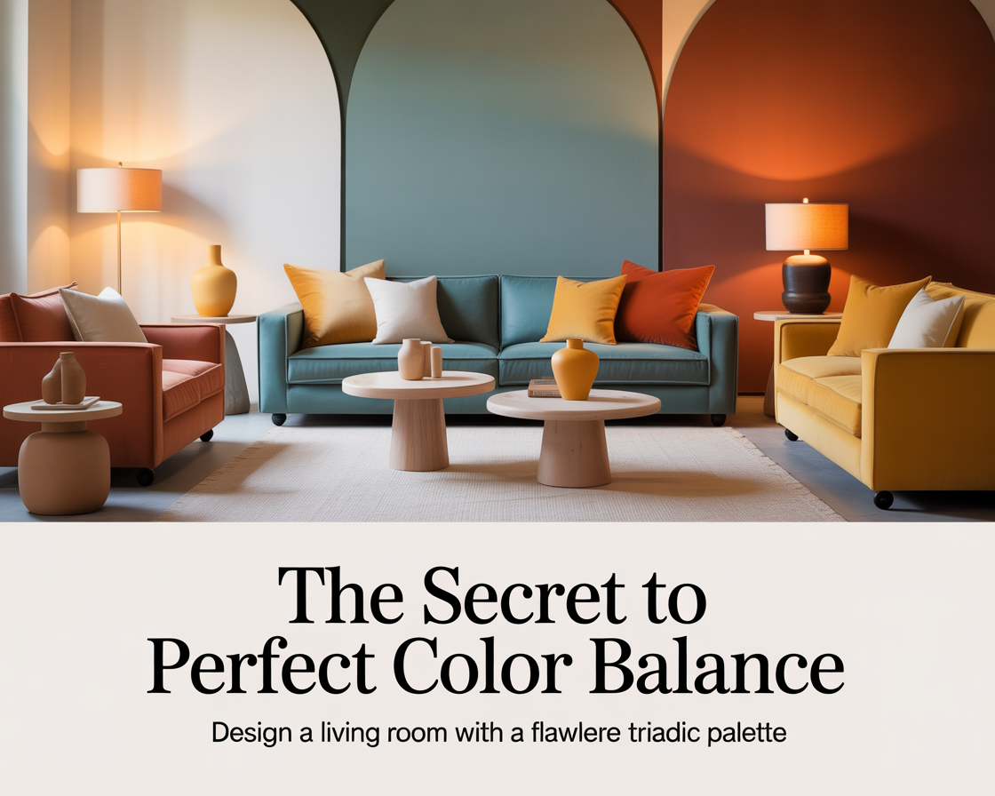
Start with the secondary triad — orange, green, violet — because it offers the most flexibility. Mute all three: terracotta for the orange, sage for the green, dusty lavender for the violet.
Assign by proportion. Terracotta on the walls — enough saturation to feel warm and present, not so much that the room feels hot. Sage as the sofa color — a substantial piece that supports the terracotta without competing. Lavender in the cushions, one small armchair, a lamp shade — small doses, high visibility because the color is distinctive enough to register without requiring quantity.
Add cream as the neutral. Cream curtains that let the window light in without adding color. A cream wool rug that grounds everything. Natural oak side table that bridges the terracotta and the cream.
That room — terracotta walls, sage sofa, lavender accents, cream throughout — is a triadic palette. It’s also just a beautiful living room. The theory disappears into the result, which is exactly where it belongs.
How to know if it’s working
Stand in the room and let your eye move through it naturally. In a successful triadic room, the eye travels — from the dominant color on the walls to the secondary color on the sofa to the accent somewhere across the room — and then rests. The circuit feels complete. Nothing is missing and nothing is fighting for attention it hasn’t earned.
If the eye keeps snagging on one element, that element is wrong — either too saturated, too large in proportion, or in the wrong position. If the eye can’t find anywhere to rest, the neutral is insufficient or the colors are too equally weighted.
The test that my designer friend eventually used: she sat in the room for thirty minutes reading. If she forgot about the room — if it receded into comfortable background — it was working. If she kept noticing individual elements, something was still off. A room that’s working is one you stop thinking about after the first few minutes. It just holds you.
What the second room taught both of us
The red sofa is gone. In its place: a dusty terracotta linen sofa that from certain angles in certain light almost reads as blush. The yellow walls are now a warm cream that carries just enough yellow undertone to relate to the gold accents without announcing itself as a palette color. The blue rug is now sage — shifted toward green, muted toward gray, related to the blue it replaced but transformed into something that cooperates rather than competes.
The triadic relationship is still there. Red-orange, yellow-green, and blue-green, shifted and muted until they became terracotta, cream, and sage. The palette that looked like a flag became a room that feels like a Sunday afternoon — warm, complete, impossible to leave.
That’s what triadic palettes are capable of when the theory serves the room rather than the other way around.