When I repainted my kitchen cabinets beige last spring, I was confident about the cabinet color within about two days of sampling. The wall color took three weeks, six paint samples, and one very regrettable weekend where I convinced myself that terracotta was the answer. It was not.
The problem with beige is that it looks like it goes with everything — and it does, mostly — but that also means the wall color has real work to do. It can’t just be neutral. It has to make a decision about what kind of kitchen you want. Warm and cozy? Crisp and fresh? Dramatic and grounded? The wall is where that decision gets made.
Here’s what I learned, and what actually works.
First: know what undertone your beige has
Before picking a wall color, hold your cabinet color up to natural light and really look at it. Beige is never just beige. It pulls in a direction — pink, yellow, gray, or green — and that undertone is the thing that either harmonizes or fights with whatever goes on the walls.
A beige with pink undertones will clash against a wall with strong yellow or green in it. A gray-beige will feel cold next to a wall that’s too warm. You don’t need to be a color theorist to figure this out — just hold paint samples next to your actual cabinet and trust what your eyes tell you. If something feels slightly off, it is.
Once you know which direction your beige pulls, everything else gets easier.
Warm white — the reliable answer
If you’re not sure where to start, warm white is the safest and most consistently successful wall color with beige cabinets. Not stark white — that creates too much contrast and makes the beige look dingy by comparison. Warm white. Creamy, slightly off, with a hint of yellow or pink.
What this combination does is create a tonal kitchen — everything in the same warm family, layered rather than contrasted. It reads as calm, cohesive, and quietly sophisticated. It’s the kitchen equivalent of wearing different shades of the same color. It works because nothing fights.
Good options in this territory: Benjamin Moore’s White Dove, Sherwin-Williams Alabaster, Farrow and Ball’s Pointing. All of them have enough warmth to sit comfortably next to beige without blending in so completely that the kitchen loses any definition.
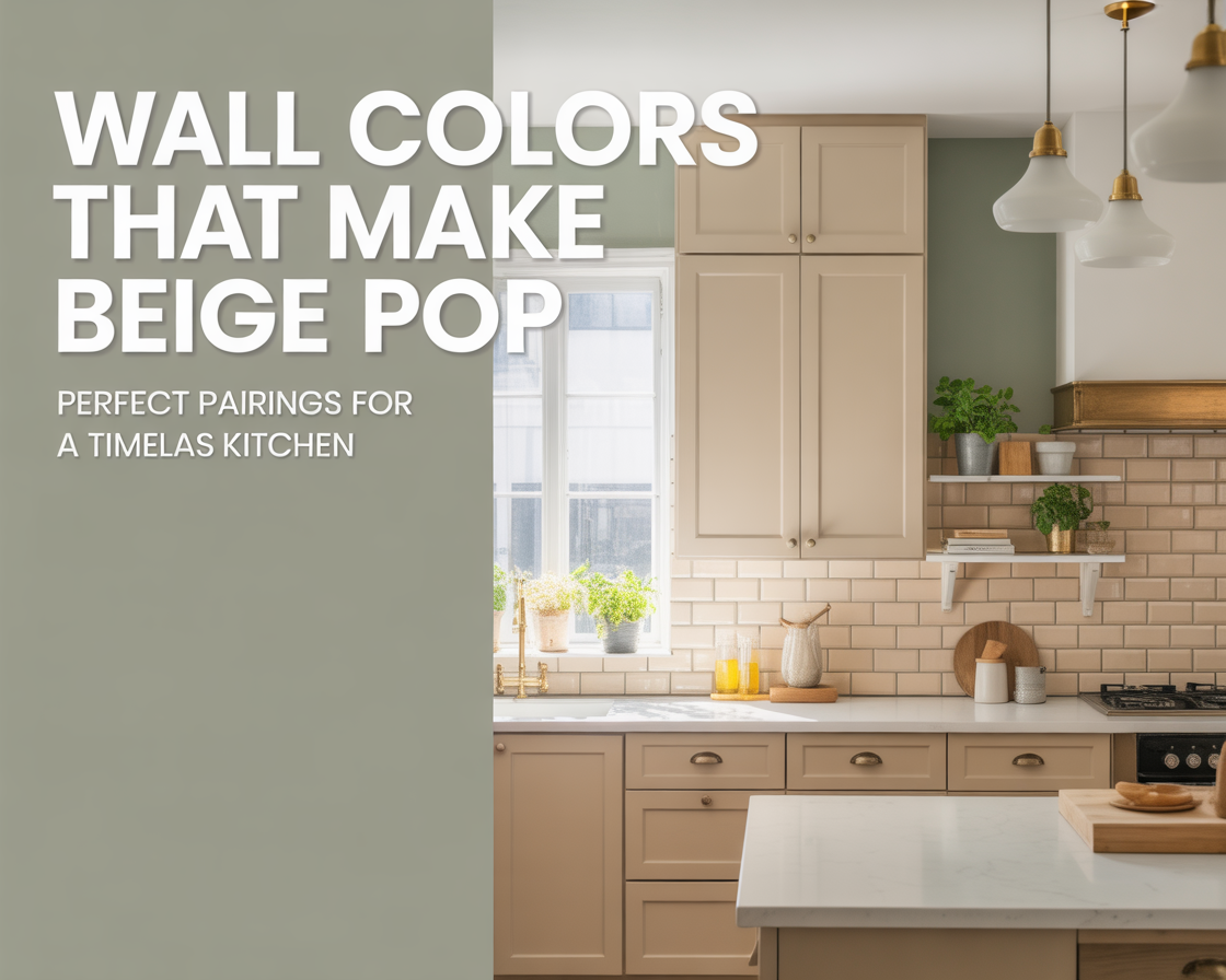
Soft sage green — the combination everyone is discovering right now
Sage green and beige is one of those pairings that seems surprising until you see it in person, and then it seems completely obvious. Green and beige both pull from the natural world — earth tones, organic, grounded. Together they create a kitchen that feels like it belongs somewhere calm and real.
The key is keeping the sage soft. Dusty, muted, almost gray-green rather than bright or saturated. Bright green next to beige cabinets will feel jarring. Soft sage feels like they were always meant to be together.
This works especially well if your kitchen gets decent natural light. In a darker kitchen, sage can pull a little heavy. In a well-lit space, it brings warmth and life to the walls without competing with the cabinets for attention.
Warm greige — when you want almost no contrast at all
Greige — the gray-beige hybrid — on the walls with beige cabinets sounds like it should be boring. In practice it’s one of the most sophisticated combinations in kitchen design right now. When done well, it creates a room where everything feels like it was considered as one unified thing rather than assembled from separate decisions.
The trick is to go slightly darker or cooler on the walls than on the cabinets. If the cabinets are warm beige, the walls should be a greige that’s just a touch more gray. That subtle distinction gives the room depth without obvious contrast. It’s a quiet combination that rewards attention.
This is not the choice if you want your kitchen to feel energetic or bold. It’s the choice if you want it to feel like the most comfortable room in the house.
Deep navy or slate blue — the dramatic option
This one surprises people. Navy or dark slate blue walls with beige cabinets sounds like it shouldn’t work. It does, dramatically.
The contrast between the depth of a dark blue wall and the warmth of beige cabinets is striking without being harsh. The blue grounds the kitchen, gives it weight and presence, and the beige keeps it from feeling heavy or cave-like. It’s a combination that photographs beautifully and looks even better in person.
This works best in kitchens with good natural light and in spaces where you want the kitchen to feel like a destination rather than just a functional room. It’s not subtle. If you want subtle, go with the greige. If you want the kitchen to be the first thing people mention when they visit your home, consider the navy.
Hardware matters more with this combination. Brass or warm gold hardware on the beige cabinets against a navy wall is a complete, considered look. Chrome or cool-toned hardware will feel slightly disconnected.
Terracotta — the one I tried and don’t recommend
Back to my terracotta weekend. On paper it made sense — both warm, both earthy, natural palette. In my actual kitchen, it felt like the walls were competing with the cabinets rather than supporting them. Both colors wanted to be the warm, earthy focal point, and neither won.
Terracotta can work in the right context — very large kitchens with high ceilings, or as an accent wall rather than all four walls. But as a full wall color next to beige cabinets in a standard kitchen, it tends to feel crowded and slightly overwhelming. I repainted after two days.
The lesson: when both the cabinets and the walls are warm and saturated, the room has nowhere to rest. One of them needs to step back. With beige cabinets, the wall usually needs to either go lighter and quieter, or go darker and contrasting. Splitting the difference with another warm mid-tone rarely lands.
Soft blush or dusty rose — underrated and genuinely beautiful
This one takes some confidence to try, but the payoff is real. A soft, dusty blush on the walls — nothing bright or candy-like, more like the color of a dry rose petal — with beige cabinets creates a kitchen that feels warm, feminine without being precious, and genuinely distinctive.
It works because blush and beige share the same pink undertone. They don’t fight. They deepen each other. The kitchen ends up feeling wrapped in warmth rather than decorated.
This combination pairs particularly well with natural wood shelving, unlacquered brass hardware, and simple linen-style window treatments. It’s a whole mood, and it’s one that not many people have committed to yet — which means if you do it well, your kitchen will look like nothing else.
The rule that cuts through everything
For every wall color you’re considering, ask one question: does this color support the beige, or does it compete with it?
Support means the wall color makes the cabinets feel more intentional — it sets them off, complements their undertone, or creates a contrast that gives the cabinets something to stand against. Compete means both colors are vying for the same visual role, and neither quite wins.
Warm white supports. Soft sage supports. Deep navy supports. Terracotta, in most cases, competes. Once you see the distinction, it becomes easy to filter your options quickly.
Before you commit to anything
Paint large samples — at least 12 by 12 inches — on the actual wall surface. Not a piece of poster board held up to the wall. The wall itself, in the actual kitchen, with the actual lighting. Leave them up for at least three or four days and look at them at different times of day.
Kitchen lighting is often the most varied in the house — morning sun from one direction, overhead fixtures at night, maybe under-cabinet lighting that adds its own warmth. A color that looks perfect at noon may feel completely different at 7 in the evening. The sample on the wall, lived with for a few days, tells you the truth that a small chip in a store never can.
My kitchen ended up with a warm white wall. Simple, quiet, exactly right. The three weeks of samples and the terracotta detour were worth it — not because the process was fun, but because I ended up with something I’m still happy with every morning when I make coffee.
That’s the goal. Not the perfect choice in theory. The right choice for your actual kitchen, your actual light, your actual life in it.