I spent an embarrassing amount of time staring at blue paint chips before redoing my bedroom. At some point I had eleven samples on the wall simultaneously, ranging from something that looked like a swimming pool to something that looked like a bruise. Neither extreme was what I wanted. What I wanted was somewhere in between — calm, warm enough not to feel clinical, deep enough not to feel like a nursery.
What I discovered in that process is that “blue” is almost a useless description when it comes to bedroom color. The range within a single color family is enormous. A sky blue bedroom and a navy bedroom are not variations on the same idea — they create entirely different rooms, different moods, different daily experiences. Choosing between them is not a matter of preference for lighter or darker. It’s a decision about what kind of room you want to live in.
Here’s an honest breakdown of the main shades and what each one actually does in a bedroom.
Navy blue — dramatic, committed, not for everyone
Navy is the shade people choose when they want their bedroom to make a statement. Done well, it is genuinely stunning — rich, enveloping, the kind of room that feels like a destination rather than just a place to sleep. Done poorly, it feels like you’re sleeping inside a cave.
The difference between those two outcomes comes down almost entirely to light and balance. Navy needs generous natural light to breathe — a room with small windows and poor orientation will feel oppressive with dark walls, regardless of how carefully everything else is arranged. It also needs warm counterweights: cream bedding, wood furniture, brass hardware, warm-toned lighting. Without those elements pulling against the darkness of the walls, navy collapses into itself.
If your bedroom has good light and you’re willing to commit to the warm elements that navy requires, it’s one of the most satisfying bedroom colors available. If you’re uncertain about either of those conditions, it’s worth trying a lighter shade first. Navy does not forgive half-measures.
Best for: large bedrooms, rooms with south or west-facing windows, people who want the bedroom to feel like a private retreat with real presence.
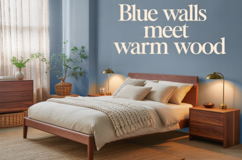
Dusty blue — the one that works in almost any bedroom
If I had to recommend a single blue shade for the widest range of bedrooms and people, it would be dusty blue. It sits in a range that is neither too light nor too dark, with enough gray or violet in it to give it complexity without tipping into any color that conflicts with the bedroom’s purpose.
Dusty blue is calm in a way that feels earned rather than imposed. It doesn’t shout. It doesn’t whisper either. It creates an atmosphere — a particular quality of light in the room — that makes the space feel like it has been thought about. Guests who walk into a well-done dusty blue bedroom almost always say something. They don’t always know why. The color is doing work they can feel but can’t quite name.
It’s also forgiving. Dusty blue works with warm wood, with cool linen, with brass and with chrome, with cream bedding and with soft gray bedding. It doesn’t demand the same careful counterbalancing that navy does. The muted quality of the color means it cooperates rather than dominates.
Best for: most bedrooms, most light conditions, people who want blue without the commitment that darker shades require.
Slate blue — cooler, quieter, almost architectural
Slate blue leans more toward gray than dusty blue does. It’s a cooler shade, more restrained, and it creates a bedroom that feels almost architectural — precise and intentional without being warm or particularly inviting in the obvious sense.
This is not a criticism. Some people want a bedroom that feels more like a well-designed hotel room than a cozy retreat — clean, quiet, stripped of unnecessary warmth. Slate blue delivers that. It’s a grown-up shade in the most genuine sense: no sentimentality, no nostalgia for sky or sea. Just a sophisticated gray-blue that makes a room feel considered.
It pairs particularly well with cool-toned materials: concrete, marble, brushed steel, white linen. Against warm wood it can feel slightly disconnected, though a very dark walnut can work if the overall room is otherwise cool. This is a shade that rewards commitment to a particular aesthetic rather than mixing elements from different directions.
Best for: modern, minimal bedrooms; people who run warm and want a room that feels genuinely cool; rooms with cool northern light.
French blue — the warmest blue on this list
French blue sits in a range that’s medium in depth — not as dark as navy, not as muted as dusty blue — but its defining quality is warmth. It has a slight red or violet undertone that pulls it away from coldness and toward something that feels almost Mediterranean: sunny, open, lived-in.
In a bedroom, French blue is the shade that feels most cheerful. It doesn’t create the enveloping calm of dusty blue or the dramatic weight of navy — it creates something more like optimism. A French blue bedroom in morning light feels like it’s looking forward to the day. That’s a specific quality and not everyone wants it in a room meant primarily for rest. But for people who find dark or muted shades oppressive, French blue is the alternative that still has real presence and character.
It pairs beautifully with white — crisp white trim, white bedding, white furniture — and with natural terracotta accents that reinforce the warm Mediterranean quality. It does not pair well with gray, which pulls the warmth out of it and leaves something slightly muddy.
Best for: rooms with limited natural light that need warmth and brightness; people who find darker blues heavy; bedrooms with a more relaxed, less formal aesthetic.
Steel blue — the underrated middle child
Steel blue doesn’t get as much attention as navy or sky blue, and that’s a shame because it occupies one of the most useful positions in the blue spectrum. It’s medium-toned, with enough gray to stay calm and enough blue to be genuinely present. It’s neither moody nor cheerful. It just sits there and makes the room work.
That might sound like a backhanded recommendation but it isn’t. In a bedroom, a color that makes everything around it feel coherent without demanding attention is exactly what you want. Steel blue is the shade that makes good furniture look better, that makes interesting bedding look intentional, that makes a room feel designed without making the color the most interesting thing in the room.
It’s particularly good in bedrooms that are transitional in style — not quite modern, not quite traditional — because it doesn’t belong exclusively to either aesthetic. It adapts. That flexibility is genuinely valuable.
Best for: transitional bedrooms, rooms with mixed furniture styles, people who want blue without strong associations to any particular design direction.
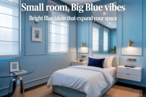
Sky blue — harder than it looks
Sky blue is the shade most people picture when they imagine a blue bedroom, and it’s the one that causes the most disappointment. On a paint chip, a soft sky blue looks serene and airy. On four walls of an actual bedroom, it often reads as cold, flat, or — depending on the exact tone — uncomfortably close to the blue of a hospital room.
The problem is that very light blues have less complexity than deeper shades. They don’t shift as much with the light. They sit on the wall and stay exactly what they are, all day. That consistency, which sounds appealing in theory, can make a room feel static rather than calm.
Sky blue can work — but it works best on a single accent wall rather than all four, in rooms with abundant warm natural light, and paired with very warm materials that prevent the lightness from tipping into coldness. In a child’s bedroom with good light and lots of natural wood, it’s genuinely lovely. In an adult bedroom with standard lighting and mixed materials, it often ends up feeling like the wrong choice within a few months.
Best for: children’s bedrooms, accent walls, rooms with exceptional natural light and deliberately warm styling everywhere else.
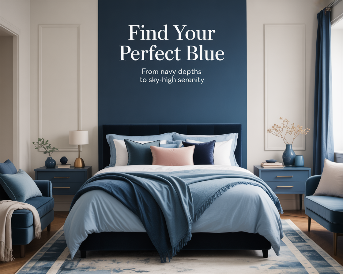
The question to ask before choosing
Before settling on a specific shade, answer one question honestly: what do you want the bedroom to feel like at 10pm on a Tuesday, when you’ve had a long day and you just want the room to receive you?
If the answer is dramatic and immersive — navy. If it’s calm and effortless — dusty blue. If it’s cool and precise — slate. If it’s warm and open — French blue. If it’s reliable and undemanding — steel blue. If it’s light and cheerful — sky, but carefully.
Every shade on this list is the right answer for someone. The wrong approach is choosing based on what looks good in someone else’s bedroom photo. The room in the photo has their light, their furniture, their proportions. You have yours.
Sample the ones that resonate. Live with them for a week. The right shade will reveal itself clearly — not because it looks perfect on the chip, but because it feels right on the wall in the room you actually live in.
That’s the one to paint.