I have rearranged my mantel probably thirty times over the past three years. Not because I keep getting it wrong — I got it reasonably right after the first few attempts — but because a mantel is a living thing. It changes with the seasons, with what I’m drawn to, with what the room needs at any given time. It’s the one surface in my home I actually think about.
The farmhouse mantel specifically is an interesting challenge because farmhouse style has been so thoroughly documented, pinned, and imitated that it’s developed its own visual clichés. The galvanized metal bucket, the three-word wooden sign, the arrangement of faux greenery that looks identical in every house on the street. Those things aren’t wrong exactly — they reference something real about farmhouse aesthetics — but they’ve been reproduced so many times they’ve lost the quality that made them appealing in the first place: the sense that someone chose these things because they meant something, not because they’d seen them somewhere.
The mantels that look genuinely cozy and genuinely farmhouse share one quality: they look like they were assembled by a specific person with specific tastes, not curated from a checklist. Here’s how to get there.
Start with one large anchor piece
Every good mantel has an anchor — one piece that commands the space and around which everything else is organized. Without an anchor, a mantel is just a collection of objects. With one, it’s a composition.
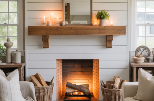
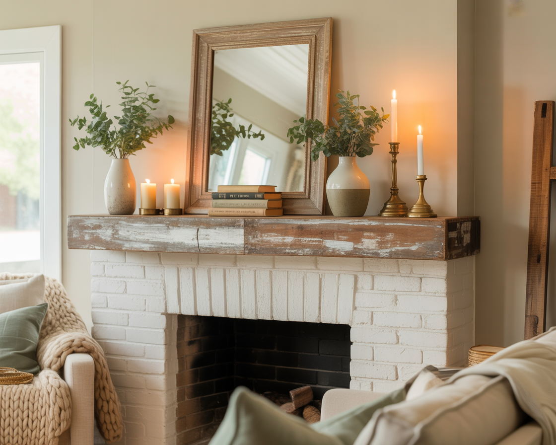
For farmhouse mantels, the anchor is almost always something vertical and substantial. A large mirror is the most reliable choice — it reflects the room, adds perceived depth, bounces firelight in the evening, and provides a neutral backdrop that works with any arrangement around it. The frame should be in keeping with farmhouse sensibility: weathered wood, simple black metal, whitewashed or distressed. Ornate gilded frames belong in a different aesthetic conversation.
A large piece of artwork works as well and adds more personality than a mirror. The challenge is finding something that has the right scale — small artwork on a large mantel looks timid and lost — and the right visual language. Farmhouse mantels respond best to art that references the natural world: botanical prints, landscape paintings, simple typographic prints in muted tones, or abstract work in earthy colors. Bright, graphic, or highly contemporary art creates a tension with the farmhouse elements around it that usually doesn’t resolve well.
A large architectural clock — simple face, substantial case, preferably with some patina — is the third option that works consistently. Clocks have an inherent farmhouse quality, referencing domestic life and the passing of time in a way that feels genuine rather than decorative. A clock that’s too small looks like an accessory. One that fills most of the wall space above the mantel becomes the room’s focal point.
Build height variation on either side
Once the anchor is in place, the objects on either side of it need to create variation in height. A mantel where every object is the same height looks like a lineup rather than a composition. The eye needs somewhere to travel — up, across, down, back — to feel engaged rather than bored.
The general principle: place the tallest objects toward the outer edges of the mantel and shorter objects toward the center, or cluster objects in groupings of unequal height rather than spreading them evenly across the shelf. Either approach creates the visual rhythm that makes a mantel look intentional.
For farmhouse mantels specifically, the tallest element on each side is often a lantern — the kind with a metal frame and glass panels, either battery-operated or with a real candle inside. Lanterns have genuine farmhouse credentials (they’re functional objects from working farm life) and they provide height without visual weight. A lantern that’s 18 to 24 inches tall on each side of a large mirror creates a composition that feels complete and balanced without being symmetrical in an obvious, forced way.
Tall candlesticks in varying heights serve the same function at lower cost. Three candlesticks — say, 18 inches, 14 inches, and 10 inches — grouped together on one side of the mantel, all holding cream or white tapers, is a farmhouse mantel staple that never goes wrong. The varying heights create movement. The candles, when lit, create warmth that no battery-operated substitute replicates.
Texture over color
Farmhouse mantel decor works best when the palette is restrained and the interest comes from texture rather than color. This is the opposite of the instinct most people follow — reaching for objects in different colors to create visual interest — and it produces results that are significantly more cohesive and elegant.
A mantel in cream, white, warm wood, and aged metal — all neutral in color but varied in texture — looks more sophisticated than the same mantel with objects in five different colors, regardless of how individually attractive each colored piece is. The neutral palette allows the textures to be read clearly: rough wood against smooth ceramic, matte linen against reflective glass, aged patina against fresh white paint. Those contrasts are what create visual richness on a farmhouse mantel.
The colors that do appear should be muted and natural. Dried botanicals in their natural tones — wheat, lavender, eucalyptus, cotton stems — bring color that feels organic rather than decorative. A small potted plant in a terracotta or ceramic pot adds living green. A worn leather book spine, a beeswax candle in amber, a rusted metal object — these colors feel found rather than chosen, which is the quality that distinguishes genuine farmhouse decor from the manufactured version.
The objects that consistently work
Certain objects appear repeatedly on well-executed farmhouse mantels because they work — they have the right visual weight, the right material references, the right relationship to the farmhouse aesthetic without being its clichés.
Wooden objects with history are the foundation. A reclaimed wood box, a dough bowl, a wooden tray used to corral smaller objects — these pieces carry the weight and patina that gives a farmhouse mantel its sense of time. New wood objects that look new feel incongruous. Old wood objects or convincingly aged new ones feel right.
Ceramic and stoneware in simple forms — a handled jug, a round vase with a matte glaze, a simple bowl — are the most versatile objects on a farmhouse mantel. They provide visual weight without visual noise. A single cream ceramic jug holding dried eucalyptus stems is more effective than a cluster of small decorative objects trying to achieve the same presence through quantity.
Books, stacked horizontally with their spines facing the room or with their pages facing out for a neutral look, are underused on farmhouse mantels. A stack of three or four books in warm, neutral tones — linen covers, worn leather, natural cloth — creates a base that raises other objects and adds an immediately domestic, lived-in quality that purely decorative objects can’t replicate.
Botanicals in their natural state — not artificial, not dyed, not arranged into a formal form — bring a quality of imperfection that’s central to farmhouse style. Dried wheat stalks in a crockery jug. A bundle of dried lavender tied with linen twine. Cotton stems in a simple vase. Eucalyptus that’s starting to dry and curl at the edges. These things look like they were brought in from outside rather than bought from a store, which is exactly the right impression.
Seasonal rotation — the practice that keeps it feeling real
A farmhouse mantel that never changes starts to look like a display within about six weeks. The eye habituates and stops registering it. The objects that felt carefully chosen start to feel like furniture — present but unnoticed.
Rotating the mantel seasonally — not dramatically, not expensively, just meaningfully — is what keeps it feeling alive. In autumn: dried gourds, wheat stalks, amber candles, a wreath of dried leaves leaning against the mirror. In winter: evergreen branches, white candles, simple pinecones, whatever feels genuinely seasonal rather than holiday-commercial. In spring: fresh eucalyptus, lighter ceramics, the feeling of something beginning. In summer: fewer objects, more negative space, something that acknowledges the heat outside.
The rotation doesn’t require buying new things each season. It requires moving things in and out of the mantel from elsewhere in the house — the bedroom, a shelf, storage — and replacing a few key pieces with something that feels current to the time of year. The mantel becomes a kind of calendar. People notice when it changes without always being able to say what changed. The room feels attended to.
The negative space rule
This is the one rule most people violate and the one that makes the most difference. A farmhouse mantel needs empty space — deliberate, intentional gaps between objects where the eye can rest before moving to the next thing.
The impulse to fill every inch of a mantel shelf is strong, especially after you’ve invested in objects you love. But a crowded mantel loses the individual presence of each object — they start to blur into a collection and stop reading as chosen things. An object with space around it is seen. An object in a crowd is part of a crowd.
A good test: look at your mantel and identify the single most beautiful or meaningful object on it. Now ask whether that object has enough space around it to be seen on its own. If it doesn’t — if it’s surrounded by other objects that compete for attention — it’s being wasted. Give it room. Remove something. The mantel that looks spare in person looks composed in a photograph and feels right to be near.
Asymmetry as a design tool
Perfectly symmetrical mantels — identical objects mirrored on each side of a central anchor — look deliberate in a way that works against the farmhouse aesthetic. Farmhouse style is about the feeling of things collected over time, not arranged in one sitting. Perfect symmetry announces itself as design. Considered asymmetry reads as life.
This doesn’t mean random placement. It means intentional imbalance — a taller grouping on the left, a single substantial object on the right; more objects on one side, more negative space on the other; the anchor positioned slightly off-center rather than exactly in the middle. These small departures from strict symmetry make the mantel feel like it evolved rather than was installed.
The test for whether asymmetry is working: stand across the room and squint at the mantel. It should feel balanced at a distance — visually weighted roughly evenly from side to side — even if it isn’t strictly symmetrical. Visual balance and geometric symmetry are different things. A tall lamp on one side and a cluster of three shorter objects on the other can feel balanced even though they’re obviously not identical. That balance, achieved without matching, is the hallmark of a mantel that looks genuinely designed.
What thirty iterations taught me
The mantel arrangements I’ve liked longest — the ones that stayed for months without feeling stale — share three qualities. One substantial anchor that commands the space. Objects grouped rather than spread, with variation in height within each group. Enough negative space that each object is seen individually rather than as part of a crowd.
The arrangements I’ve changed within a week violated at least one of those. Usually it was overcrowding — too many objects I loved trying to coexist in too little space, each one diminishing the others. Editing is the hardest part of mantel styling and the most important. The objects that come off the mantel don’t disappear — they go to a shelf, a side table, a bedroom. They still exist in the home. They just stop competing.
The farmhouse mantel that looks most effortlessly right is the one that looks like you thought about it once, put the things you love on it, and then stopped thinking about it. Getting to that effortlessness takes more thought than it appears. But once you’re there — once the anchor is right and the height variation is right and the negative space is right — the mantel takes care of the room every day without requiring anything further.
That’s the goal. A focal point that works so well you forget it’s working.