Introduction
Choosing the perfect Interior Paint Palette can transform your living space from ordinary to extraordinary. Whether you’re renovating your entire home or simply refreshing a single room, the right color combinations set the mood and define your personal style. This comprehensive guide explores 17 current paint palette creations that will inspire your next design project. From calming neutrals to bold contemporary schemes, discover interior wall color ideas that reflect today’s most sought-after trends.
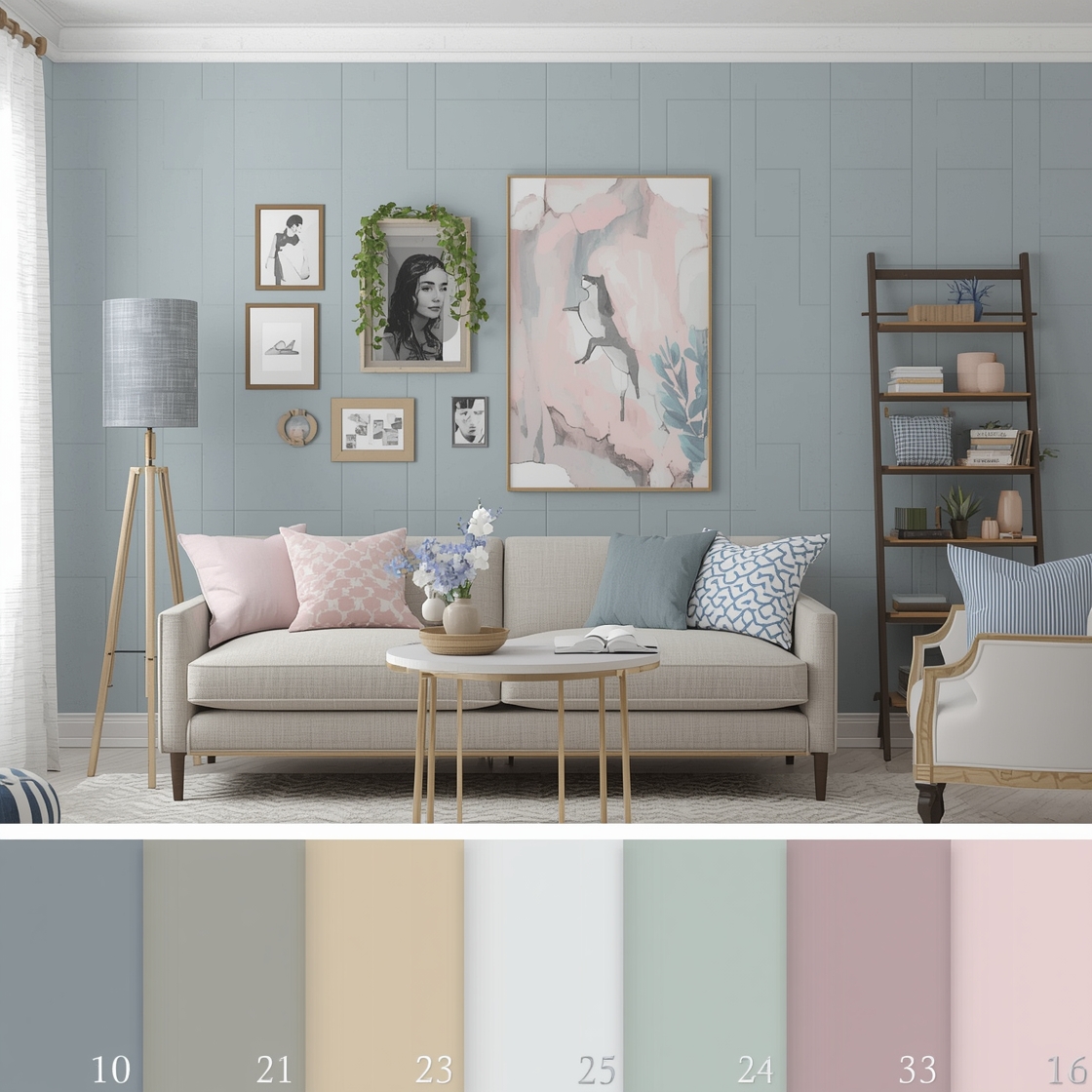
Interior Paint Palette Creation Boards
Creating cohesive color schemes starts with understanding how different hues interact within your space. An Interior Paint Palette board helps you visualize how wall colors, trim, and accent shades work together before you commit to painting. Digital mood boards allow you to experiment with various combinations, layering paint swatches with furniture fabrics and flooring samples. This planning method saves time and money while ensuring your final selections create the harmonious atmosphere you envision. Consider photographing your room at different times of day to see how natural light affects your chosen colors.
Paint Colors for North-Facing Rooms
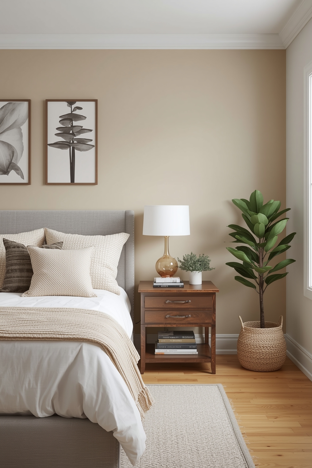
North-facing rooms receive cooler, indirect light throughout the day, making color selection particularly important. The best Interior Paint Palette choices for these spaces include warm neutrals like creamy beiges, soft taupes, and gentle yellows that counterbalance the bluish light. Avoid pure white or cool grays in north-facing rooms, as they can appear stark and unwelcoming. Instead, opt for warmer undertones that add coziness and depth. Benjamin Moore’s “Manchester Tan” or Sherwin-Williams’ “Accessible Beige” are excellent starting points for creating inviting north-facing interiors.
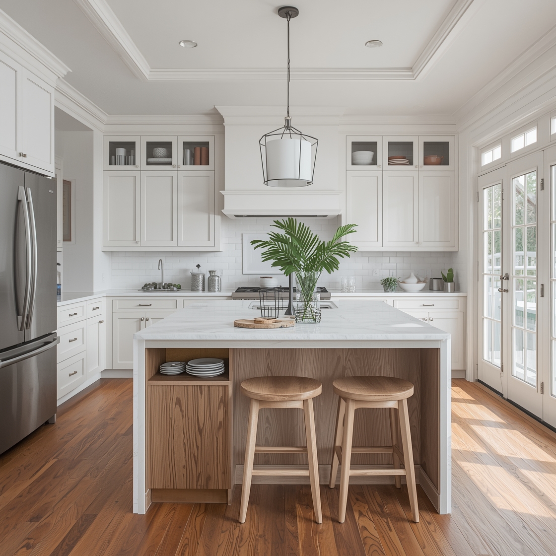
Modern Room Color Trend Galleries
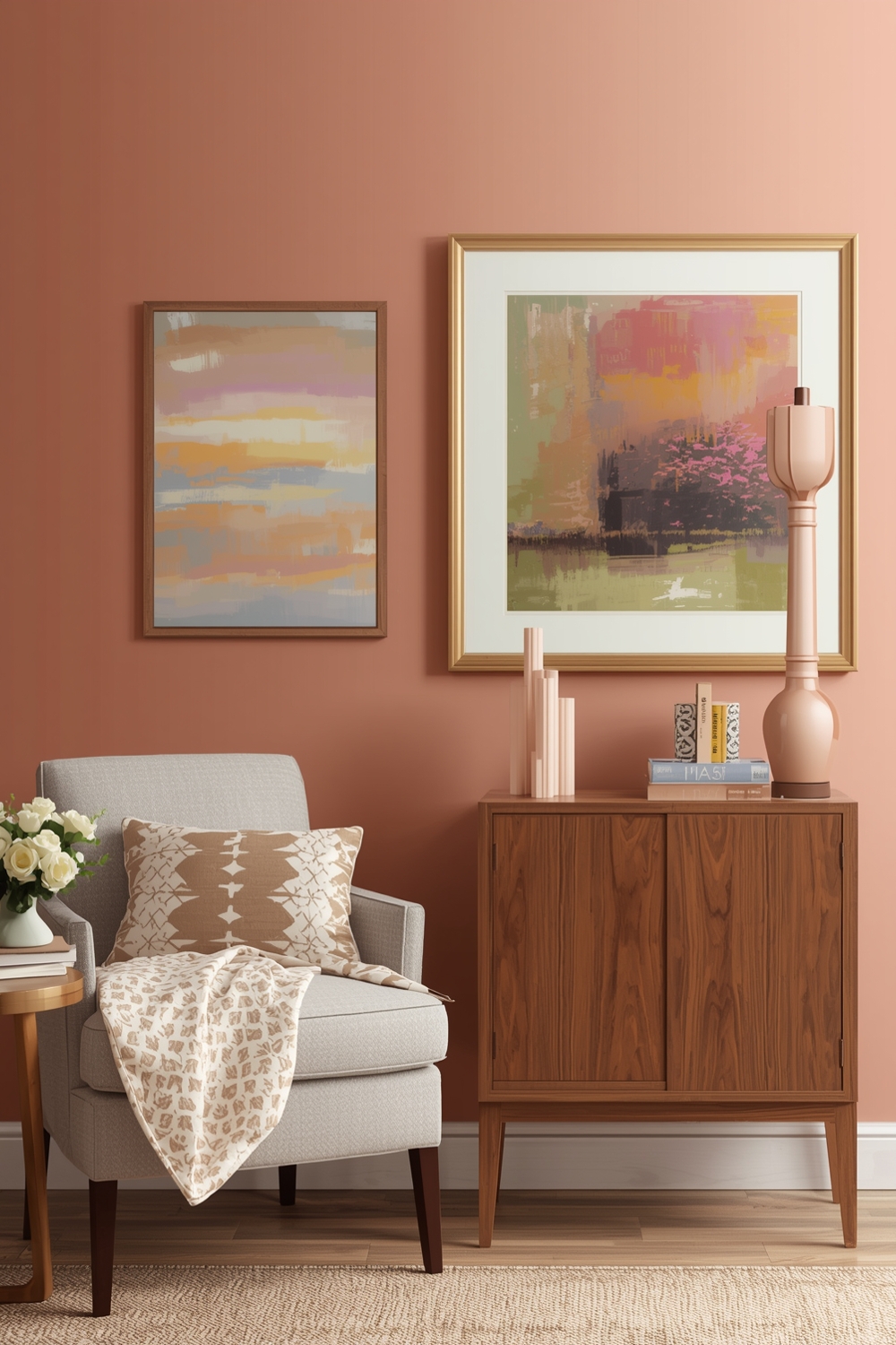
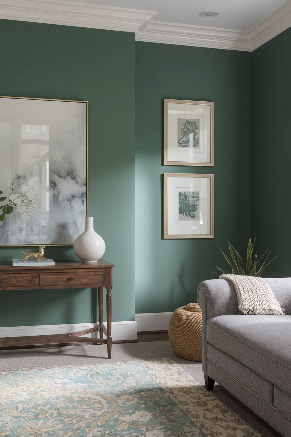
Contemporary design embraces both minimalist neutrals and unexpected color pops. Modern interior wall color ideas feature sophisticated combinations like charcoal gray with brass accents, sage green paired with terracotta, or navy blue complemented by warm wood tones. Trending palettes incorporate nature-inspired hues that bring the outdoors inside. Earthy terracottas, forest greens, and clay browns dominate modern galleries, often paired with crisp whites to maintain visual balance and prevent overwhelming smaller spaces.
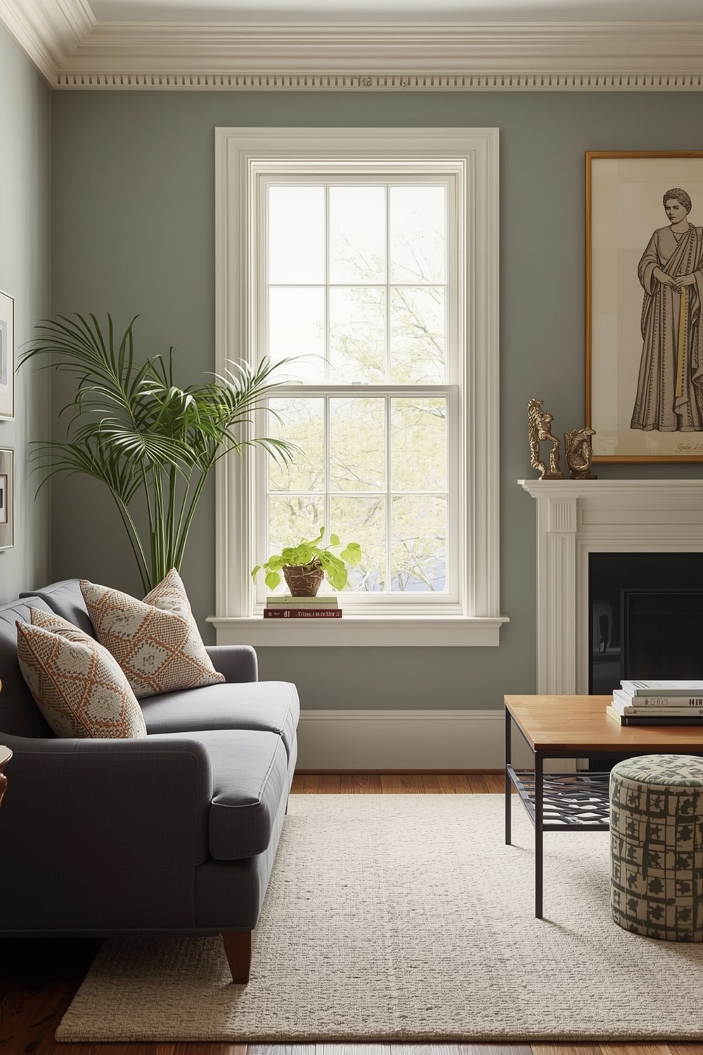
Neutral and Refined Paint Inspirations
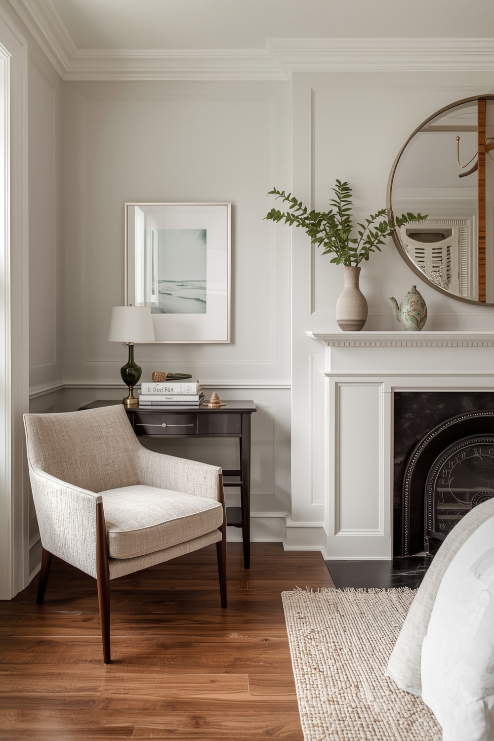
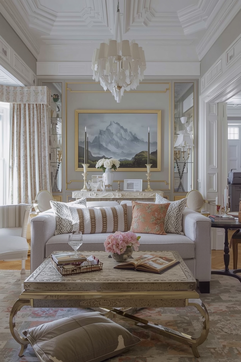
Neutral palettes remain timeless for good reason—they provide versatility and longevity. A refined Interior Paint Palette built on neutrals includes layers of beige, gray, cream, and taupe that create sophisticated depth without overwhelming the senses. The key to successful neutral schemes lies in varying undertones and finishes. Pair warm grays with cooler beiges, or combine matte walls with satin trim. This subtle variation prevents monotony while maintaining the calming, elegant atmosphere that makes neutral palettes perpetually popular.
Current Interior Color Themes
Today’s color themes reflect our collective desire for comfort and connection to nature. Current Interior Paint Palette trends include biophilic designs featuring botanical greens, desert-inspired palettes with warm sands and burnt oranges, and coastal schemes combining soft blues with weathered whites. Wellness-focused themes also dominate, with calming lavenders, soothing blues, and grounding earth tones taking center stage. These palettes promote relaxation and mental wellbeing, transforming homes into personal sanctuaries. Color psychology plays an increasingly important role in how we select our interior hues.
Vibrant and Contemporary Room Color Schemes
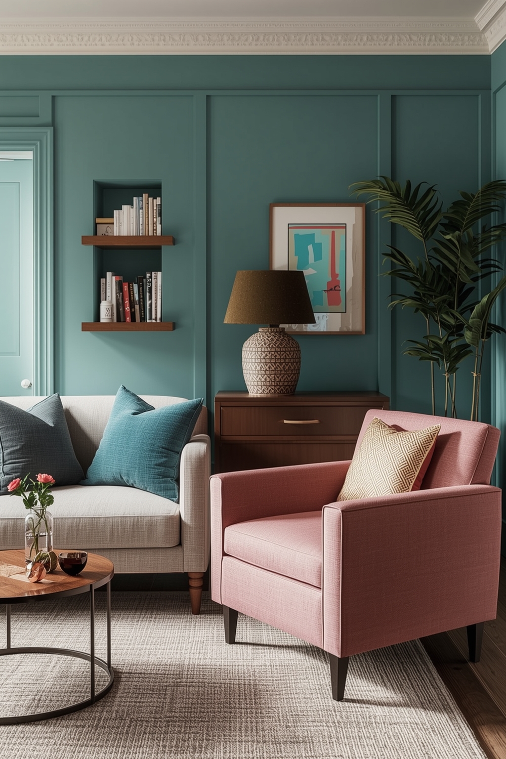
For those who embrace bold design, vibrant color schemes make powerful statements. Contemporary interior wall color ideas pair jewel tones like emerald green or sapphire blue with metallic accents for luxurious impact. The secret to successful vibrant palettes is balance—use intense colors strategically on accent walls or smaller spaces while anchoring them with neutrals elsewhere. This approach prevents visual fatigue while showcasing your personality and creating memorable, energizing environments.
Essential Room Paint Layout Ideas
Strategic paint layouts maximize architectural features and correct spatial challenges. An effective Interior Paint Palette layout considers which walls to highlight, where to place darker shades, and how color flow affects room transitions. Painting ceilings in lighter shades than walls creates the illusion of height, while darker ceilings add intimacy to large spaces. Horizontal color blocking can make rooms appear wider, and vertical stripes draw the eye upward, making low ceilings seem taller.
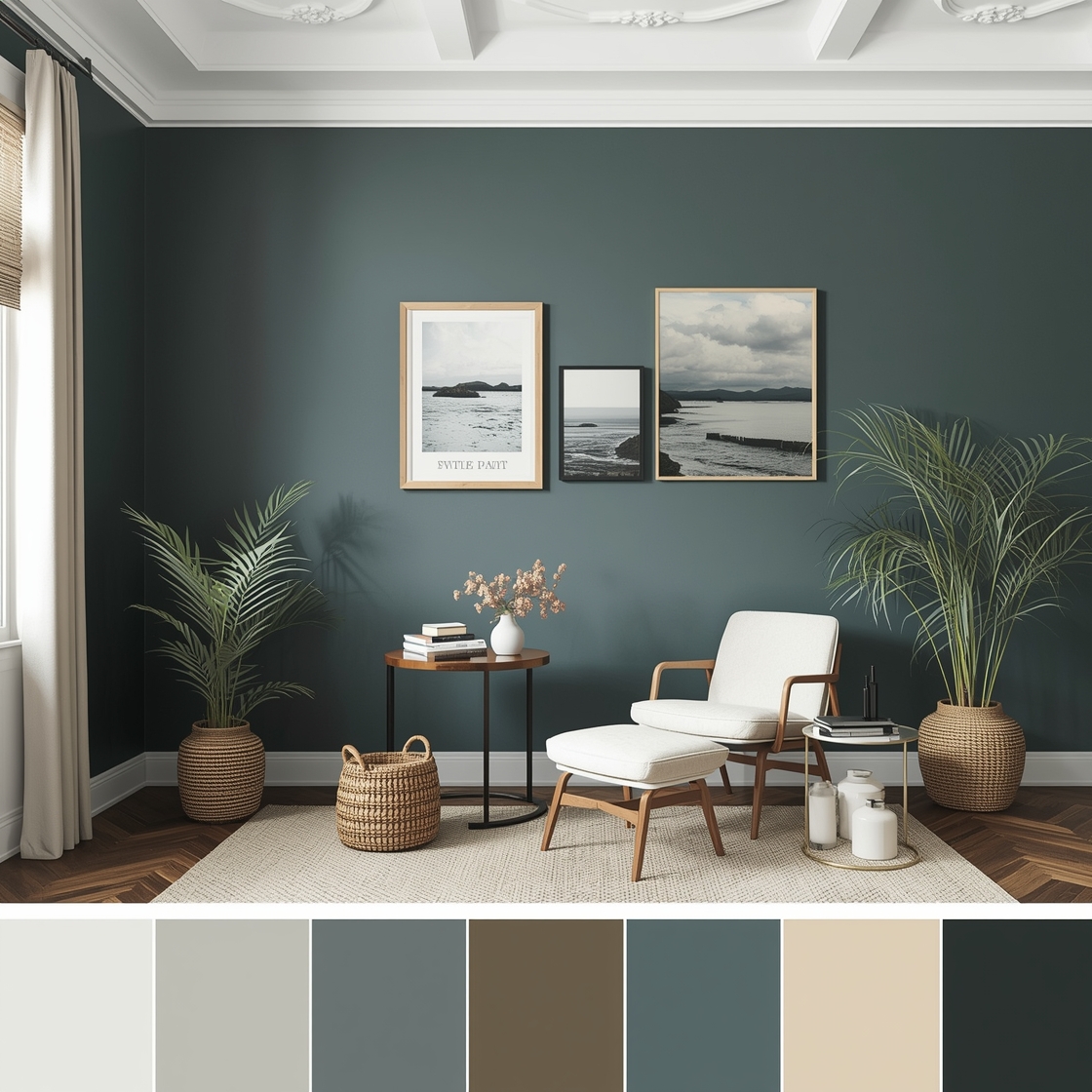
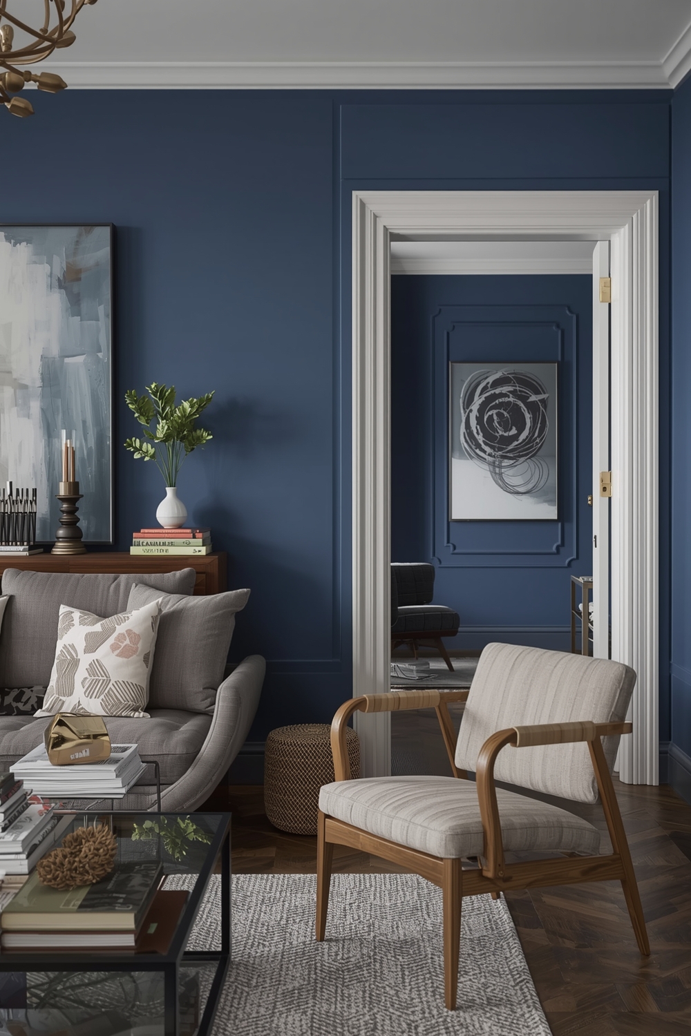
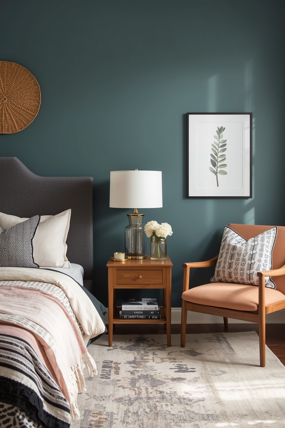
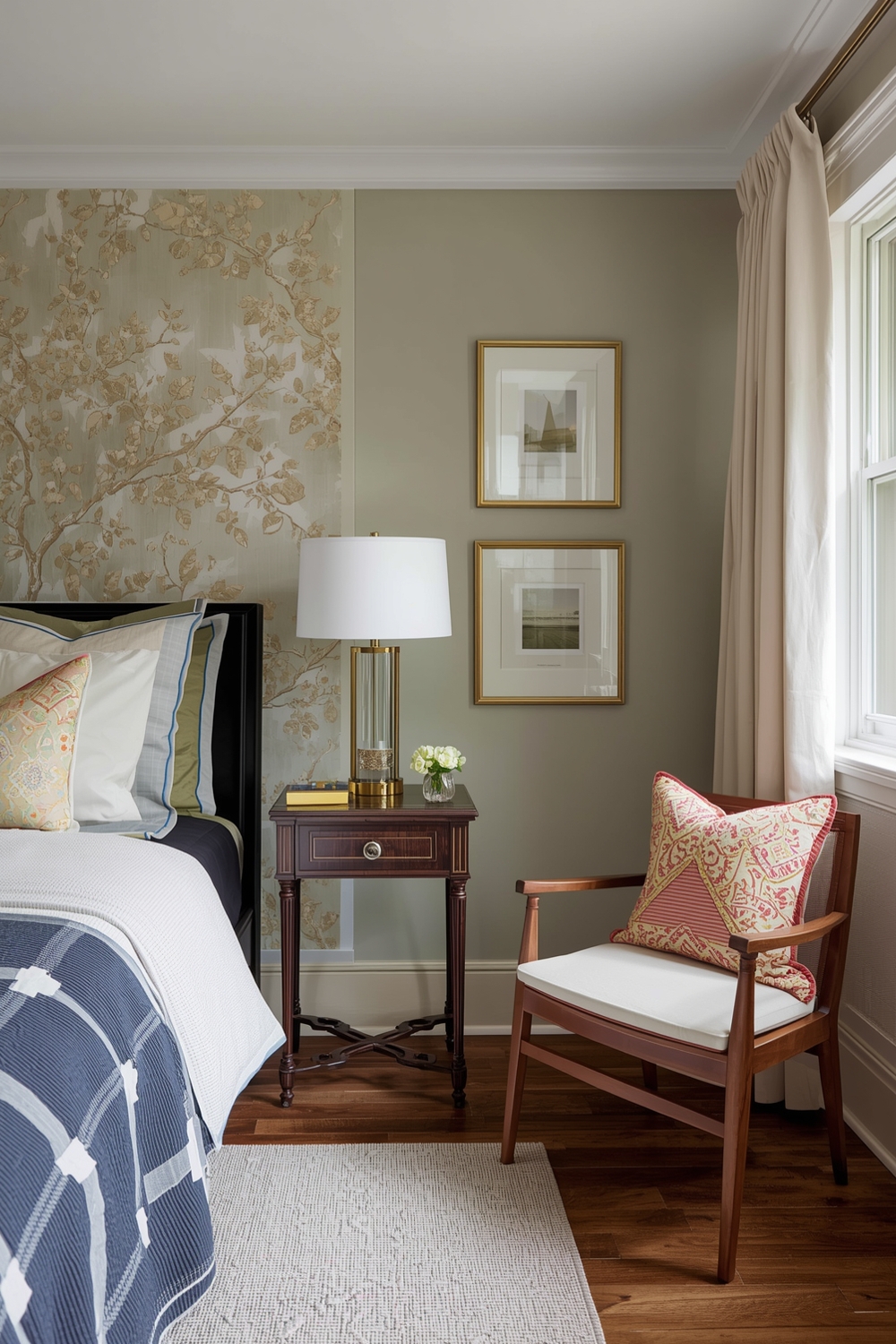
Room Paint Ideas with Dramatic Accent Walls
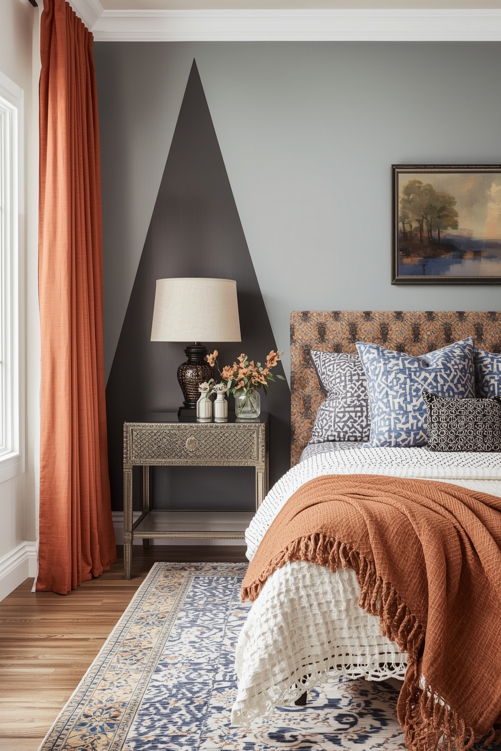
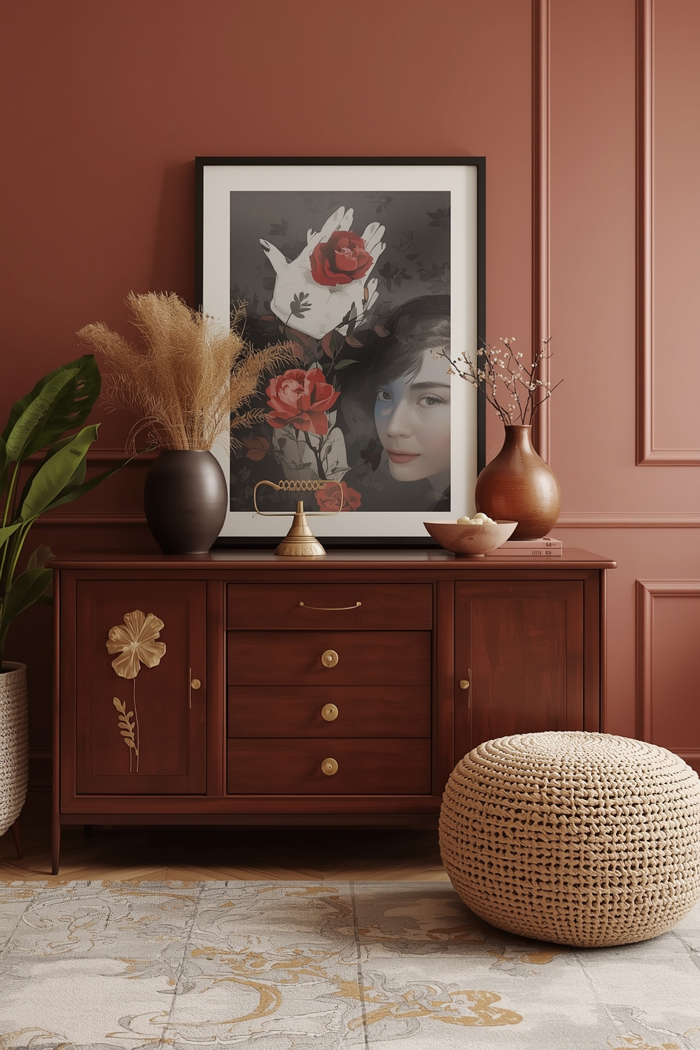
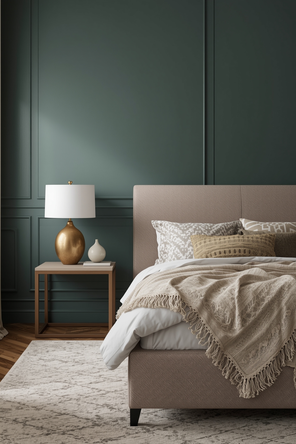
Accent walls serve as focal points that add personality without overwhelming entire rooms. When planning your Interior Paint Palette, consider which wall naturally draws attention—typically the one behind the bed in bedrooms or the fireplace wall in living rooms. Deep jewel tones, bold patterns, or textured finishes work beautifully for accent walls. Navy, forest green, or charcoal gray create drama while remaining sophisticated. Alternatively, warm terracotta or rich burgundy add coziness to dining areas or home offices, establishing distinct zones within open floor plans.
Open Space Interior Paint Harmonizations
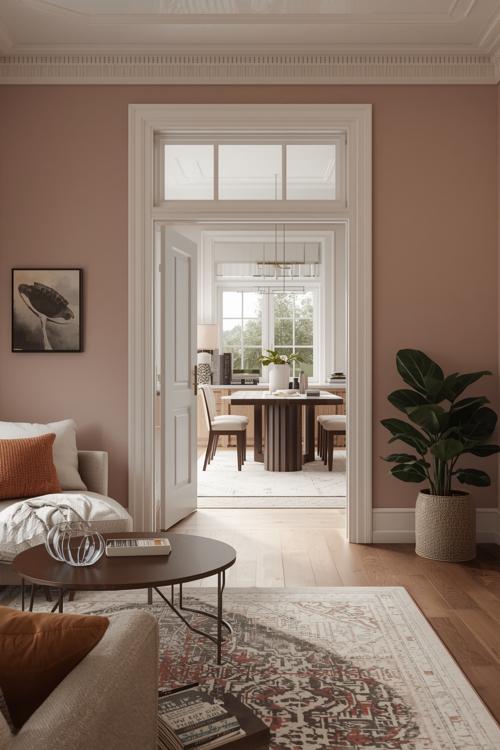
Open-concept living requires careful color coordination to define separate functional areas while maintaining visual flow. Your interior wall color ideas should create distinction without disruption, using complementary shades from the same color family. Consider the 60-30-10 rule: 60% dominant color, 30% secondary color, and 10% accent shade. This formula ensures balance throughout open spaces while allowing each zone to maintain its unique character and purpose.
Functional Room Paint Palette Strategies
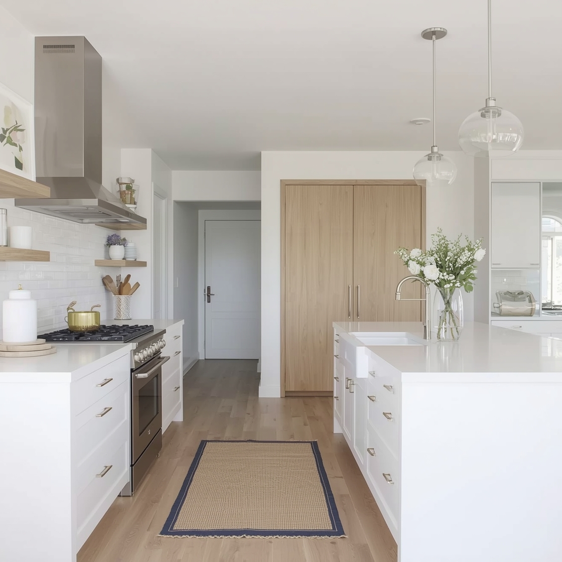
Different rooms serve different purposes, requiring thoughtful color selection. Kitchen Interior Paint Palette choices often include energizing yet clean hues like soft yellow or crisp white, while bedrooms benefit from calming blues or soothing greens. Home offices perform best with focus-enhancing colors like soft gray or sage green. Bathrooms shine with spa-like palettes featuring aquas, pale blues, or fresh whites that promote cleanliness and relaxation throughout your daily routines.
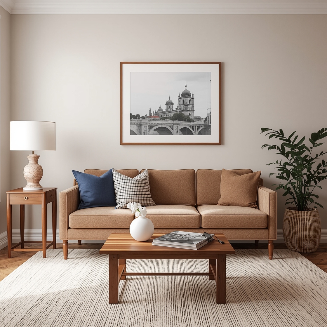
Warm and Cool Tone Paint Pairings
Understanding color temperature helps create balanced, appealing spaces. Successful Interior Paint Palette designs often combine warm and cool tones to prevent rooms from feeling too sterile or too heavy. Pair warm beiges with cool grays, or balance golden yellows with crisp blues. This temperature contrast adds depth and interest while maintaining overall harmony. Consider your room’s natural light and existing furnishings when determining which temperature should dominate your palette.
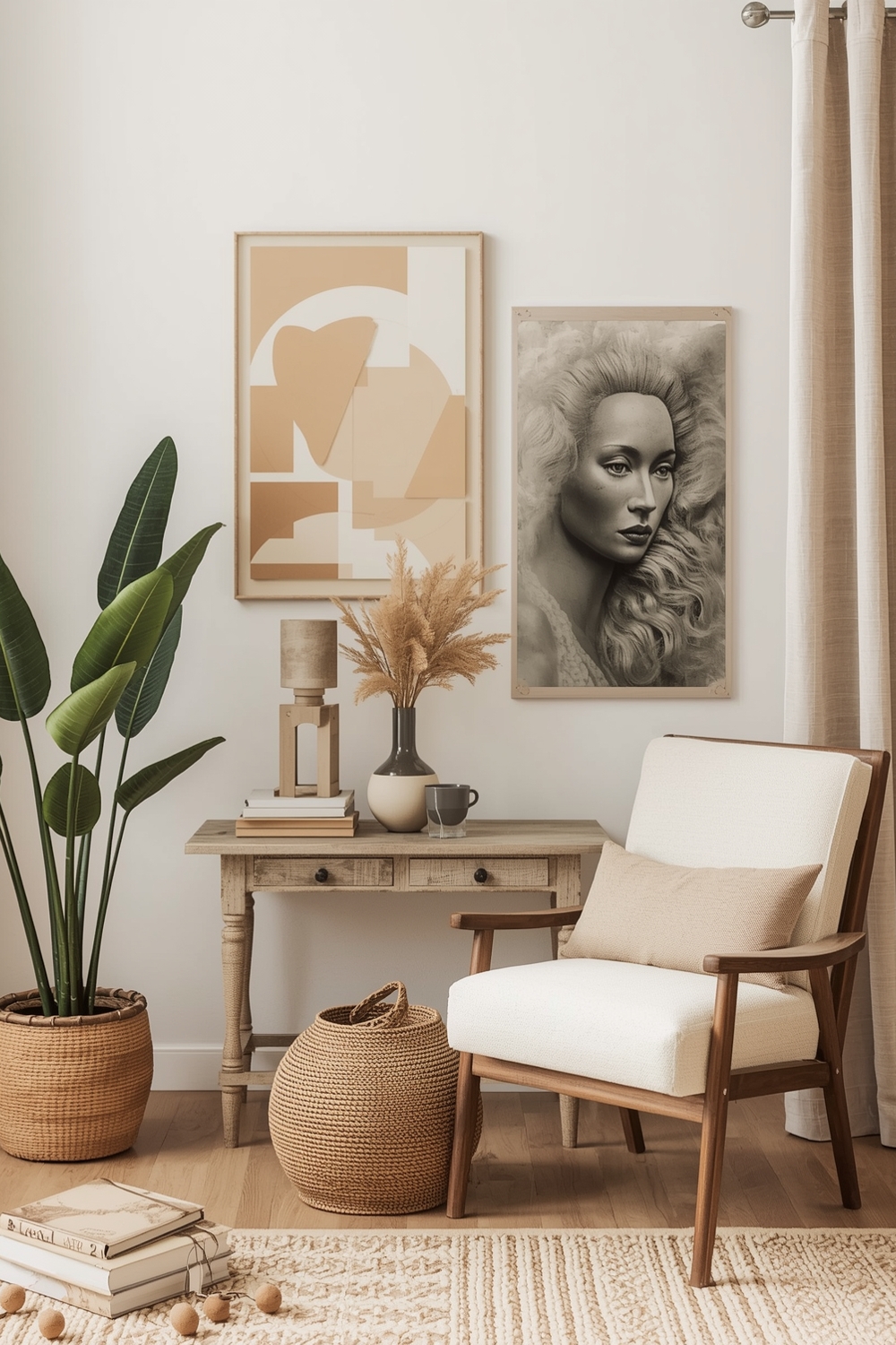
Fashionable Interior Paint Idea Galleries
Design-forward spaces showcase current color trends while maintaining practical livability. Fashionable interior wall color ideas currently feature dusty pinks paired with olive greens, warm neutrals combined with black accents, and monochromatic schemes using varying shades of a single color. Instagram and Pinterest galleries provide endless inspiration, showing how real homeowners implement trending palettes in their spaces. Study these examples to understand how lighting, furniture placement, and accessory choices complement paint selections for cohesive, magazine-worthy results.
Room Paint Ideas for City Apartments
Urban dwellings often feature limited natural light and compact dimensions. The best Interior Paint Palette choices for city apartments include light-reflective colors that maximize available brightness while creating the illusion of spaciousness. Soft whites, pale grays, and light beiges work beautifully in small urban spaces. Add depth through textured finishes or strategic accent walls rather than dark colors that might make tight quarters feel claustrophobic. Glossy or semi-gloss finishes bounce light effectively in windowless hallways or bathrooms.
Enduring Interior Paint Color Assemblies
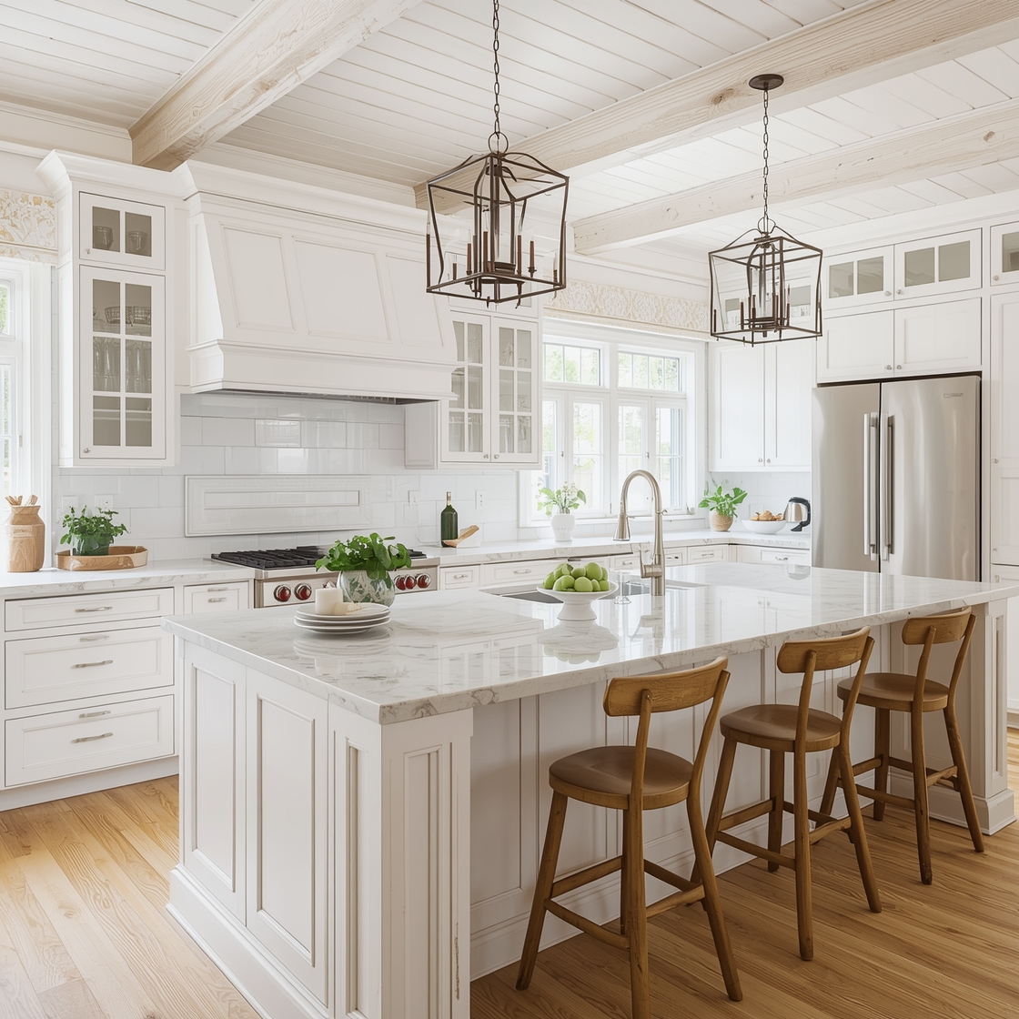
Timeless palettes transcend fleeting trends, ensuring your investment remains stylish for years. Classic Interior Paint Palette assemblies include variations of white with gray undertones, warm greige throughout main living areas, and crisp white trim that frames any wall color choice. These enduring combinations adapt easily to changing décor preferences and life stages. You can update accessories, artwork, and furniture without repainting, making timeless palettes both practical and cost-effective for homeowners who value longevity in their design decisions.
Bedroom and Den Paint Idea Boards
Private spaces allow for more personal color expression. Bedroom interior wall color ideas should promote rest and relaxation, featuring soft blues, gentle greens, or muted lavenders that calm the nervous system and encourage quality sleep. Dens and libraries benefit from cocoon-like atmospheres created by deeper, richer hues like chocolate brown, forest green, or midnight blue. These intimate spaces feel luxurious and inviting, perfect for reading, conversation, or quiet contemplation away from the household’s main activity areas.
How This Idea Improves Your Space
Implementing a cohesive paint palette dramatically enhances your home’s aesthetic appeal and market value. Professional-looking color coordination creates flow between rooms, making your home feel larger and more thoughtfully designed. Beyond aesthetics, the right colors impact mood and productivity. Calming palettes reduce stress, while energizing hues boost creativity and motivation. Strategic color choices also highlight architectural features and disguise imperfections, maximizing your space’s potential.
Budget-Friendly Tips
Sample paint before purchasing full gallons—test colors on multiple walls to see how light affects them throughout the day. Focus your budget on high-traffic areas and use leftover paint for closets or utility spaces. Shop seasonal sales for quality brands at reduced prices, and consider one-coat coverage formulas that save time and money.
Conclusion
Creating the perfect paint palette transforms your house into a personalized home that reflects your style and enhances daily living. From timeless neutrals to bold contemporary schemes, these 17 current interior paint palette creations offer inspiration for every design preference and budget. Start planning your transformation today and watch your space come alive with carefully chosen colors.
FAQs
Q: How many colors should an interior paint palette include? A: A cohesive palette typically includes 3-5 colors: one dominant neutral, one or two supporting colors, and one or two accent shades for visual interest. Q: Should all rooms in my home use the same paint palette? A: While maintaining a general color story creates flow, rooms can feature palette variations suited to their specific functions and lighting conditions. Q: How do I choose between warm and cool paint tones? A: Consider your room’s natural light, existing furnishings, and desired atmosphere—warm tones feel cozy while cool tones appear more spacious and calming. Q: What’s the best way to transition colors between connected rooms? A: Use varying shades from the same color family or maintain consistent trim color throughout to create smooth visual transitions. Q: How often should I update my interior paint palette? A: Quality paint lasts 5-10 years, though you may want to refresh trendy colors sooner or maintain classic palettes longer depending on personal preference.