Introduction
Choosing the perfect Interior Paint Palette can transform your living space from ordinary to extraordinary. Whether you’re planning a complete home makeover or simply refreshing a single room, the right color combinations set the mood and define your personal style. From calming neutrals to bold statement hues, selecting interior wall color ideas requires thoughtful consideration of lighting, furniture, and your lifestyle needs. This comprehensive guide explores fifteen striking paint palette selections that will inspire your next decorating project and help you create spaces that truly feel like home.
Interior Paint Color Palette Selections
When embarking on your painting journey, understanding the fundamentals of an Interior Paint Palette makes all the difference. A well-curated palette typically includes three to five complementary colors that work harmoniously throughout your space. Consider your primary wall color as the foundation, then layer in accent shades through trim, doors, and architectural features. The beauty of interior wall color ideas lies in their versatility—you can create dramatic contrast or subtle sophistication depending on your selections. Start by identifying the undertones in your existing furnishings and flooring. Cool undertones pair beautifully with grays, blues, and greens, while warm undertones complement beiges, taupes, and earth tones perfectly.
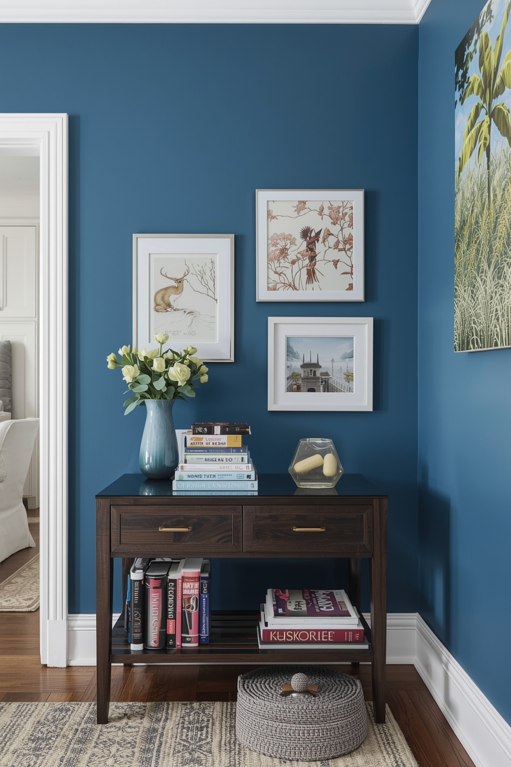
Modern Accent Wall Paint Colors
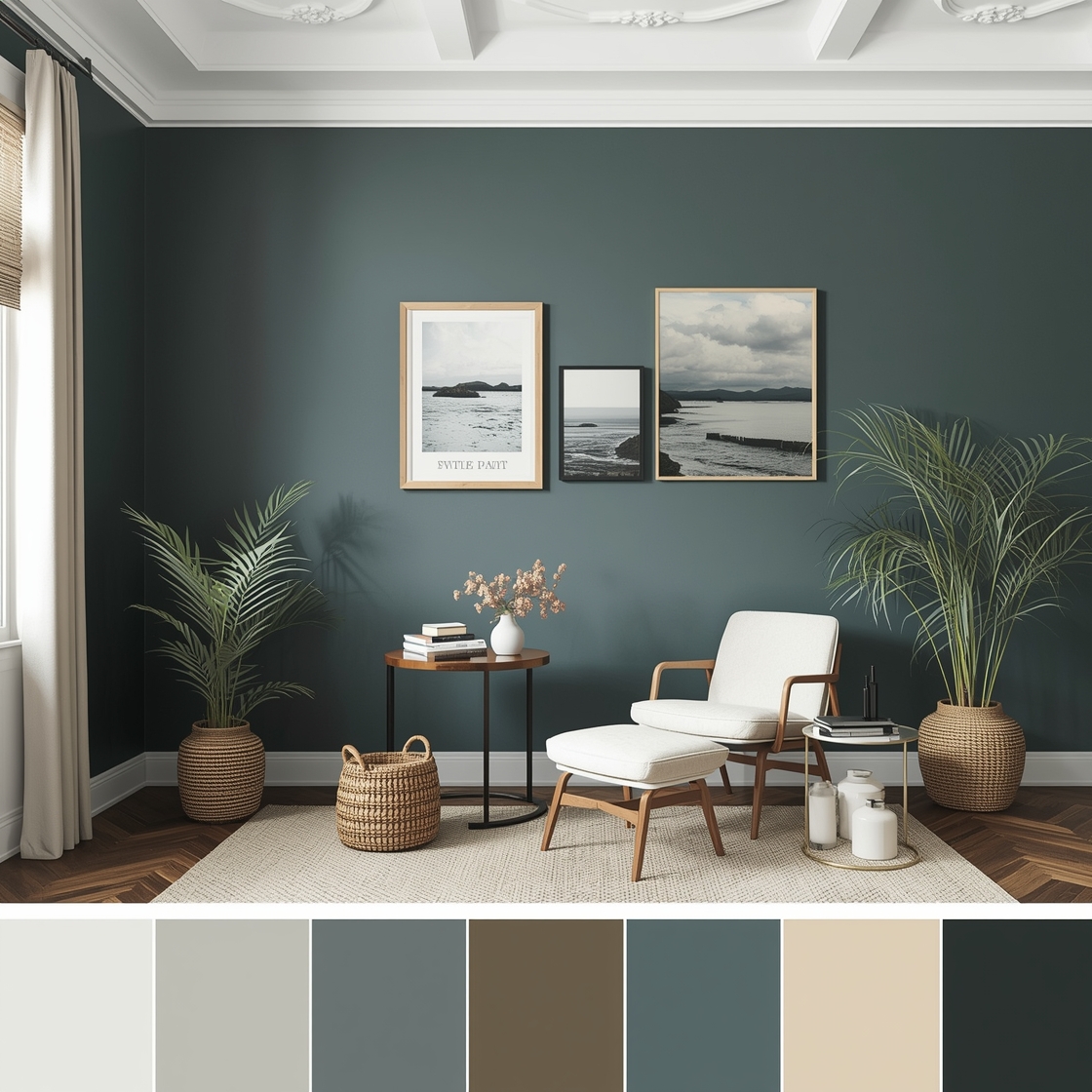
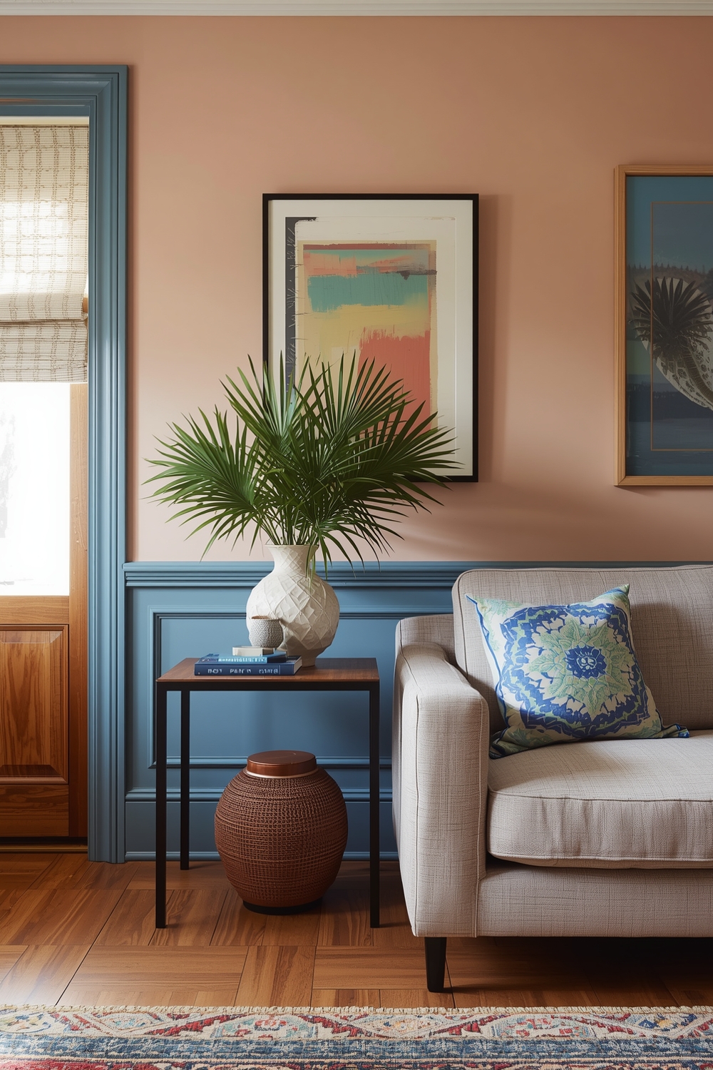
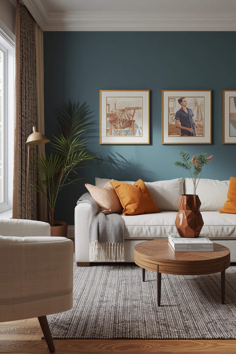
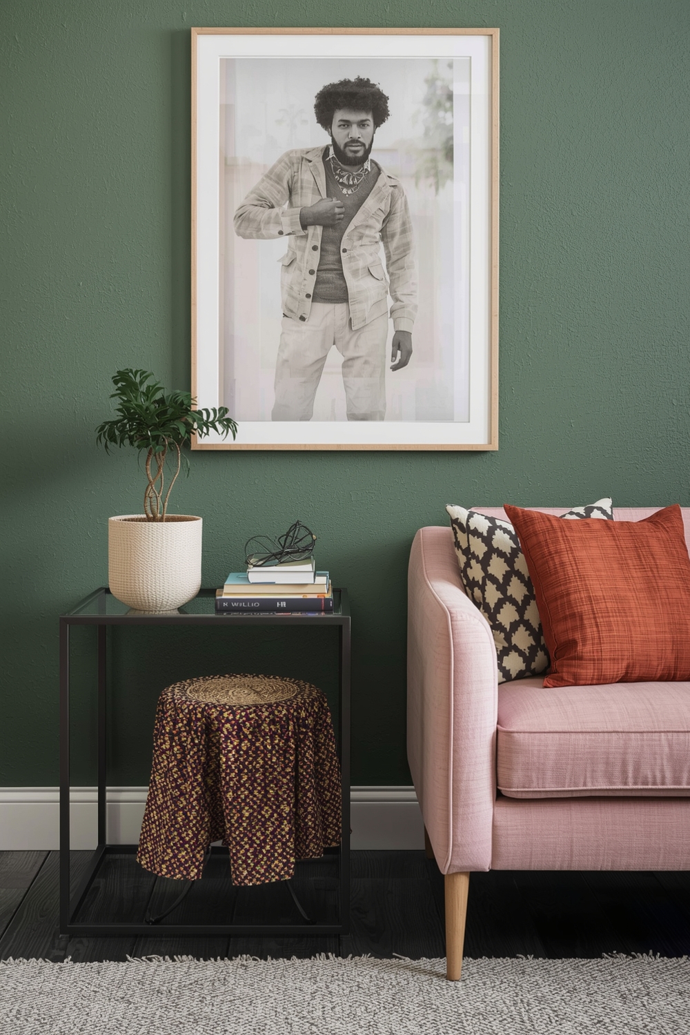
Modern accent walls have revolutionized how we approach interior design, offering a bold way to incorporate eye-catching hues without overwhelming a room. An effective Interior Paint Palette for accent walls includes deep jewel tones like emerald green, sapphire blue, or rich burgundy. These striking colors create focal points that draw the eye and add architectural interest to otherwise plain spaces. Popular modern choices include charcoal gray, navy blue, and warm terracotta, each bringing distinct personality to your rooms. When selecting accent wall colors, consider the natural light exposure and the mood you want to establish. North-facing rooms benefit from warm accent colors, while south-facing spaces can handle cooler, more dramatic shades.
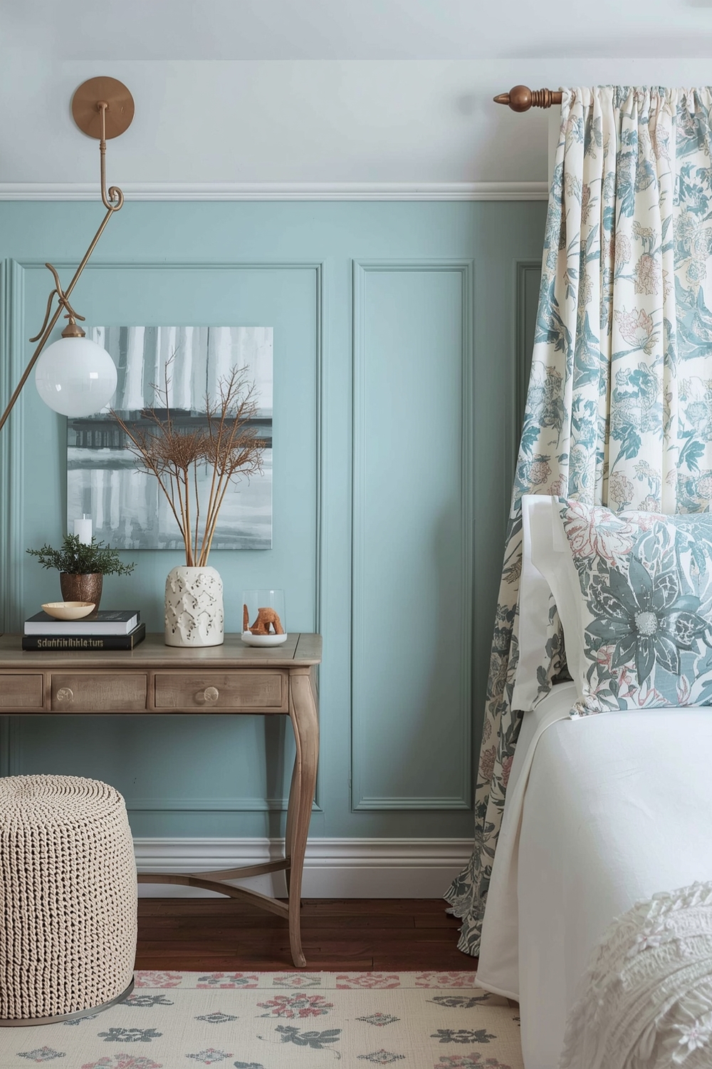
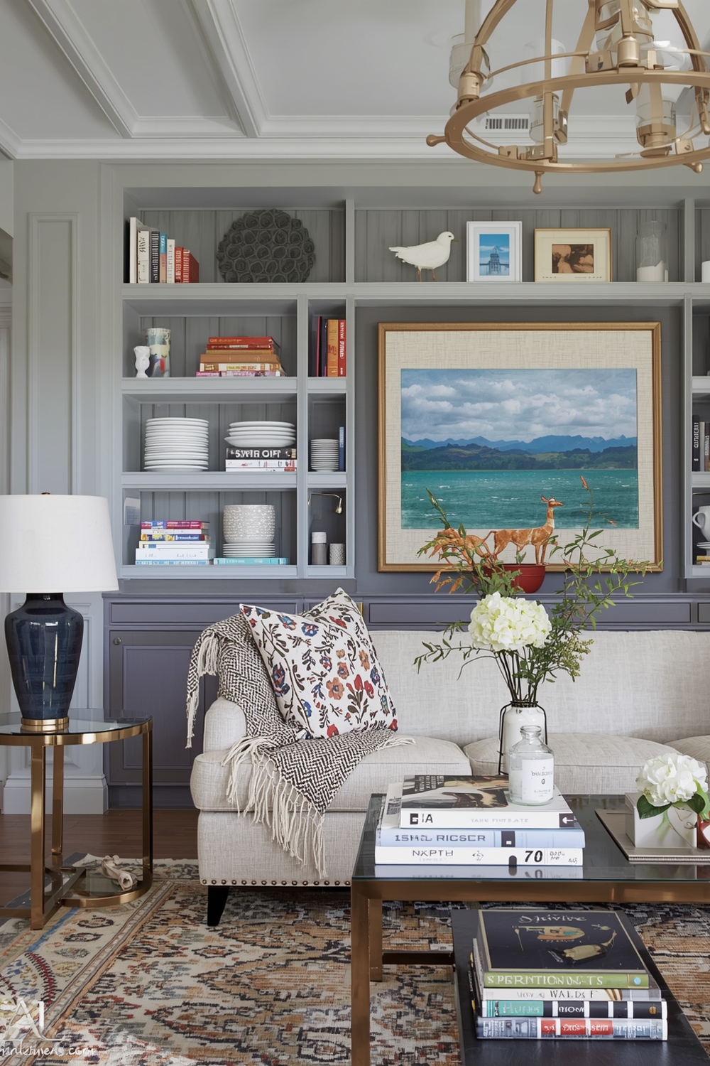
Serene and Neutral Paint Palettes
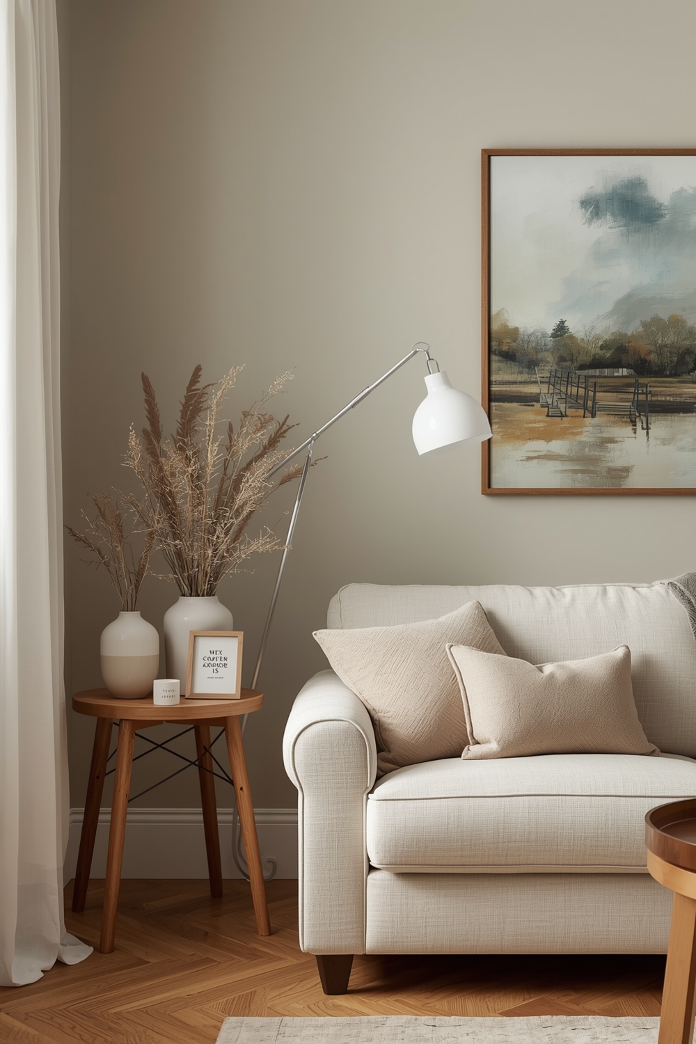
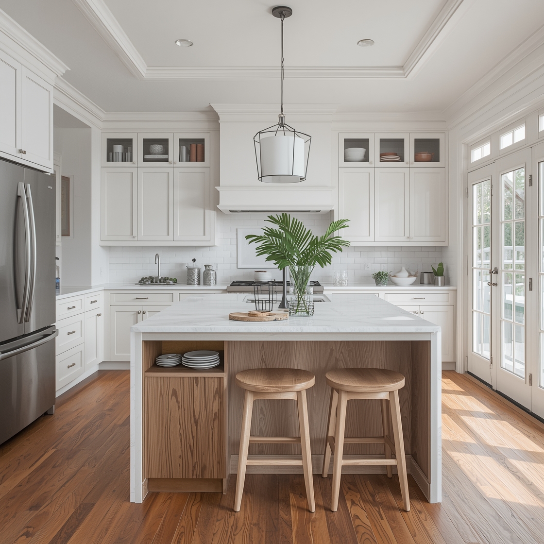
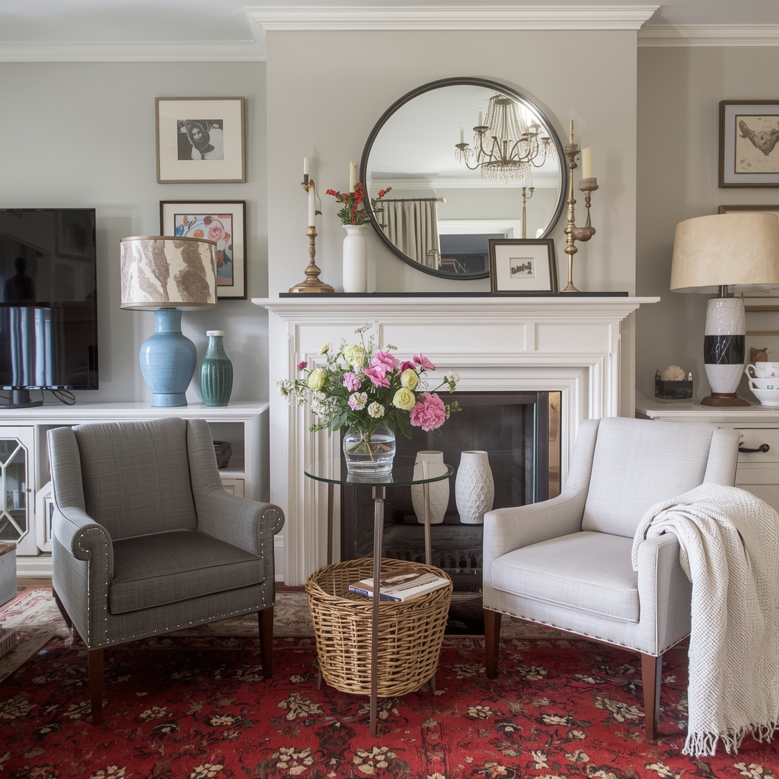
Neutral palettes remain timeless favorites for homeowners seeking tranquility and versatility. Soft whites, warm beiges, gentle grays, and subtle taupes form the backbone of serene interior wall color ideas that never go out of style. These understated hues create calming environments perfect for bedrooms, living rooms, and spaces designed for relaxation. The beauty of neutral palettes lies in their ability to adapt to changing décor trends—simply swap accessories and textiles to refresh your look. Layer different neutral shades to add depth and dimension, preventing spaces from feeling flat or sterile while maintaining that peaceful atmosphere.
Vibrant and Fashion-Forward Room Hues
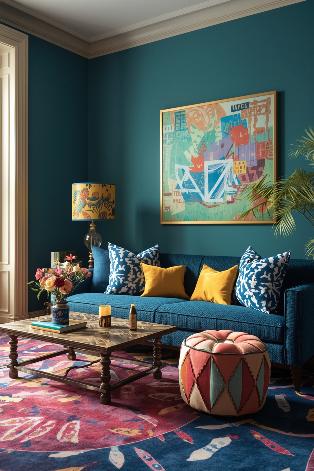
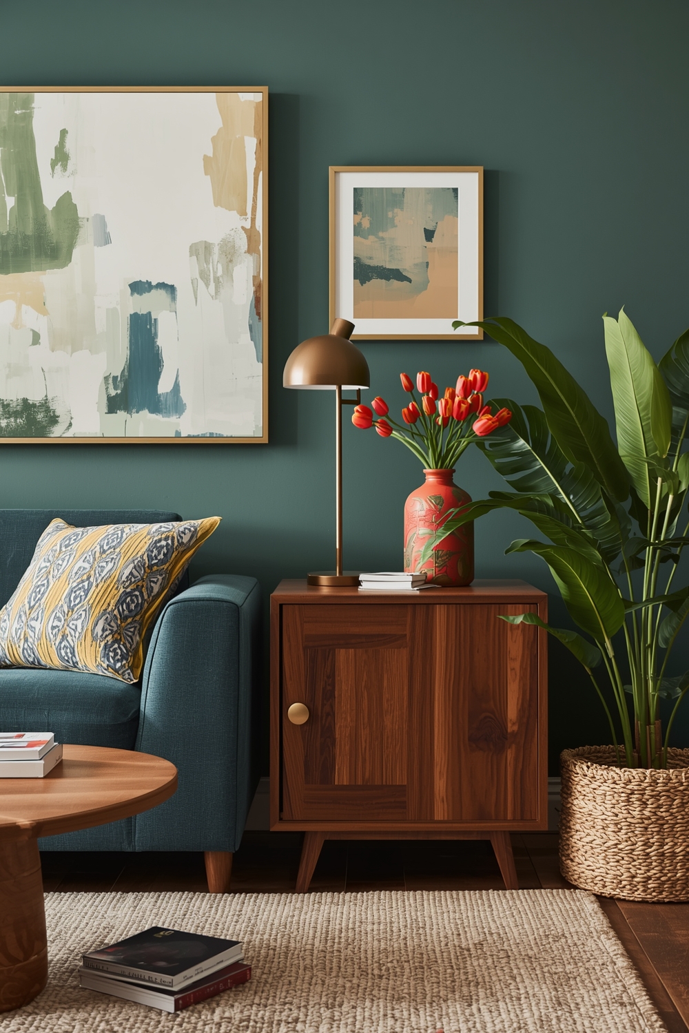
For those who embrace bold design choices, vibrant Interior Paint Palette selections make powerful statements. Think coral, teal, mustard yellow, and fuchsia—colors that energize spaces and reflect confident personal style. Fashion-forward hues work exceptionally well in social spaces like dining rooms, home offices, and creative studios where you want to stimulate conversation and inspiration. These dynamic colors pair beautifully with neutral furnishings, allowing the walls to become the star attraction. Don’t shy away from experimenting with unexpected combinations like dusty rose with olive green or burnt orange with deep plum.
Essential Interior Color Concepts
Understanding basic color theory transforms how you select and combine paint colors. The color wheel remains your best friend when developing an effective Interior Paint Palette strategy for any room. Complementary colors (opposite on the wheel) create vibrant, energetic spaces, while analogous colors (adjacent on the wheel) offer harmonious, cohesive looks. Monochromatic schemes using various shades of a single color provide sophisticated elegance with minimal risk. Consider the 60-30-10 rule: use your dominant color for 60% of the space, a secondary color for 30%, and an accent color for the remaining 10%. This balanced approach ensures visual interest without overwhelming your senses.
Polished Room Color Pairings
Sophisticated color pairings elevate interior design from basic to exceptional. Classic combinations like navy and gold, sage green and cream, or charcoal and blush pink demonstrate how thoughtful interior wall color ideas create polished aesthetics. These refined pairings work across various design styles, from traditional to contemporary. The key lies in balancing cool and warm tones, light and dark values, and muted versus saturated colors. Test your chosen pairings in different lighting conditions before committing to ensure they maintain their appeal throughout the day and into evening hours.
Current Paint Color Collections
Today’s trending paint collections reflect our collective desire for connection with nature and personal wellness. Earthy terracottas, soothing sage greens, warm clay tones, and soft sky blues dominate current Interior Paint Palette offerings from major manufacturers. These nature-inspired hues bring the outdoors inside, creating restorative environments that support mental and physical well-being. Biophilic design principles influence these trending collections, emphasizing colors that reduce stress and promote tranquility. Contemporary collections also feature sophisticated neutrals with complex undertones that shift beautifully throughout the day as natural light changes.
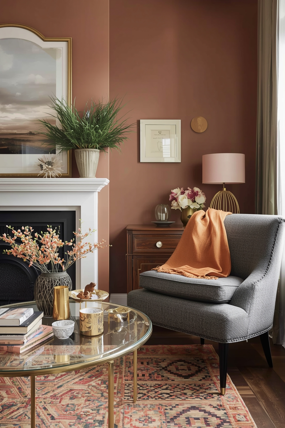
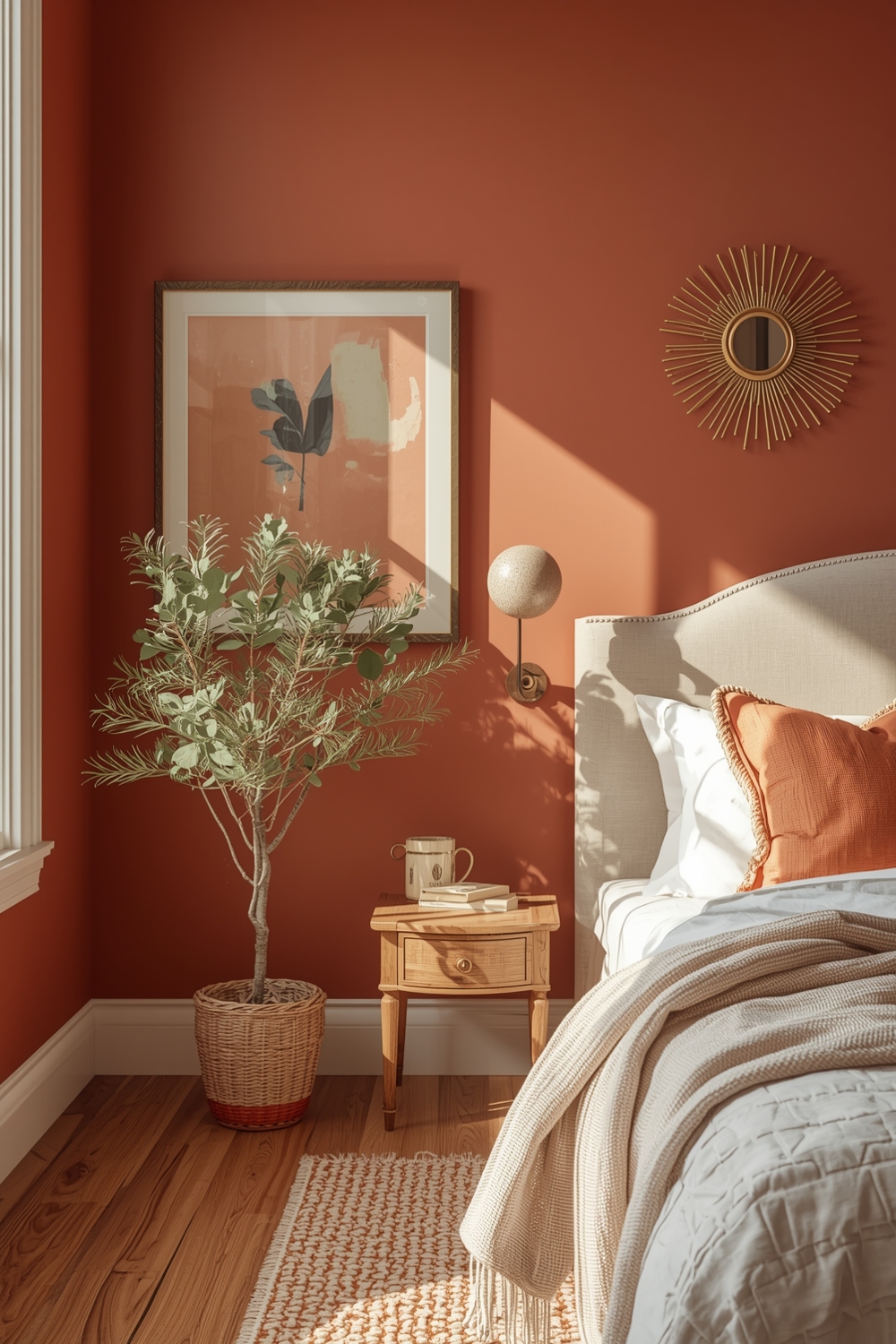
Inviting and Warm Room Paint Ideas
Warm color palettes create cozy, welcoming atmospheres perfect for gathering spaces and bedrooms. Honey golds, soft peaches, warm taupes, and buttery creams envelop rooms in comforting embrace. These inviting hues work particularly well in homes located in cooler climates or rooms with limited natural light. Warm interior wall color ideas reflect light beautifully, making spaces feel more expansive and cheerful. Consider layering different warm tones to create depth—perhaps a creamy base with caramel accents and touches of rust or copper. This approach adds richness without feeling heavy or dated.
Feature Wall Color Inspiration Galleries
Drawing inspiration from curated galleries helps visualize how different Interior Paint Palette selections perform in real-world settings. Online platforms showcase countless feature wall examples demonstrating texture, pattern, and color application techniques. Geometric patterns, ombré effects, and color-blocking techniques offer creative alternatives to solid painted walls. These artistic approaches transform walls into genuine design features that express personality and creativity. Browse inspiration galleries to identify which styles resonate with your aesthetic preferences before investing time and money in your project.
Interior Paint with Sunny Warm Undertones
Paint colors with warm undertones infuse spaces with cheerful, optimistic energy reminiscent of sunshine. Yellows with peachy undertones, beiges with golden bases, and creams with hint of butter create uplifting environments. These sunny hues combat dreariness in north-facing rooms and smaller spaces with limited windows. Warm undertones also complement wood furnishings beautifully, creating cohesive looks that feel intentional and polished. Test paint samples in your specific lighting conditions, as warm undertones can appear differently depending on natural and artificial light sources throughout your home.
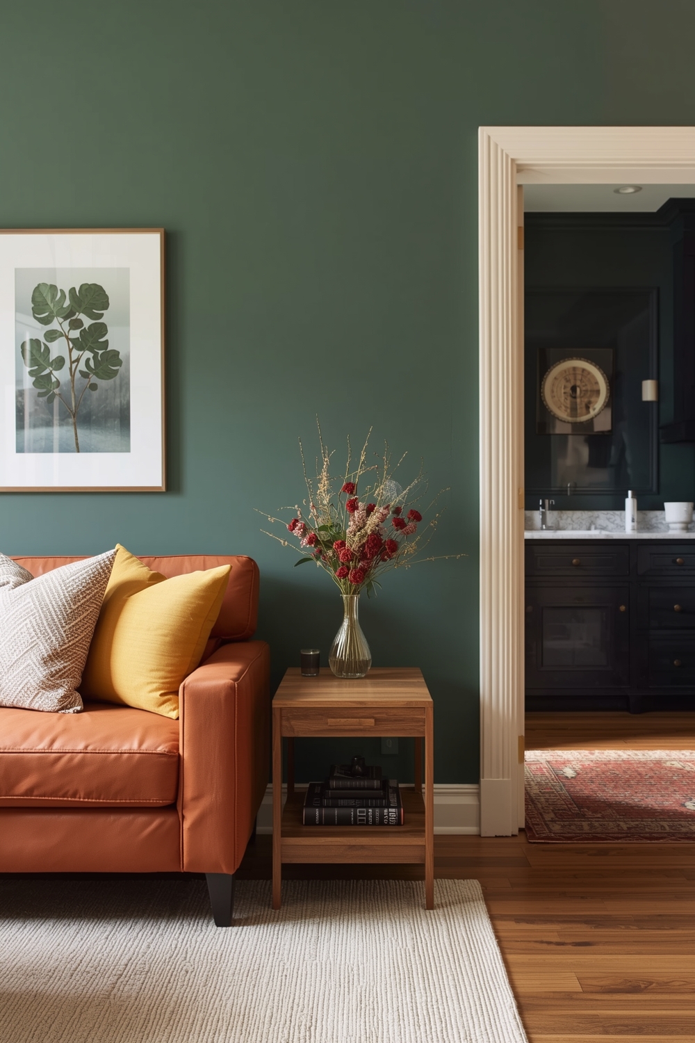
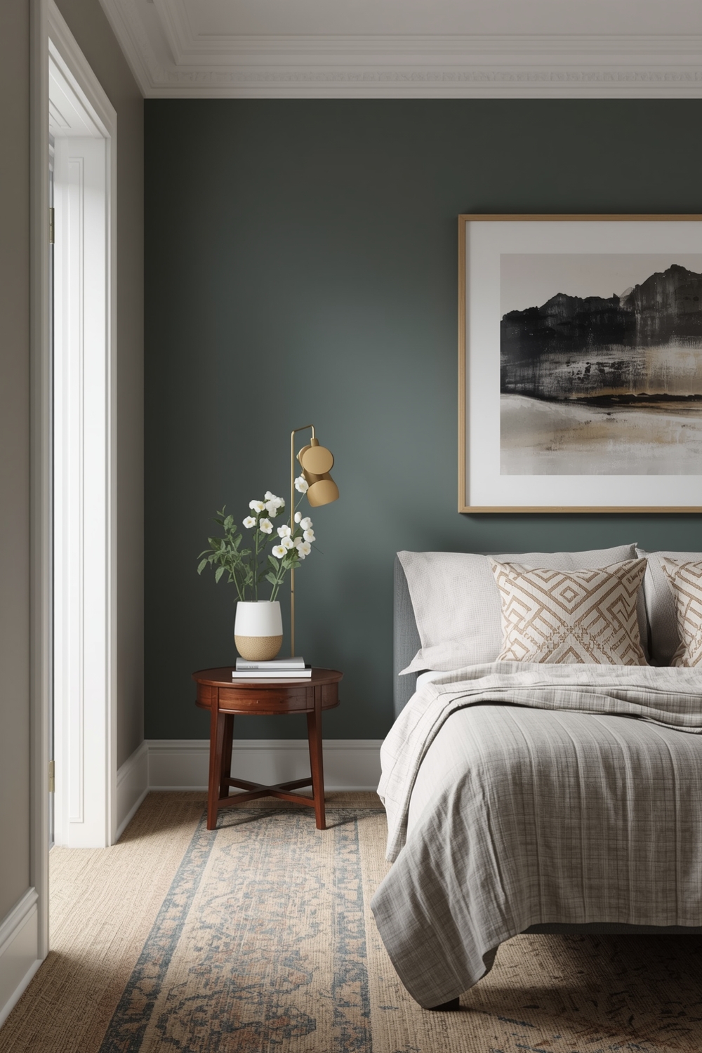
Refreshing Cool-Tone Paint Palettes
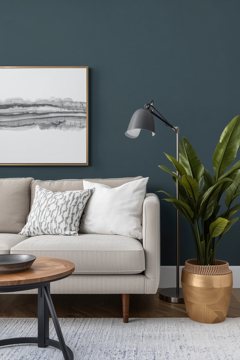
Cool-toned palettes offer refreshing alternatives for homeowners seeking calm, collected atmospheres. Blues, greens, purples, and grays with blue or green undertones create serene environments perfect for concentration and relaxation. These interior wall color ideas work exceptionally well in warm climates or south-facing rooms with abundant natural light. Cool tones visually recede, making them ideal for smaller spaces that benefit from an expanded feeling. Consider pairing cool wall colors with warm wood tones and natural textiles to prevent spaces from feeling cold or uninviting. This balance creates harmonious environments that feel both refreshing and comfortable.
Paint Schemes for Multi-Use Spaces
Modern homes increasingly feature multi-functional rooms requiring versatile Interior Paint Palette solutions that support various activities. Neutral bases with strategic accent colors offer flexibility for spaces serving multiple purposes. Consider zones within open-plan areas, using subtle color shifts to define different functional areas without installing physical barriers. Soft grays transitioning to warm beiges can distinguish living areas from dining spaces while maintaining visual flow. These thoughtful color transitions create psychological boundaries that help our brains switch between work mode, relaxation, and social activities within shared spaces.
Practical Interior Color Coordinations
Practical color coordination extends beyond walls to include trim, ceilings, and architectural details. Cohesive interior wall color ideas consider how baseboards, crown molding, and door frames interact with wall colors. Crisp white trim provides classic contrast that works with virtually any wall color, while tinted trim in complementary shades creates sophisticated, contemporary looks. Ceiling colors deserve equal attention—soft tints of your wall color create intimate feelings, while lighter ceilings enhance spaciousness. Don’t forget about coordinating paint sheens—matte finishes hide imperfections beautifully, while semi-gloss withstands moisture and cleaning in high-traffic areas.
Fashionable Paint Ideas for Entertainment Rooms
Entertainment spaces benefit from Interior Paint Palette selections that energize and engage. Deep, dramatic colors like charcoal, midnight blue, or rich burgundy create theater-like atmospheres perfect for movie nights. These moody hues minimize glare on screens while creating cozy environments that encourage lingering conversations and quality time with family and friends. Balance dark walls with lighter furnishings and adequate lighting to maintain functionality. Consider accent walls behind bar areas or entertainment centers using metallic paints or bold patterns that become conversation starters during gatherings.
Bedroom Paint Color Selection Guides
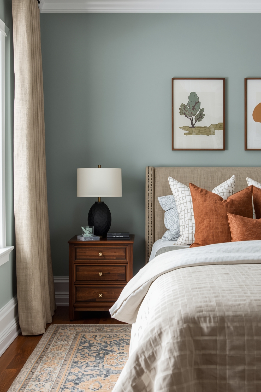
Bedrooms require special consideration when selecting paint palettes, as these intimate spaces significantly impact sleep quality and morning moods. Soft blues, gentle lavenders, muted greens, and warm grays promote relaxation and restful sleep. Avoid overly stimulating colors like bright reds, oranges, or intense yellows in primary sleeping areas. Instead, opt for interior wall color ideas with calming properties that support your circadian rhythms. Master bedrooms can handle slightly deeper, more saturated colors than children’s rooms, where lighter, playful hues encourage creativity while remaining soothing. Consider your bedding and curtain colors when finalizing your bedroom palette to ensure cohesive, harmonious design.
How This Idea Improves Your Space
Implementing a thoughtfully selected Interior Paint Palette dramatically improves your living environment by creating visual harmony, reflecting your personality, and enhancing daily experiences. Color psychology research confirms that our surroundings significantly affect mood, productivity, and overall well-being. Strategic color choices make small rooms feel larger, dark spaces brighter, and disconnected areas more cohesive. Beyond aesthetics, the right paint palette increases your home’s market value and appeal to potential buyers if you decide to sell in the future.
Budget-Friendly Tips
Transform your space affordably by starting with high-impact areas like accent walls rather than painting entire rooms. Purchase quality paint in smaller quantities to test multiple interior wall color ideas before committing. Shop end-of-season sales, use paint calculators to avoid overbuying, and handle preparation and application yourself to save on labor costs while achieving professional-looking results.
Conclusion
Selecting the perfect Interior Paint Palette transforms houses into personalized homes that reflect your unique style and support your lifestyle needs. From serene neutrals to bold statement hues, the options are limitless. Use this guide as your roadmap to confident color selection, remembering that the best palette is one that makes you feel happy, comfortable, and inspired every single day.
FAQs
What is the most popular interior paint palette for 2024? Nature-inspired palettes featuring warm terracottas, sage greens, and soft clay tones dominate current trends, reflecting our collective desire for calming, earth-connected spaces. How many colors should be in an interior paint palette? Most effective palettes include three to five colors: a dominant wall color (60%), secondary color (30%), and one or two accent colors (10%) for trim, doors, and accessories. What’s the best paint palette for small rooms? Light, cool-toned colors like soft grays, pale blues, and gentle whites make small rooms feel more spacious by reflecting light and visually receding walls. Should I use the same paint palette throughout my entire home? While maintaining a cohesive color story creates flow, varying palettes between rooms adds interest—just ensure they share common undertones or complementary hues. How do I choose between warm and cool paint palettes? Consider your home’s natural lighting, existing furnishings, and personal preferences—warm palettes suit cooler climates and north-facing rooms, while cool palettes refresh warm climates and south-facing spaces.