Introduction
Choosing the perfect Interior Paint Palette can transform any space from ordinary to extraordinary. Whether you’re renovating your entire home or refreshing a single room, the right color combinations create harmony, enhance mood, and reflect your personal style. This comprehensive guide presents 16 flawless Interior Paint Palette pairings that work beautifully in various settings. From neutral sophistication to vibrant energy, discover interior wall color ideas that will inspire your next decorating project and help you create spaces you’ll love for years to come.
Curated Interior Paint Palettes
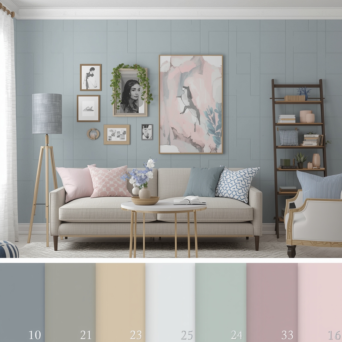
When selecting an Interior Paint Palette, consider how colors interact with natural light, furniture, and architectural features. Curated palettes take the guesswork out of color selection by offering pre-matched combinations that designers trust. These professionally assembled color schemes ensure visual coherence throughout your home. Whether you prefer monochromatic elegance or complementary contrasts, curated palettes provide a foundation for confident decorating decisions. The best interior wall color ideas balance personal preference with timeless appeal, creating spaces that feel both current and enduring.
Modern Paint Colors for Urban Homes
Urban living demands sophisticated color choices that maximize limited space while reflecting contemporary aesthetics. Modern Interior Paint Palettes for city dwellings often feature clean neutrals accented with bold statement colors. Consider pairing crisp whites with charcoal gray for a minimalist foundation, then adding pops of mustard yellow or terracotta for warmth. These combinations work exceptionally well in open-concept apartments where color flow matters. Modern palettes embrace simplicity without sacrificing personality, offering contemporary color solutions that complement sleek furnishings and industrial architectural elements common in urban spaces.
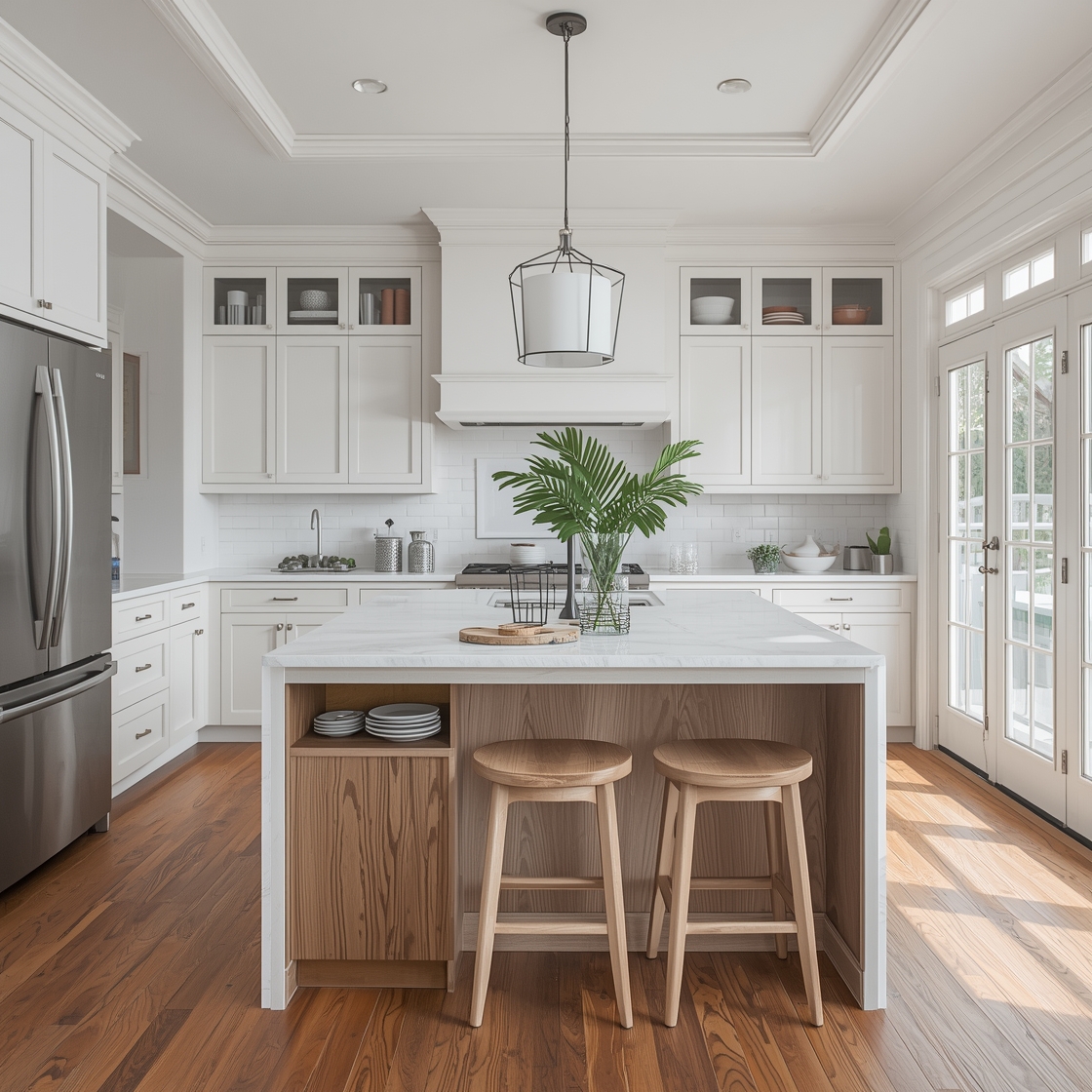
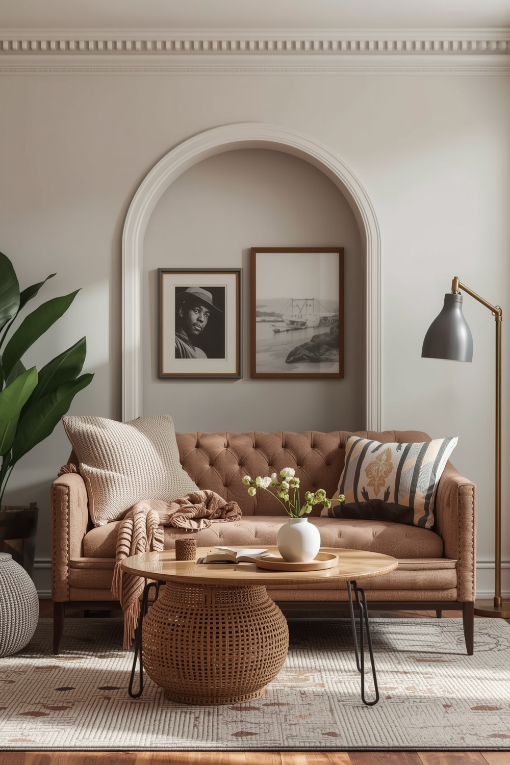
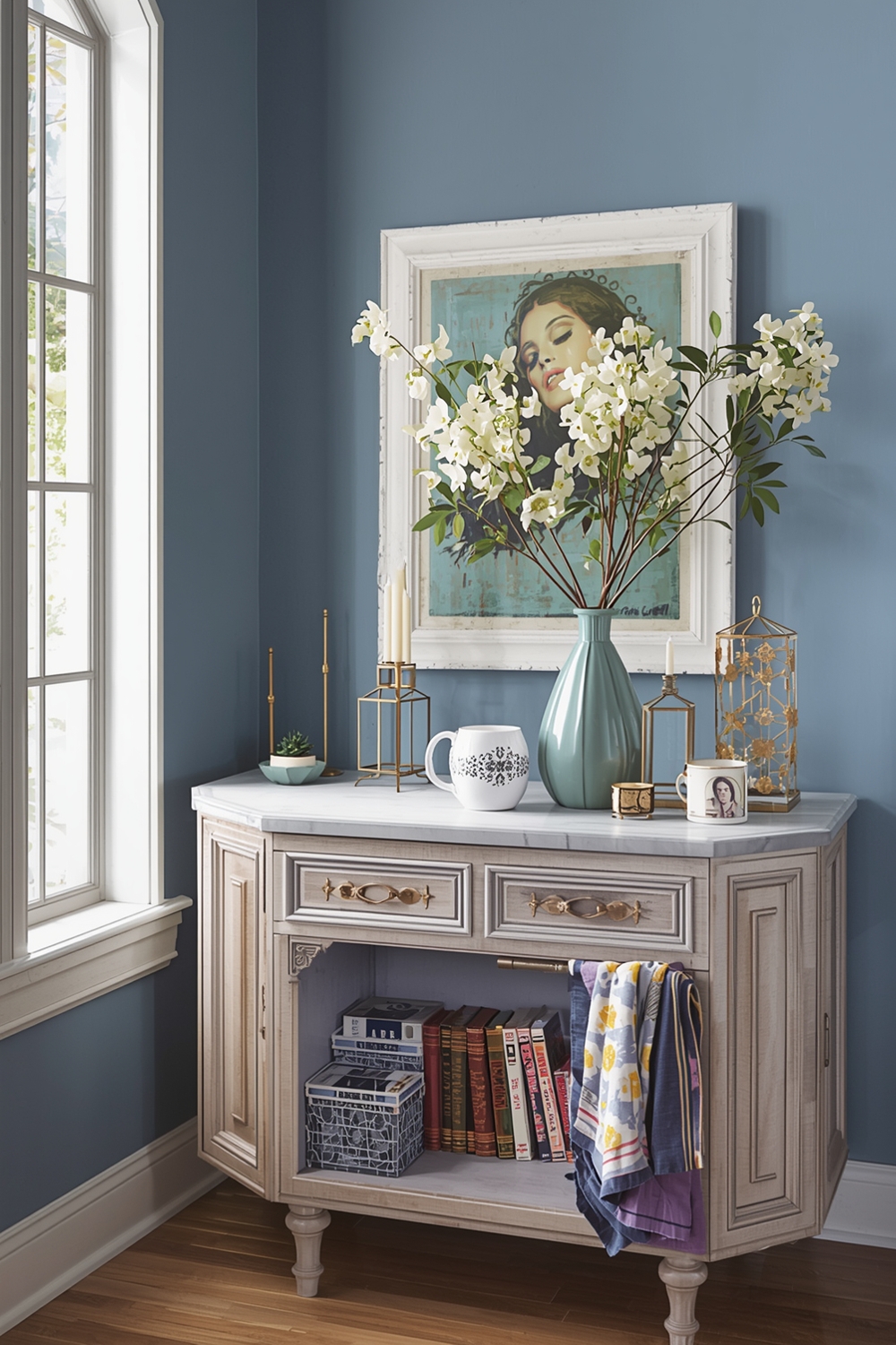
Neutral Room Color Storyboards
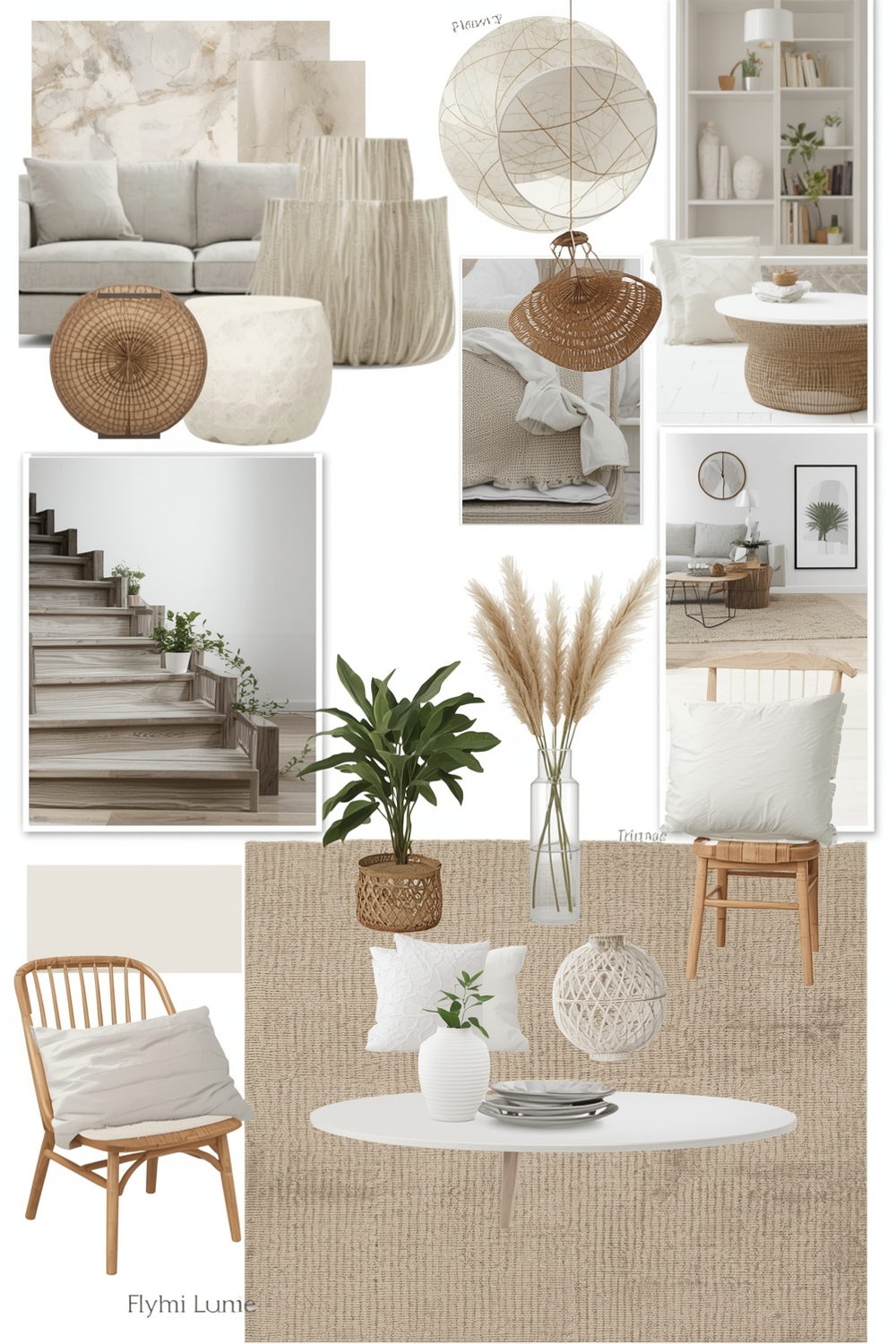
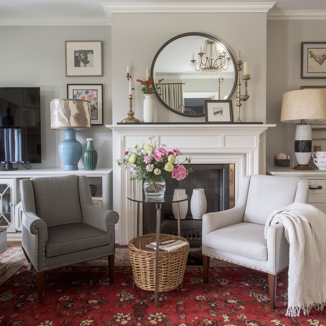
Neutral palettes remain eternally popular for good reason—they create calm, versatile backdrops that adapt to changing decor trends. A well-crafted neutral Interior Paint Palette includes varying shades of beige, gray, taupe, and cream that layer beautifully together. Try combining warm greige walls with crisp white trim and soft mushroom accents for a sophisticated look that never feels dated. Neutral storyboards allow artwork, textiles, and furniture to shine while providing the visual cohesion every home needs. These timeless interior wall color ideas create peaceful environments perfect for relaxation.
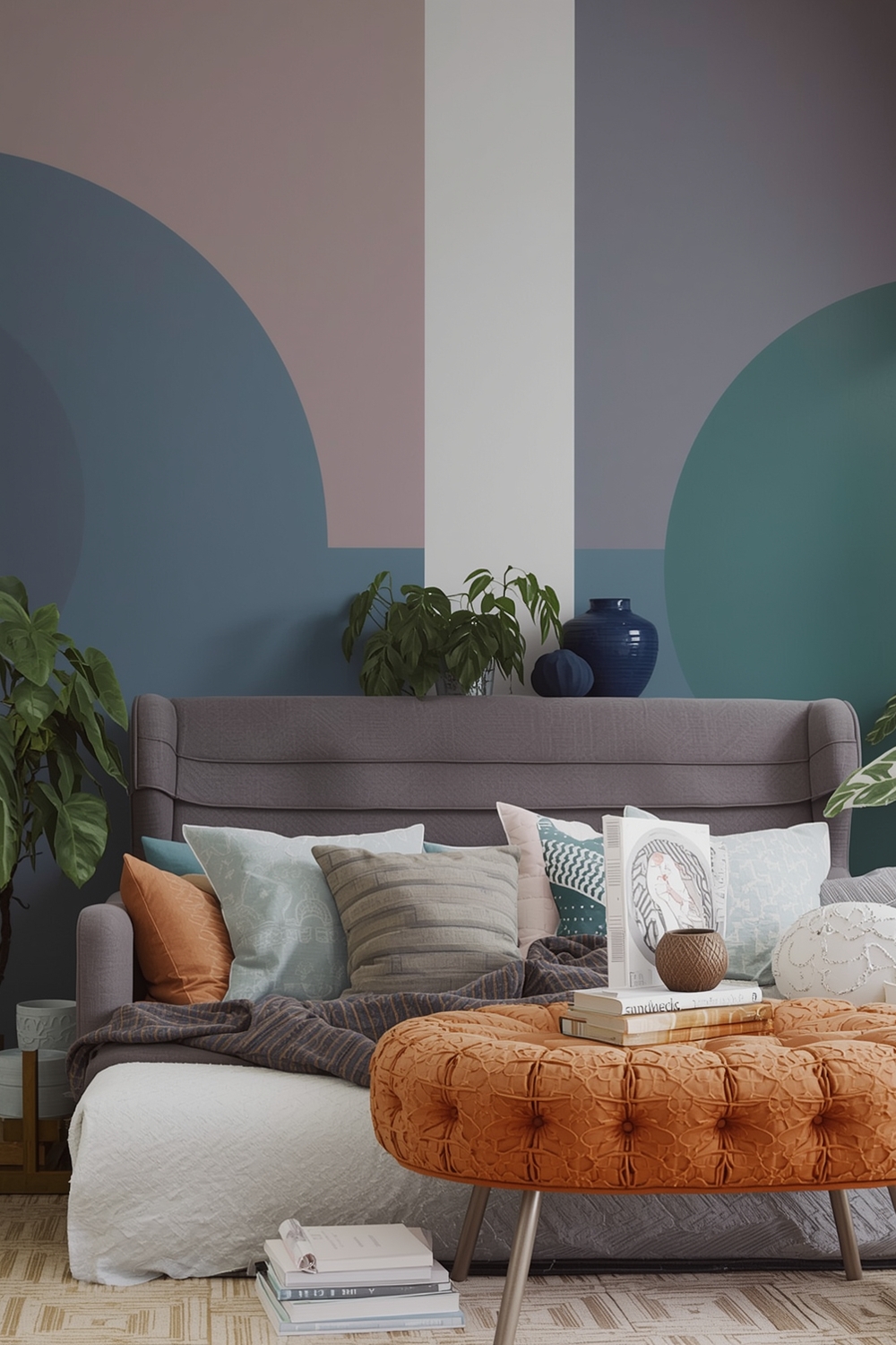
Vibrant Room Color Mix Inspirations
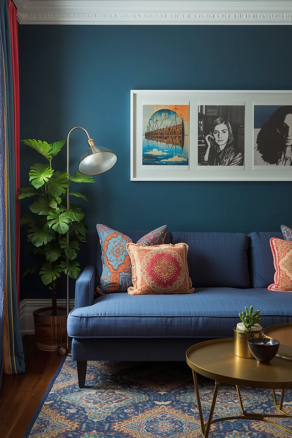
For those who crave energy and personality, vibrant Interior Paint Palettes deliver dramatic impact. Bold color combinations like emerald green with blush pink or navy blue with burnt orange create memorable spaces that showcase confidence. When working with vibrant hues, balance is essential. Use the 60-30-10 rule: 60% dominant color, 30% secondary color, and 10% accent color. This approach prevents overwhelming the senses while allowing bold colors to make statements. Vibrant palettes work beautifully in social spaces like dining rooms, home offices, and creative studios.
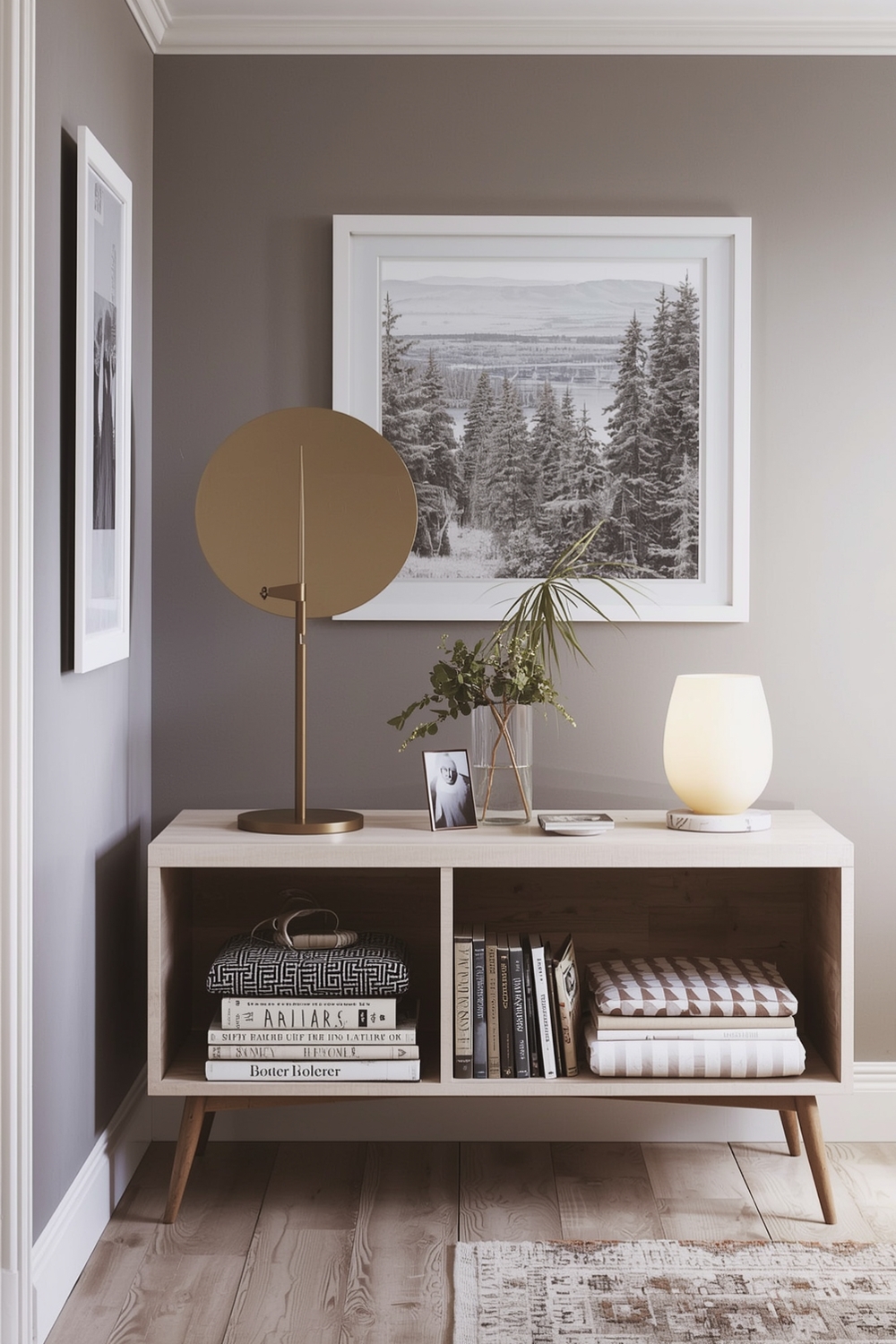
Essential Interior Paint Idea Galleries
Building your personal gallery of paint inspirations helps clarify your style preferences and identifies recurring themes in the colors you love. Essential Interior Paint Palette galleries showcase diverse approaches to color—from Scandinavian simplicity to Mediterranean warmth. Browse design magazines, websites, and social media to collect images that resonate with you. Notice which color families appear repeatedly in your saved selections. This exercise reveals your authentic color preferences, making paint selection easier and more confident. Creating mood boards with your favorite paint palette examples streamlines decision-making before you purchase a single can.
Polished Room Color Theme Boards
Theme boards organize color selections around specific design concepts—coastal, farmhouse, industrial, or mid-century modern. A polished Interior Paint Palette theme board includes wall colors, trim colors, accent colors, and complementary decor shades that work harmoniously together. For coastal themes, combine soft aqua, sandy beige, and crisp white. Farmhouse aesthetics pair beautifully with sage green, cream, and warm gray. These organized approaches to interior wall color ideas ensure every room contributes to your home’s overall design narrative while maintaining individual character.
Current Paint Palette Assemblies
Today’s trending Interior Paint Palettes reflect our desire for comfort, connection to nature, and authentic self-expression. Current assemblies feature earthy terracottas, soothing sage greens, warm terracottas, and versatile warm grays that ground contemporary interiors. These palettes move away from stark minimalism toward warmer, more inviting color stories. They incorporate natural materials and organic color inspiration, creating spaces that feel nurturing rather than cold. Current trends emphasize sustainability and timelessness over fleeting fashion, ensuring your color choices remain relevant for years.
Snug Room Paint Mood Collections
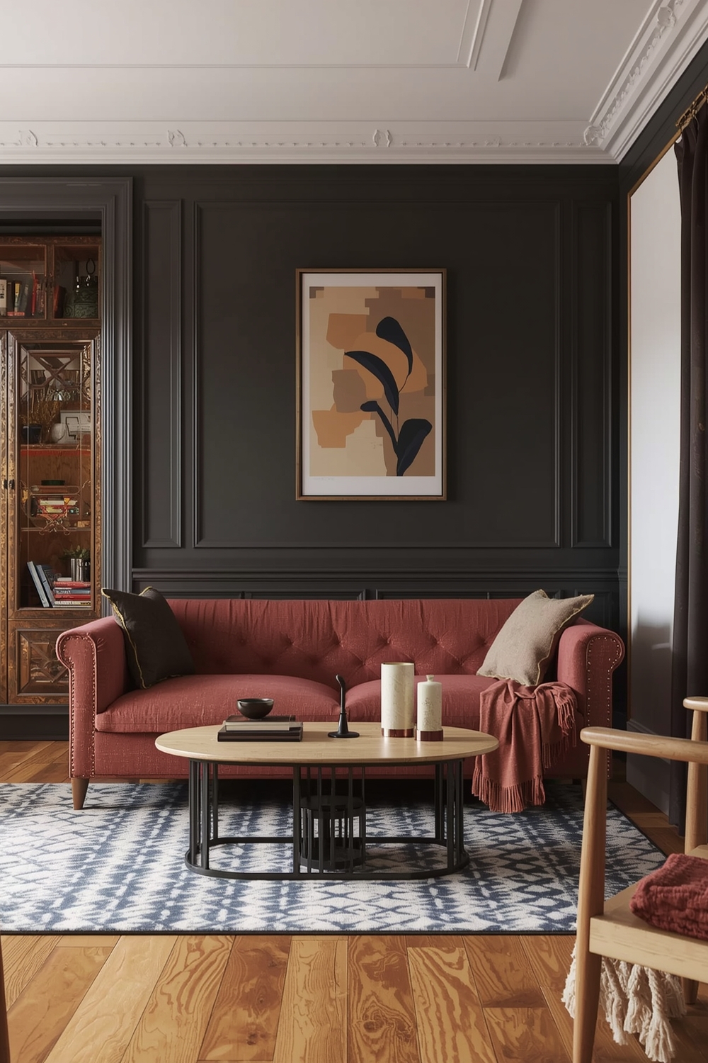
Creating cozy, intimate spaces requires thoughtful color selection that promotes relaxation and comfort. Snug room Interior Paint Palettes typically feature deeper, warmer tones that envelope spaces in welcoming ambiance. Consider rich chocolate brown, deep burgundy, or forest green for reading nooks, bedrooms, and home libraries. These colors absorb light, creating cocoon-like environments perfect for unwinding. Balance darker walls with lighter ceilings and adequate lighting to prevent spaces from feeling claustrophobic. Add texture through fabrics and finishes to enhance the cozy factor. These interior wall color ideas transform ordinary rooms into cherished retreats where you’ll want to spend quality time.
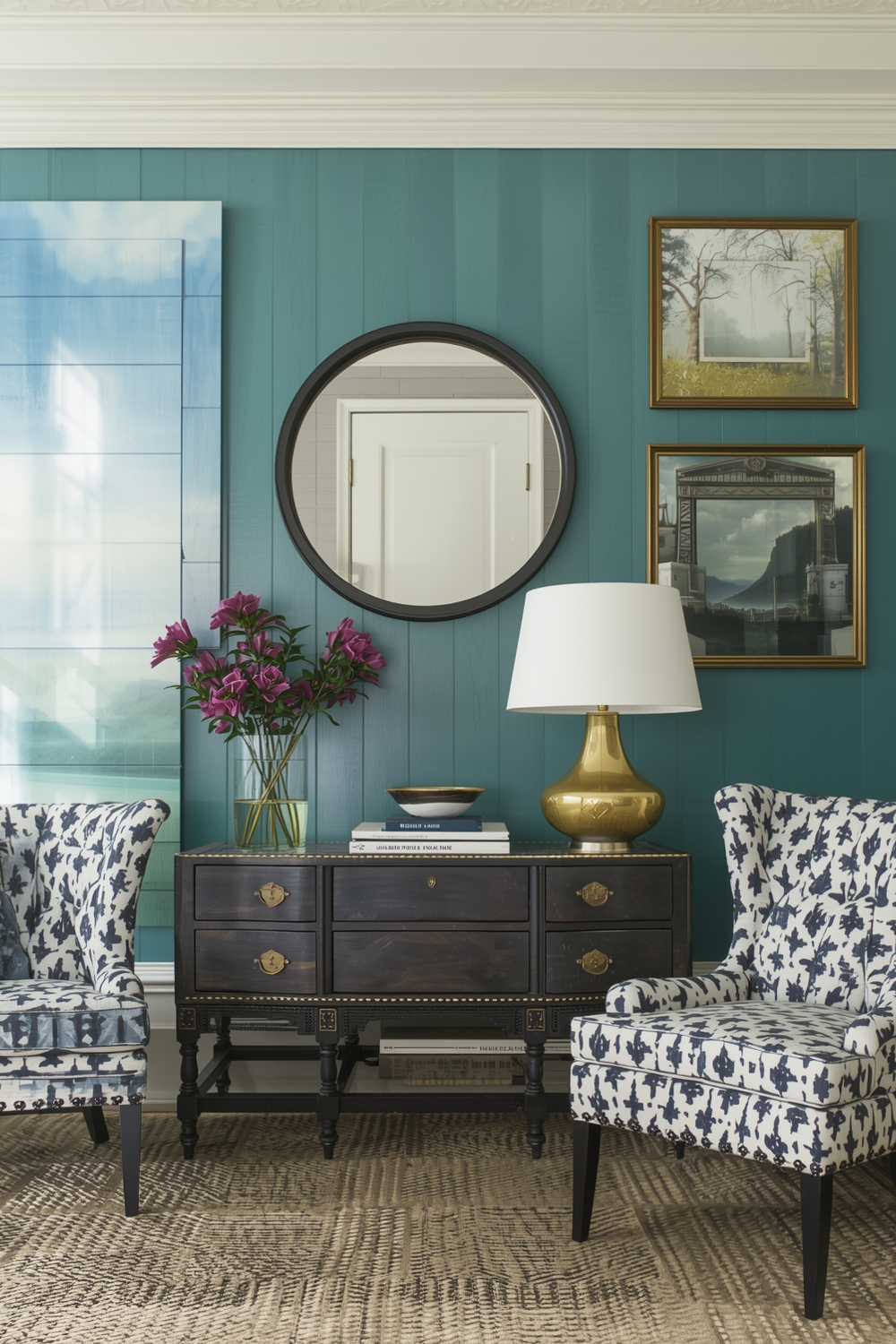
Accent Color Ideas for Modern Walls
Strategic accent walls add visual interest without overwhelming spaces. Modern accent color strategies go beyond single feature walls to include architectural elements, built-ins, and ceiling treatments using your Interior Paint Palette. Pair neutral base colors with unexpected accents like deep teal, terracotta, or charcoal. Paint interior doors, window frames, or shelving units in contrasting colors for subtle drama. These techniques add depth and personality while maintaining overall design cohesion throughout your home.
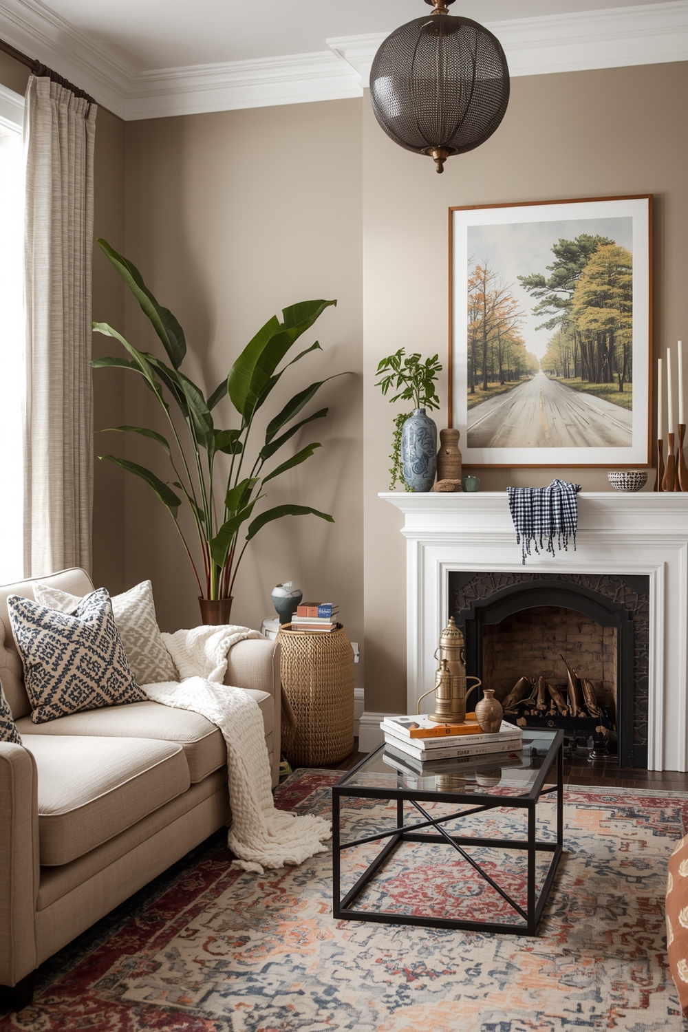
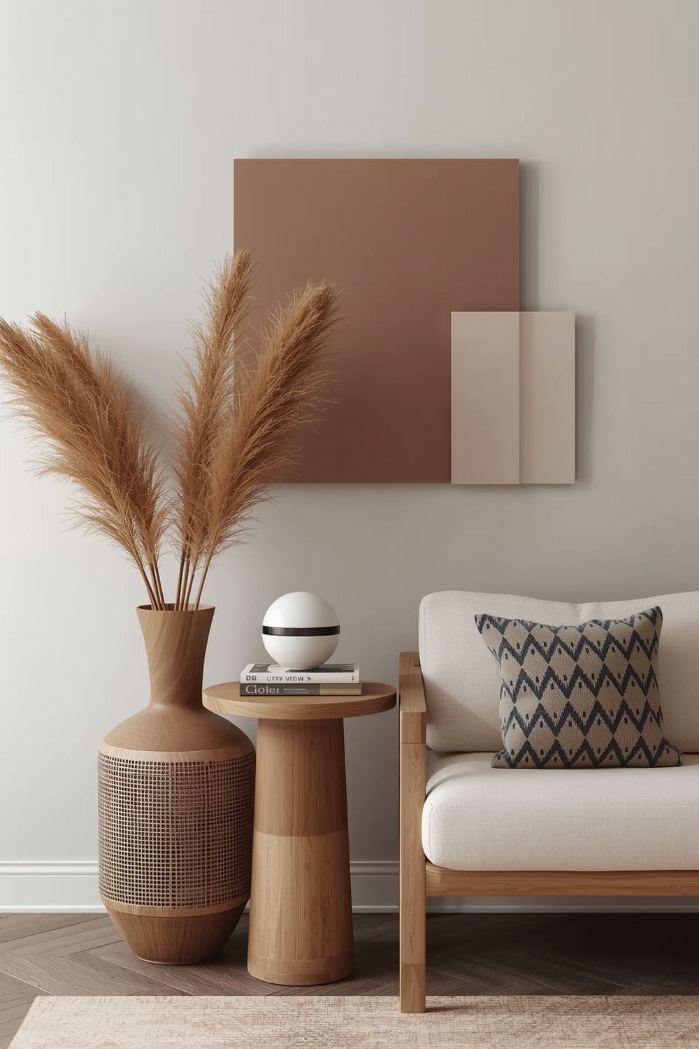
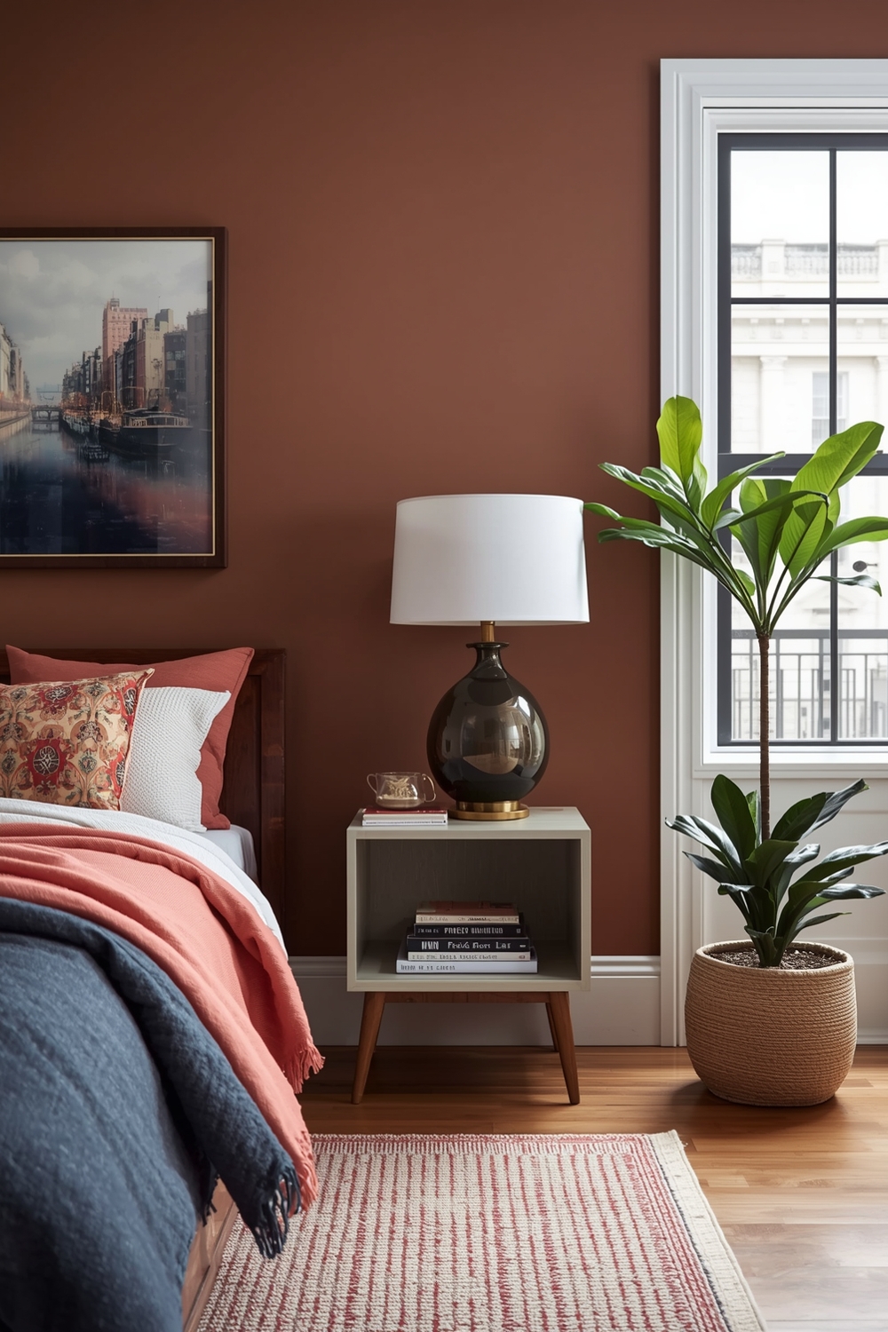
Interior Paints with Earthy Warm Tones
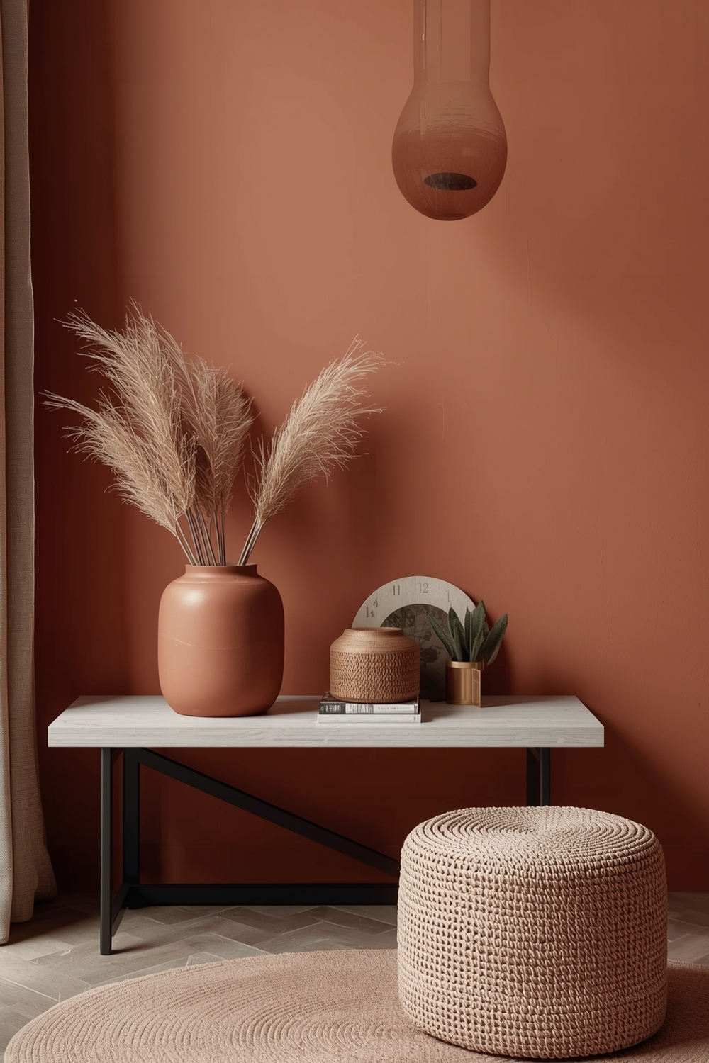
Warm-toned palettes create inviting, nurturing environments that feel immediately comfortable. Earthy Interior Paint Palettes draw inspiration from natural landscapes—desert sunsets, autumn forests, and sun-baked clay. Combine warm terracotta with soft cream and olive green for a Mediterranean-inspired look. Or pair caramel brown with rust orange and buttery yellow for harvest-inspired warmth. These warm color schemes work beautifully in gathering spaces where you want to encourage conversation and connection, creating atmospheres that welcome family and friends.
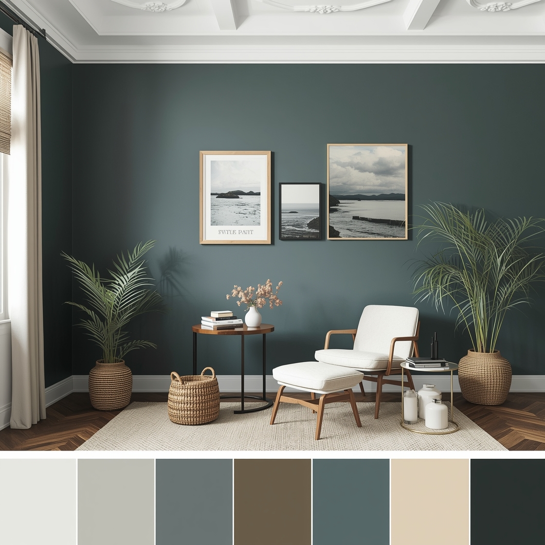
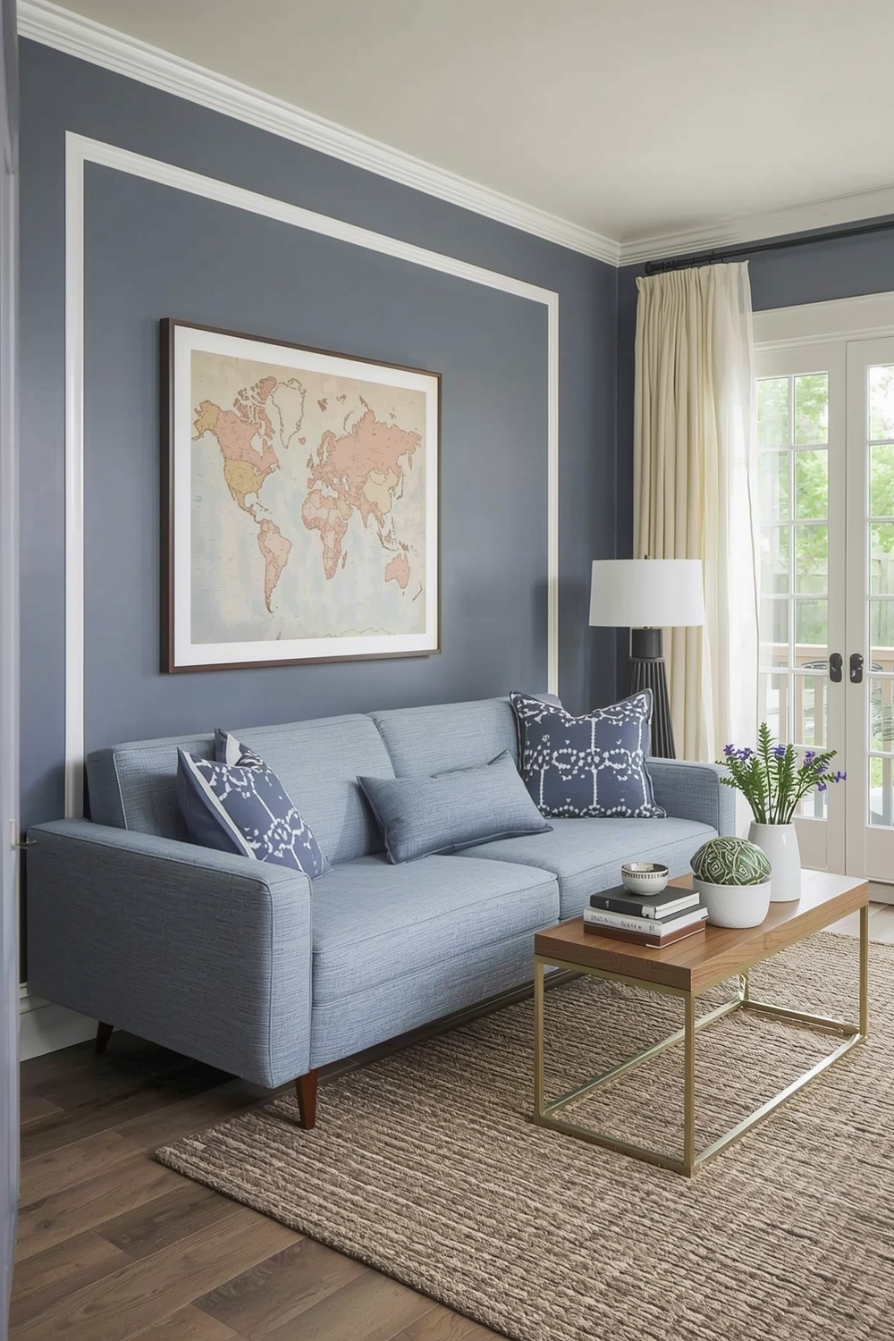
Bracing Cool-Tone Paint Ideas
Cool-toned Interior Paint Palettes offer refreshing alternatives that promote calm and clarity. These palettes feature blues, greens, purples, and cool grays that create serene, spa-like environments throughout your home. Try pairing soft powder blue with silvery gray and crisp white for a peaceful bedroom sanctuary. Or combine sage green with cool taupe and pale lavender for a nature-inspired retreat. Cool tones work especially well in rooms with abundant natural light or southern exposures where you want to counterbalance warmth. These interior wall color ideas create restful spaces perfect for decompressing after busy days.
Color Palettes for Connected Living Areas
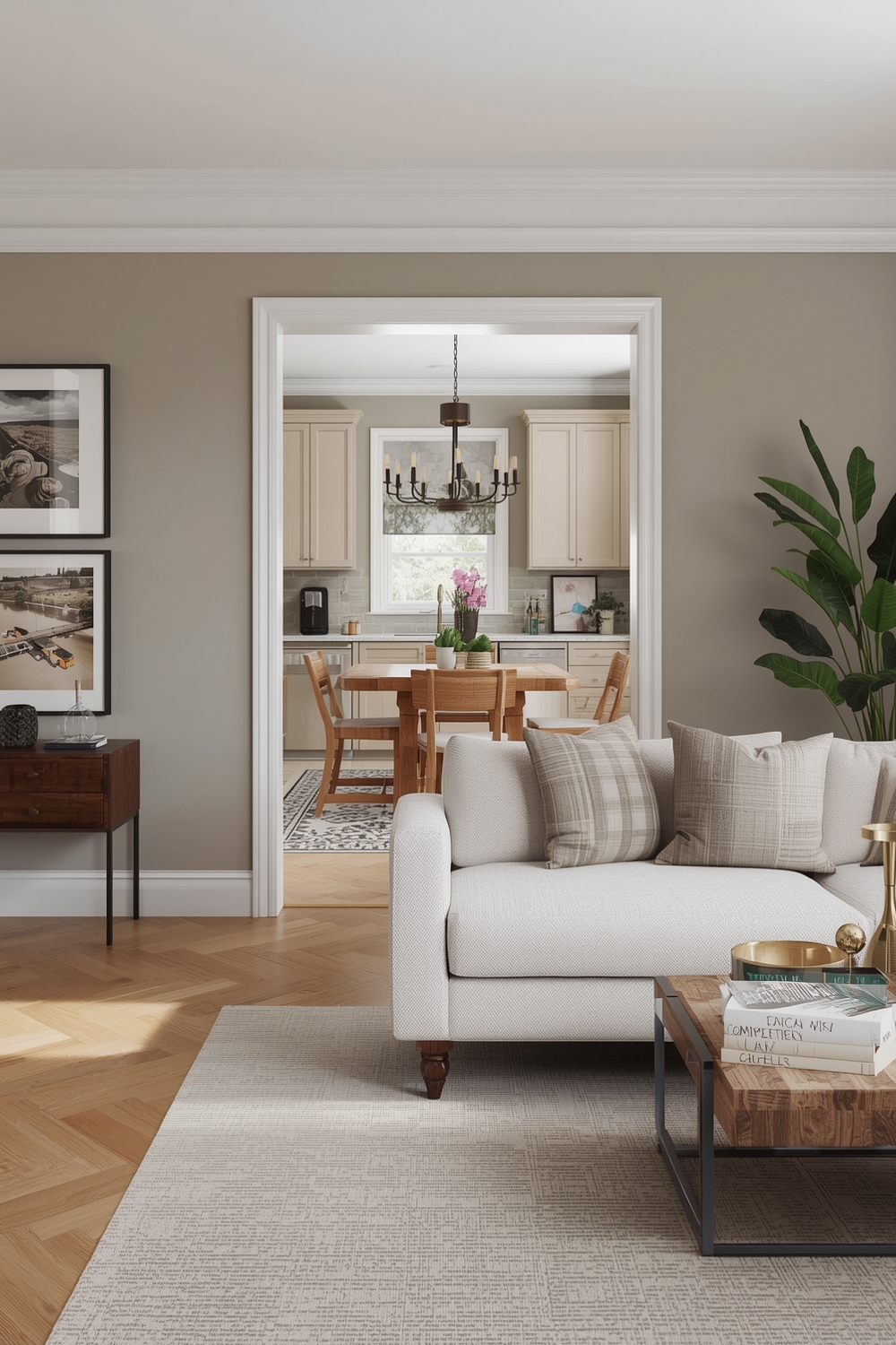
Open-concept homes require carefully coordinated color strategies that define zones while maintaining visual flow. Successful Interior Paint Palettes for connected spaces use color variations within the same family to create subtle distinctions between areas. Consider using three shades of gray—light in the kitchen, medium in the living area, and darker in the dining space. This graduated approach defines areas without jarring transitions. Alternatively, maintain consistent wall colors but vary accent colors through furnishings and accessories. These techniques help open floor plans feel cohesive yet purposeful, giving each zone its own identity while contributing to the whole.
Logical Interior Color Blends
Color theory provides valuable guidance when creating harmonious Interior Paint Palettes. Logical blends follow established color relationships—analogous, complementary, or triadic—that naturally please the eye. Analogous palettes use colors adjacent on the color wheel, like blue, blue-green, and green for naturally harmonious results. Complementary schemes pair opposites like blue and orange for dynamic contrast. Understanding these principles helps you create interior wall color ideas that feel intentional and professionally designed rather than randomly assembled.
Fashionable Paint Ideas for Dens
Dens and recreational spaces allow more experimental color approaches than formal areas. Fashionable Interior Paint Palettes for these rooms embrace current trends while reflecting the room’s recreational purpose. Consider dramatic navy walls with brass accents for a sophisticated game room, or energizing coral with teal for a creative hobby space. These rooms tolerate bolder choices because they’re designed for specific activities rather than daily living. Don’t be afraid to express personality and try trending color combinations you might avoid elsewhere.
Bedroom Paint Color Visualization Guides
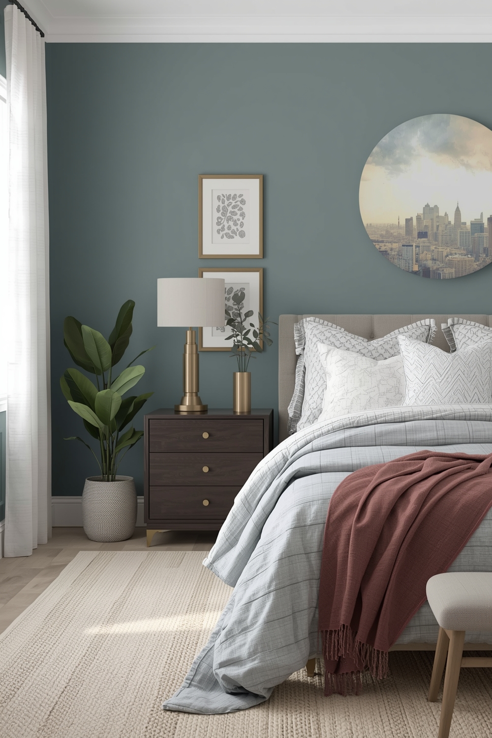
Bedrooms deserve especially thoughtful color consideration since they directly impact sleep quality and morning mood. Successful bedroom Interior Paint Palettes promote relaxation while reflecting personal style preferences. Soft blues, gentle greens, and warm neutrals scientifically promote better sleep than vibrant or dark colors. Create visualization boards showing your proposed palette in different lighting conditions—morning, afternoon, and evening. Test paint samples on multiple walls since light exposure varies significantly around rooms. Consider how your bedding, curtains, and furniture will interact with wall colors. These interior wall color ideas help you create personal sanctuaries that support rest and rejuvenation.
How This Idea Improves Your Space
Implementing a cohesive Interior Paint Palette throughout your home creates visual harmony that reduces stress and increases enjoyment of your living spaces. Well-chosen colors enhance architectural features, improve perceived room dimensions, and set the desired mood in each area. Strategic color placement guides traffic flow, highlights focal points, and creates seamless transitions between rooms. Beyond aesthetics, the right palette increases your home’s value and appeal to potential buyers while making daily living more pleasurable.
Budget-Friendly Tips
You don’t need unlimited funds to implement beautiful paint palettes. Start with one room to test your chosen colors before committing to the entire house. Purchase sample sizes to try colors on your walls before buying gallons. Consider painting accent walls or furniture pieces rather than entire rooms for budget-friendly updates. Many paint retailers offer loyalty programs and seasonal sales that significantly reduce costs.
Conclusion
Selecting the perfect Interior Paint Palette transforms houses into homes that reflect your unique style and support your lifestyle. Whether you prefer neutral sophistication, vibrant energy, or earthy warmth, these 16 flawless pairings provide inspiration for every aesthetic preference. Take time to test colors in your specific lighting conditions, consider how rooms connect, and trust your instincts. With thoughtful planning and these proven combinations, you’ll create beautiful, cohesive spaces you’ll love.
FAQs
Q: How many colors should I include in my interior paint palette? A: Most successful palettes include 3-5 colors: a dominant neutral, a secondary supporting color, and 1-3 accent colors for variety and interest. Q: Should I use the same paint palette throughout my entire home? A: Maintaining a cohesive color family throughout creates flow, but varying shades and intensities room-by-room adds interest while preserving harmony. Q: How do I choose between warm and cool-toned palettes? A: Consider your home’s natural lighting, existing furnishings, and personal preferences. Warm tones create cozy atmospheres while cool tones feel refreshing and calming. Q: What’s the best way to test paint colors before committing? A: Paint large samples (at least 2’x2′) on multiple walls and observe them in morning, afternoon, and evening light for several days before deciding. Q: Can I mix different paint finishes within the same palette? A: Absolutely! Using different sheens (matte, eggshell, satin, semi-gloss) on walls, trim, and ceilings adds subtle dimension while maintaining color cohesion.