Introduction
Choosing the perfect Interior Paint Palette can transform your home from ordinary to extraordinary. Whether you’re renovating a single room or reimagining your entire living space, the right color combination creates harmony, reflects your personality, and enhances your home’s architectural features. This comprehensive guide explores 16 proven strategies to help you develop cohesive interior wall color ideas that flow seamlessly throughout your home while maintaining each room’s unique character.
Interior Paint Palette Strategy Boards
Creating a strategy board is your first step toward developing a successful Interior Paint Palette. Start by collecting paint swatches, fabric samples, and inspiration images that resonate with your vision. Digital tools like Pinterest allow you to curate mood boards featuring various color combinations and room layouts. Physical boards work equally well—attach samples to foam core boards and move them around different rooms to see how natural light affects each shade. This hands-on approach helps you visualize how colors interact with your existing furniture, flooring, and architectural details. Strategy boards prevent costly mistakes by allowing you to experiment before committing to paint purchases.
Unified Room Paint Color Concepts
A unified approach to your interior color scheme creates visual continuity throughout your home. Select a base palette of three to five colors that will appear in varying proportions across different spaces. Your primary color might dominate living areas, while secondary and accent colors appear in smaller doses through trim, doors, or feature walls. This strategy doesn’t mean painting every room identically. Instead, it establishes a consistent color language that allows each space to have its own personality while maintaining overall cohesion. Consider how colors transition from room to room, using hallways as bridge spaces where colors gradually shift from one dominant hue to another.
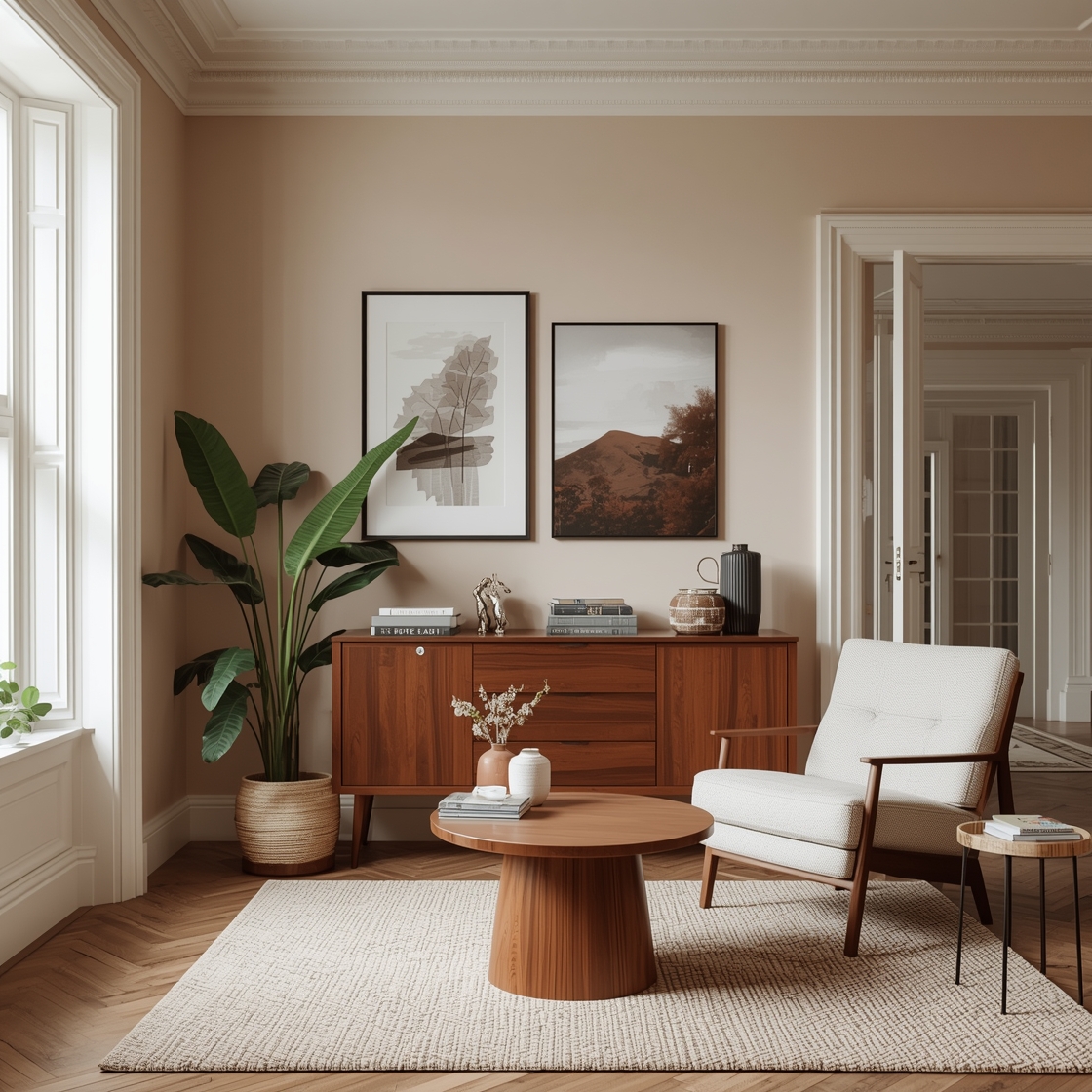
Interior Paint Mixes for Contemporary Homes
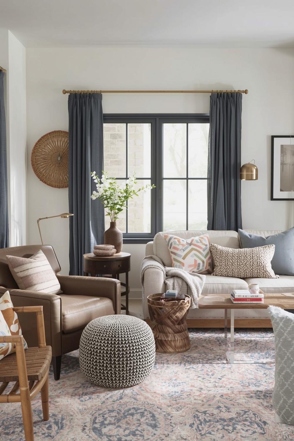
Modern homes benefit from sophisticated color combinations that embrace both boldness and restraint. Contemporary palettes often feature neutral foundations—grays, warm whites, or soft beiges—punctuated with unexpected accent colors like deep navy, terracotta, or sage green. Monochromatic schemes using varying shades of a single color family create depth without visual clutter. Alternatively, pair warm and cool neutrals for subtle contrast that feels fresh and current. Contemporary palettes prioritize clean lines and uncluttered spaces where color enhances rather than overwhelms architectural elements.
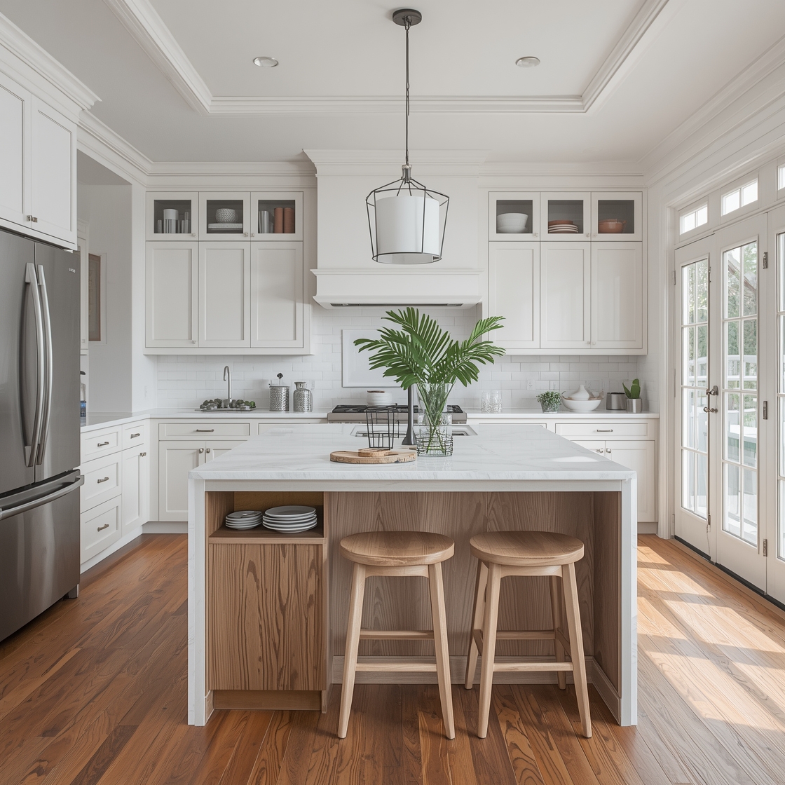
Neutral and Luminous Room Color Layouts
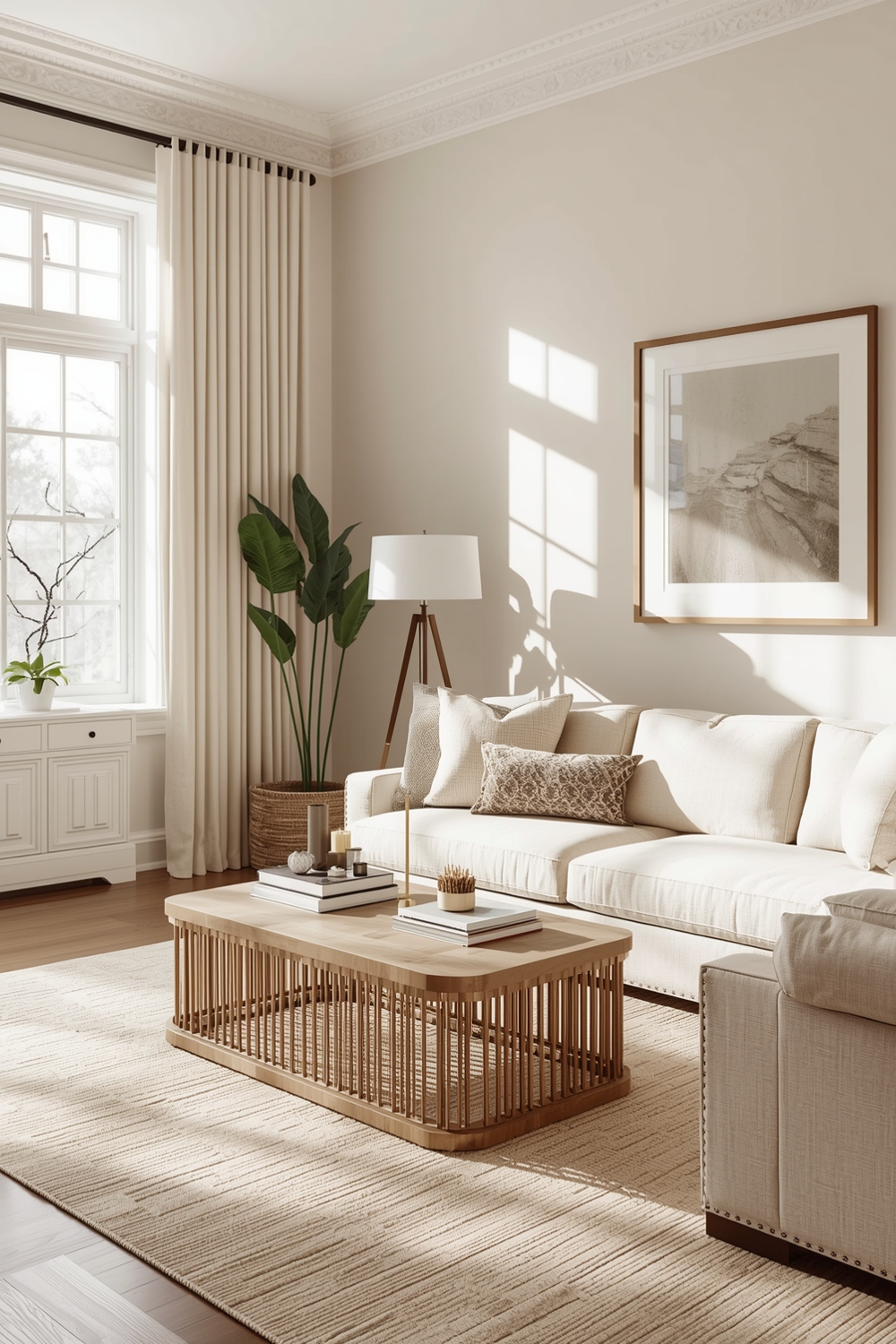
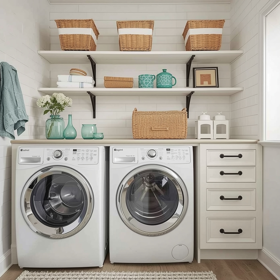
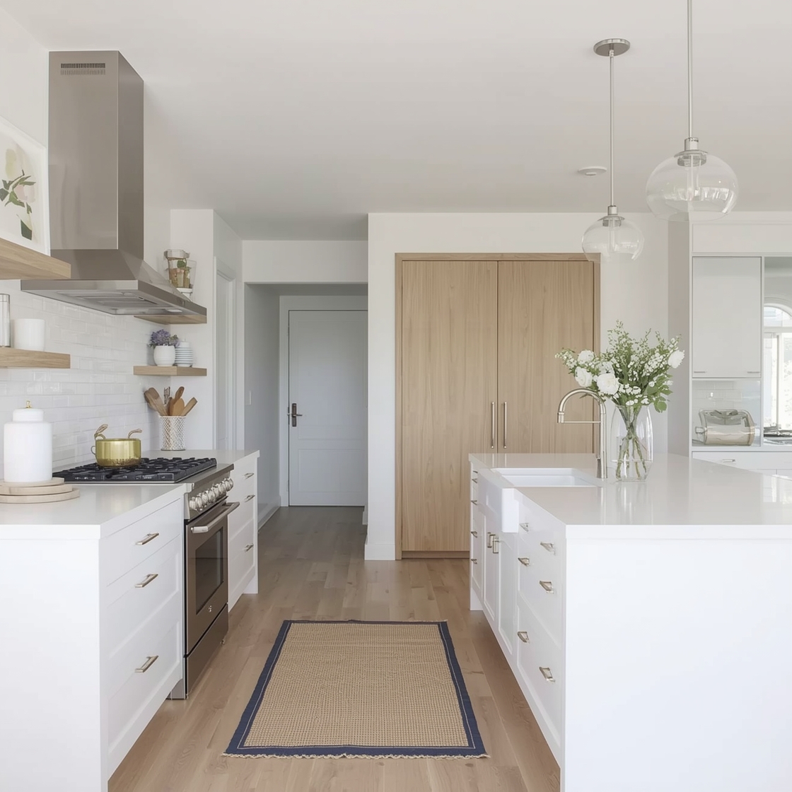
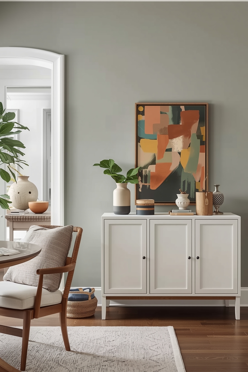
Neutral palettes remain timelessly popular because they create calm, versatile spaces that accommodate changing décor styles. Today’s neutrals extend beyond beige to include warm grays (greiges), soft taupes, creamy whites, and gentle khakis. These colors reflect light beautifully, making rooms feel more spacious and airy. Layer different neutral tones to prevent flatness—pair warm undertones in one room with cooler shades in adjacent spaces. Add depth through texture rather than bold color: think grasscloth wallpaper, natural wood finishes, and varied fabric textures that create visual interest within a restrained color scheme.
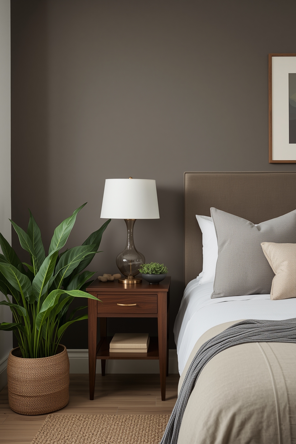
Functional Interior Paint Palette Plans
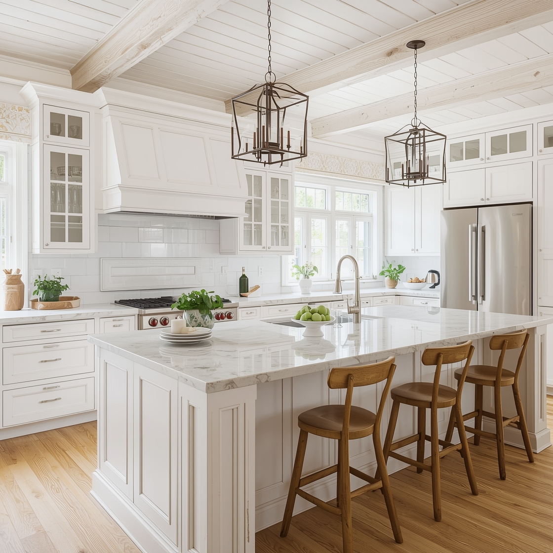
Different rooms serve different purposes, and your Interior Paint Palette should reflect functional needs. Bedrooms benefit from calming blues, soft greens, or warm neutrals that promote relaxation. Home offices perform better with energizing yet focused colors like sage, soft yellow, or medium gray. Kitchens and dining areas welcome warmer tones that stimulate appetite and conversation—think soft terracotta, warm cream, or buttery yellows. Bathrooms can handle both spa-like cool tones or energizing warm hues depending on whether you want a relaxing retreat or an invigorating start to your day. Align color psychology with room function for spaces that truly support your lifestyle.
Polished Room Color Layout References
Professional designers use reference tools to ensure color accuracy and consistency. Paint brands offer digital apps that let you visualize colors in your actual space using augmented reality. These tools eliminate guesswork and help you see how natural and artificial lighting affects color appearance throughout the day. Create physical reference samples by painting large poster boards with your chosen colors and moving them around rooms at different times. This practical approach reveals how morning light versus evening light transforms each shade, ensuring you’ll love your choices in all lighting conditions.
Essential Room Paint Combinations
Certain color combinations have proven themselves timeless and versatile. Classic pairings include white trim with any wall color, which creates crisp definition and makes colors pop. Navy and white delivers sophisticated coastal vibes, while gray and yellow offers cheerful contemporary contrast. Greige (gray-beige) paired with warm wood tones creates organic modern spaces, while soft sage with cream white provides calming natural elegance. Black accent walls with light surroundings make dramatic statements in dining rooms or home offices. These essential combinations serve as reliable starting points that you can personalize with unique accent colors.
Room Paint Ideas for Vaulted Spaces
Vaulted ceilings and high walls present unique painting opportunities. Consider painting ceilings a shade lighter than walls to emphasize height, or go dramatic with a darker ceiling color that creates cozy intimacy despite tall spaces. Two-tone approaches—where upper walls differ from lower sections—can visually lower soaring ceilings when desired. Highlight architectural features like exposed beams with contrasting colors that draw the eye upward. In open-concept homes with vaulted spaces, use your established palette to maintain flow while celebrating the dramatic architecture. These vertical spaces offer perfect opportunities to showcase bolder interior wall color ideas that might overwhelm standard-height rooms.
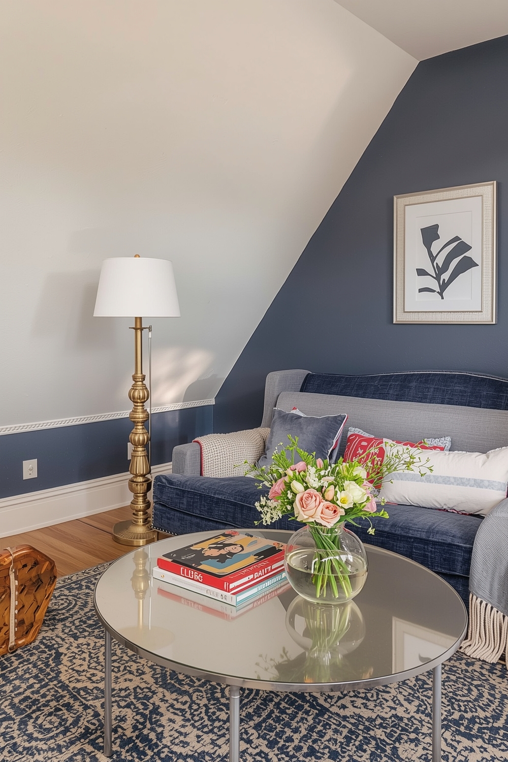
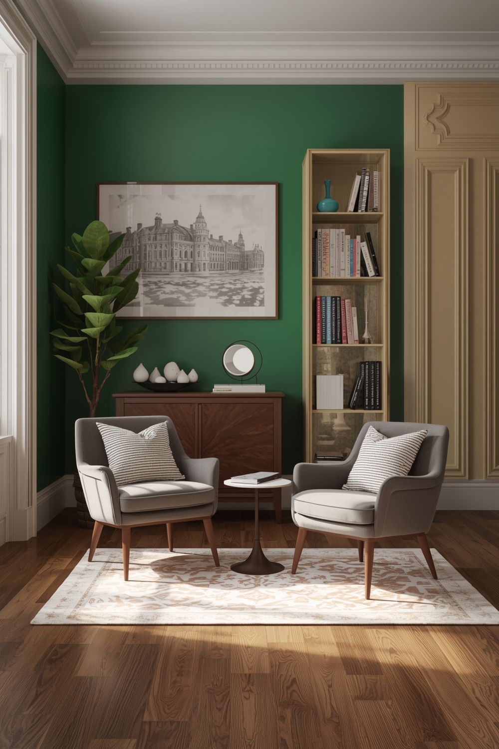
Interior Paint Color Stories for Gathering Rooms
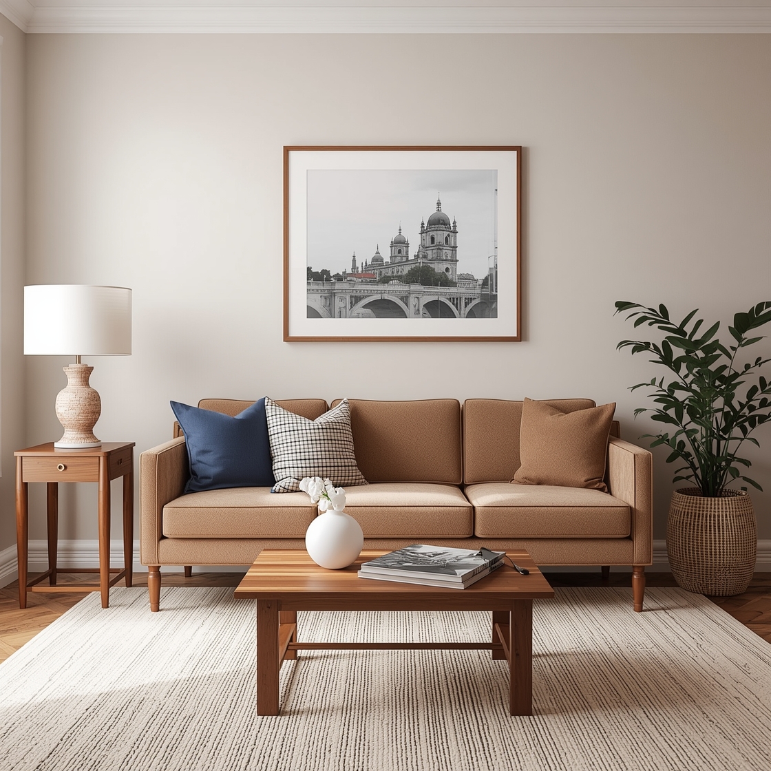
Living rooms and family rooms benefit from cohesive color narratives that tell a story. Begin with inspiration from a favorite piece—an artwork, rug, or furniture piece—and pull colors from it to build your palette. This approach ensures all elements feel intentionally connected. Create focal points through accent walls in deeper or brighter versions of your main color. Use the 60-30-10 rule: 60% dominant color (walls), 30% secondary color (upholstery, curtains), and 10% accent color (pillows, accessories). This balanced approach prevents color chaos while maintaining visual interest throughout your gathering spaces.
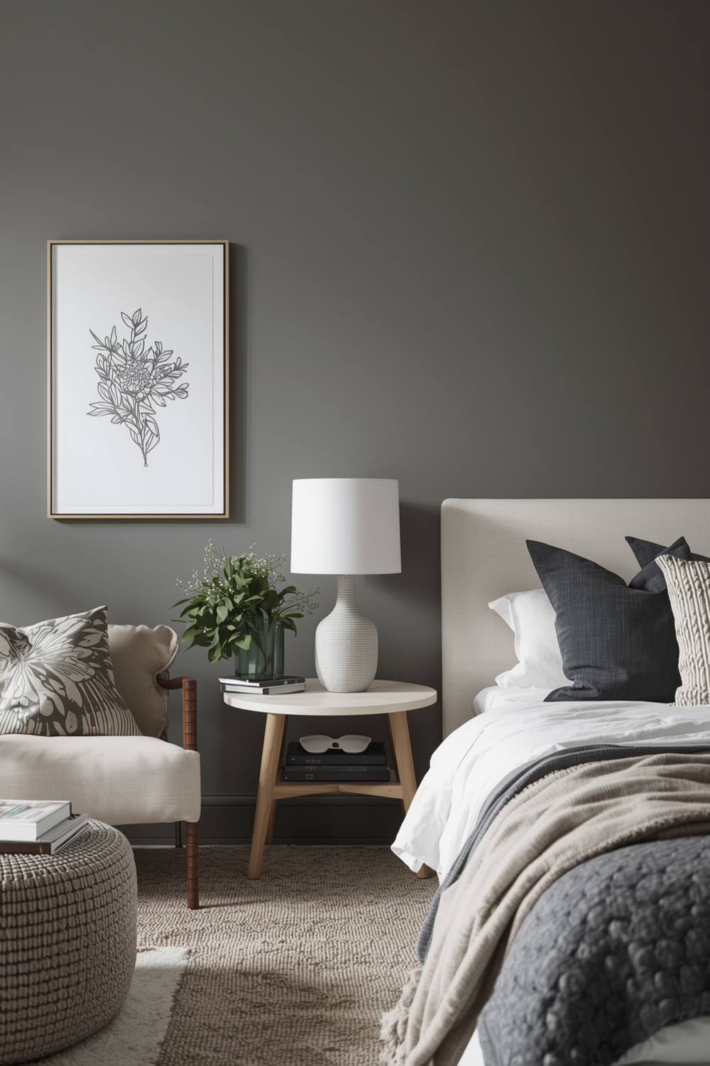
Snug Room Paint Layout Inspirations
Smaller spaces require thoughtful color approaches. Contrary to popular belief, dark colors can make cozy rooms feel intimate and jewel-like rather than cramped. Deep blues, rich greens, or warm charcoals create enveloping comfort in bedrooms, libraries, or powder rooms. Alternatively, light-reflective colors like soft white, pale blue, or light greige maximize available light and create airiness. Paint trim the same color as walls to blur boundaries and make walls appear to recede. These strategic choices help compact spaces feel intentional and perfectly proportioned.
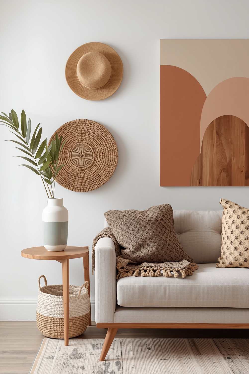
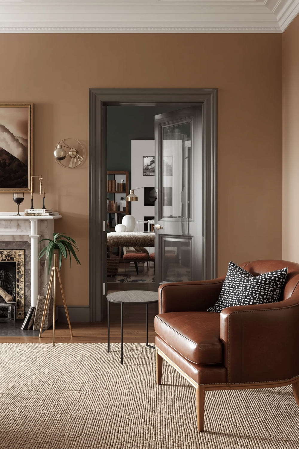
Fashionable Interior Room Paint Design Galleries
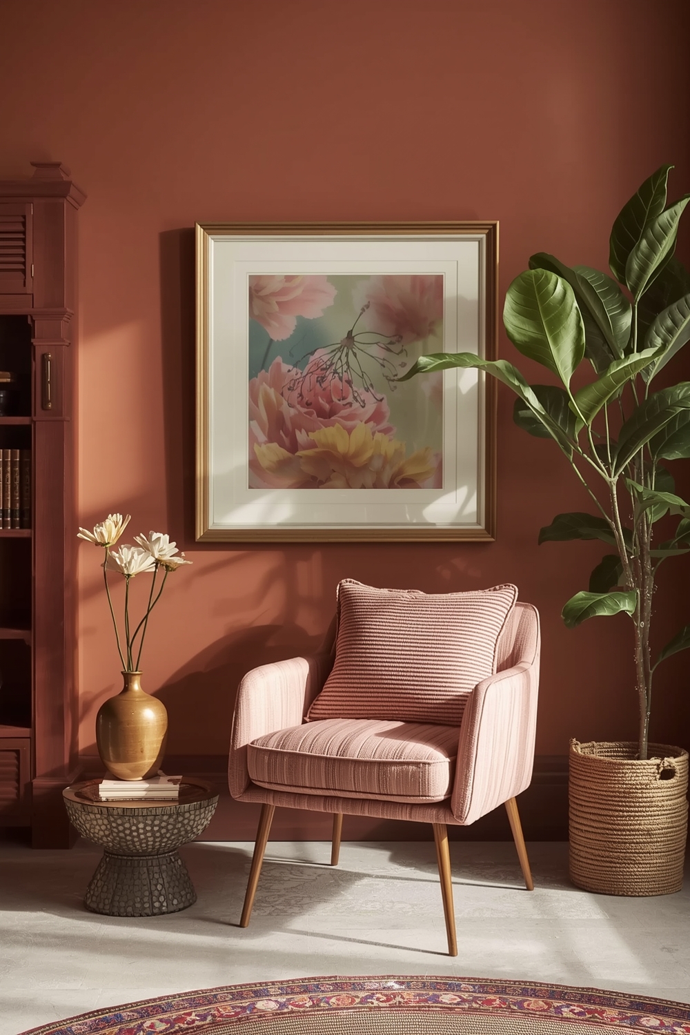
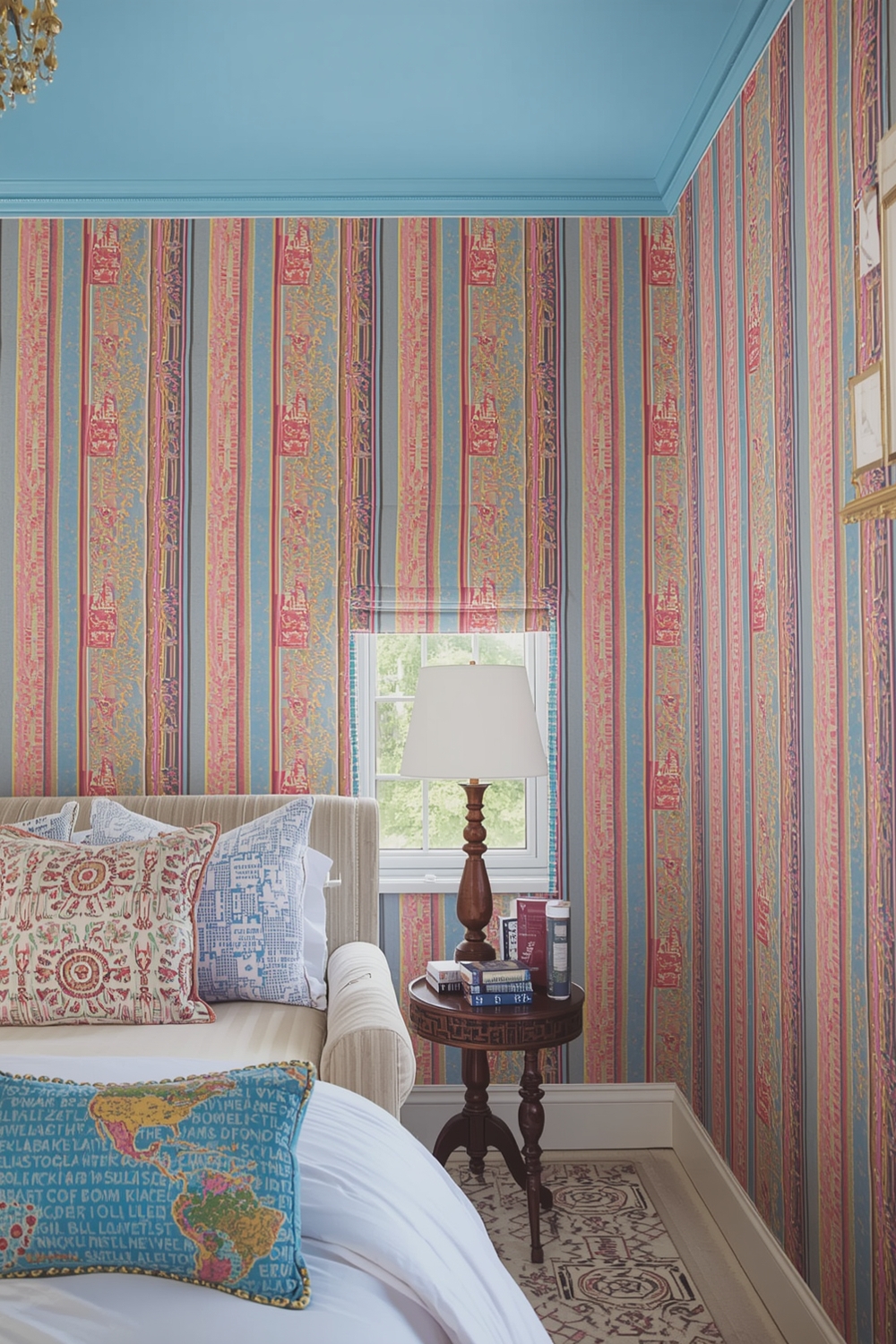
Current design trends embrace earthy, nature-inspired palettes featuring terracotta, olive green, rust, and warm clay tones. These grounded colors create wellness-focused environments that feel connected to the natural world. Pair them with natural materials like wood, stone, and linen for cohesive organic spaces. Maximalist approaches are also trending, where bold colors layer together confidently—think emerald green with dusty pink and gold accents. These expressive palettes work best when unified by consistent undertones (all warm or all cool) that prevent visual chaos. Browse design galleries and social media for current inspiration while ensuring trends align with your personal style.
Bright and Cheerful Room Paint Ideas
Inject joy into your home with optimistic color choices that elevate mood and energy. Soft yellows bring sunshine indoors without overwhelming, while coral and peach tones add warmth with sophisticated flair. Sky blue creates happy, serene environments perfect for bedrooms or bathrooms. When working with brighter colors, balance is essential. Use cheerful hues as accent walls or in spaces where you spend shorter periods, pairing them with neutral companions that prevent sensory overload. Kitchens, breakfast nooks, and children’s spaces particularly benefit from these uplifting Interior Paint Palette choices that make everyday moments more delightful.
Current Room Paint Layout Concepts
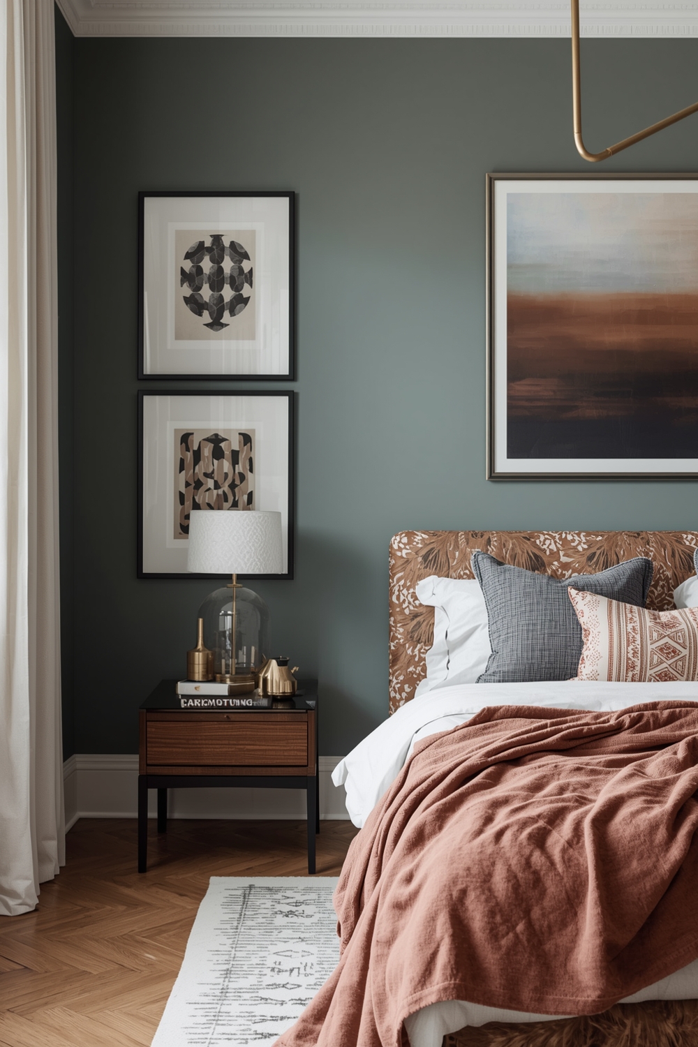
Today’s interior color trends favor warm, comforting palettes over the cool grays that dominated previous years. Warm whites with creamy or peachy undertones create inviting foundations, while mid-tone browns and taupes ground spaces with earthy sophistication. Sage green continues its popularity as a versatile neutral alternative. Color-drenching—painting walls, trim, and ceilings the same color—creates envelope-like spaces with modern sophistication. This technique works particularly well in smaller rooms or when showcasing beautiful architectural details without contrast distraction. These contemporary concepts balance trend awareness with timeless appeal.
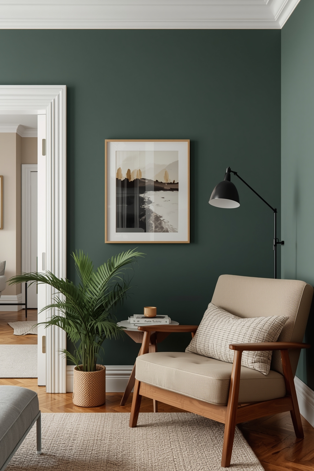
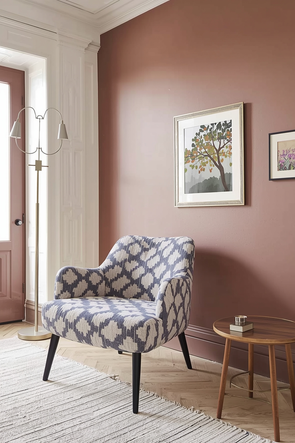
Accent Color Mixes for Statement Walls
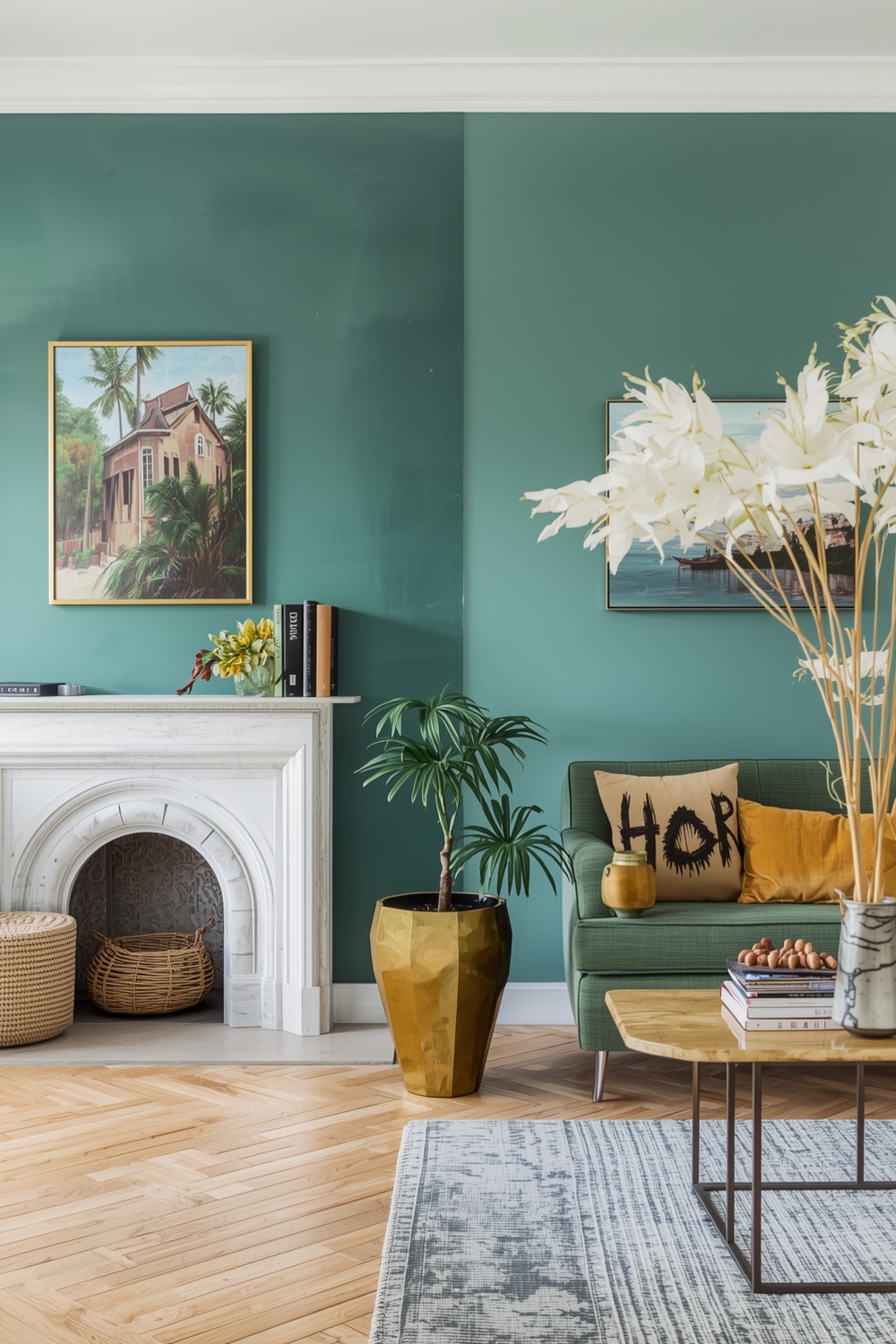
Statement walls showcase your Interior Paint Palette creativity without committing entire rooms to bold choices. Select the wall you naturally notice first when entering a room—typically the one opposite the entry or behind a bed or sofa. Paint this focal wall in a deeper or brighter version of your room’s main color. Alternatively, choose a complementary color that contrasts with surrounding walls while coordinating with your overall palette. Deep emerald green, navy blue, charcoal, or rich terracotta create dramatic backdrops for furniture and art. Balance statement walls with neutral companions that let your bold choice shine without overwhelming the space.
Classic Room Paint Layout Strategies
Timeless color strategies never go out of style, making them wise investments for long-term satisfaction. All-white interiors create clean, gallery-like spaces that showcase art, furniture, and architectural details. Vary whites by undertone—warm whites in gathering spaces, cool whites in work areas—for subtle interest. Traditional combinations like cream walls with white trim, soft gray with navy accents, or beige with warm wood tones offer sophisticated restraint that accommodates changing décor trends. These classic approaches provide reliable foundations that you can personalize with accessories and furniture, ensuring your home remains stylish for years without requiring frequent repainting.
How This Idea Improves Your Space
Implementing cohesive interior color strategies transforms disconnected rooms into unified, flowing spaces that feel intentionally designed. Well-planned palettes enhance natural light, emphasize architectural features, and create emotional atmospheres that support how you live. Color continuity makes homes feel larger and more sophisticated while allowing individual rooms to maintain distinct personalities. These strategies eliminate decorating paralysis by providing clear frameworks for decision-making, resulting in spaces that genuinely reflect your style and enhance your daily life.
Budget-Friendly Tips
Maximize impact while minimizing expense by painting accent walls instead of entire rooms. Purchase mistinted paints at significant discounts—they often become perfect accent colors. Focus premium paint on high-traffic areas while using mid-range options for low-traffic spaces. Paint samples directly on walls rather than buying multiple test cans, and tackle projects yourself using online tutorials to save on labor costs.
Conclusion
Creating a cohesive interior color scheme requires thoughtful planning but delivers transformative results. These 16 strategies provide frameworks for developing palettes that unify your home while celebrating each space’s unique purpose. Whether you prefer timeless neutrals, bold contemporary combinations, or cheerful energizing hues, intentional color choices elevate your home’s beauty and functionality. Start with strategy boards, consider room functions, and trust your instincts to create spaces you’ll love for years.
FAQs
Q: How many colors should I include in my interior paint palette? A: Limit your palette to 3-5 colors used throughout your home in varying proportions—one dominant color, one or two secondary colors, and one or two accent colors for cohesion without monotony. Q: Should I paint all rooms the same color for flow? A: Not necessarily. Use variations of your core palette—different shades or intensities—to maintain flow while giving each room its own character and respecting its unique lighting and function. Q: How do I choose paint colors if I have limited natural light? A: In low-light spaces, avoid stark whites that appear gray. Choose warm, light-reflective colors like cream, soft yellow, or warm beige that maximize available light and create welcoming atmospheres. Q: Can I mix warm and cool tones in one palette? A: Yes, but maintain consistency in undertones. Mix warm neutrals with warm accents, or cool neutrals with cool accents, to prevent colors from clashing and creating visual confusion. Q: How do I test paint colors before committing? A: Paint large poster boards or directly on walls with sample sizes. View samples in different lighting conditions throughout the day and against your furniture and flooring for several days before deciding.