Introduction
Transforming your living space starts with understanding Color Harmony Palettes that create visual balance and emotional impact. Whether you’re refreshing a single room or redesigning your entire home, mastering the art of color palette combinations can elevate your interior design game. These 15 contemporary color harmony palettes offer inspiring mixes that blend modern aesthetics with timeless appeal, helping you discover the perfect combination for every room in your home.
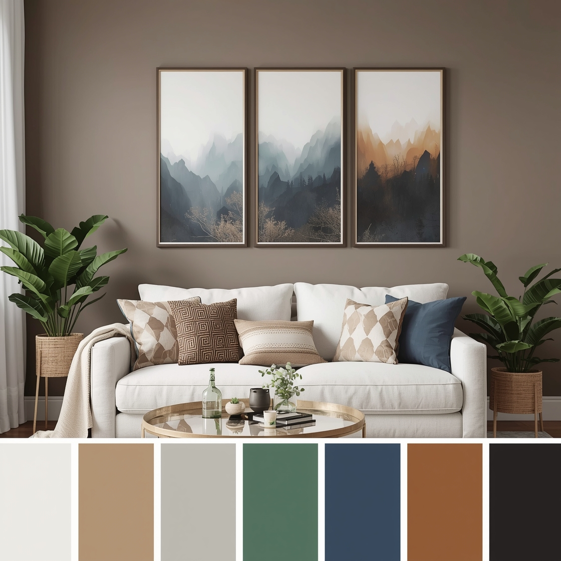
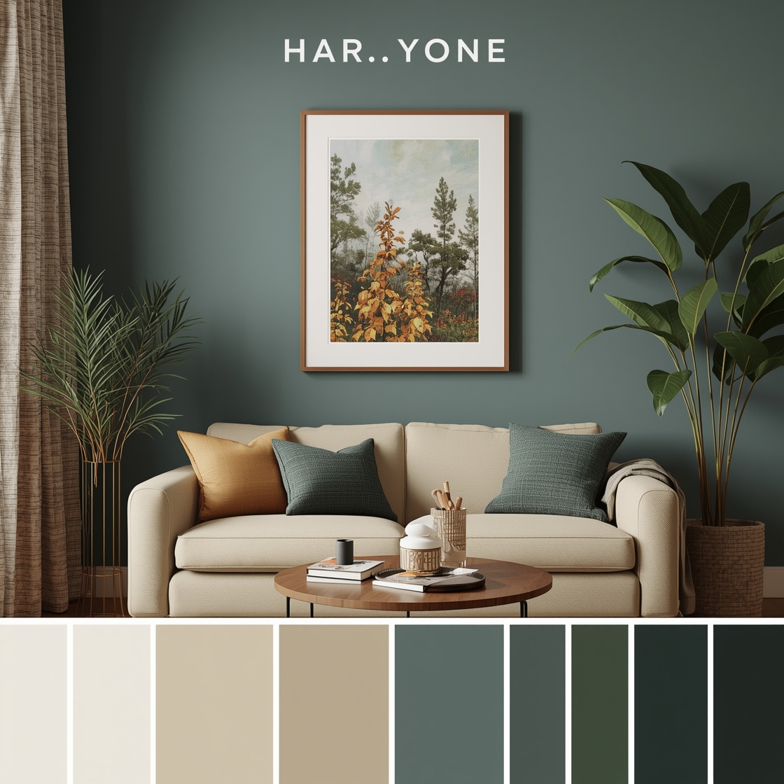
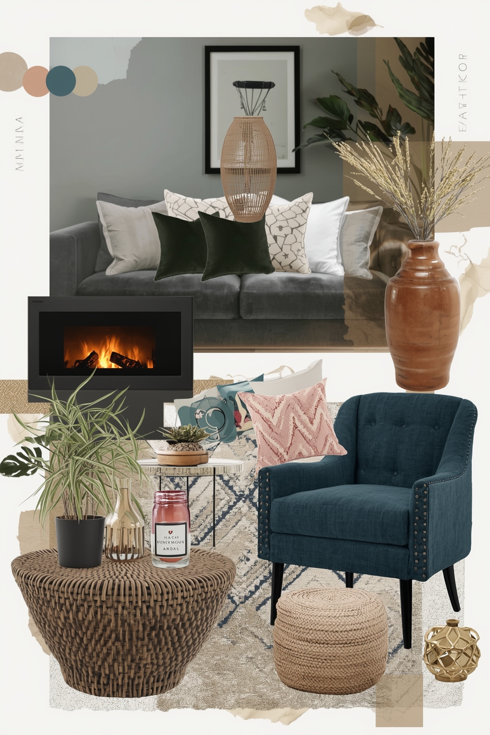
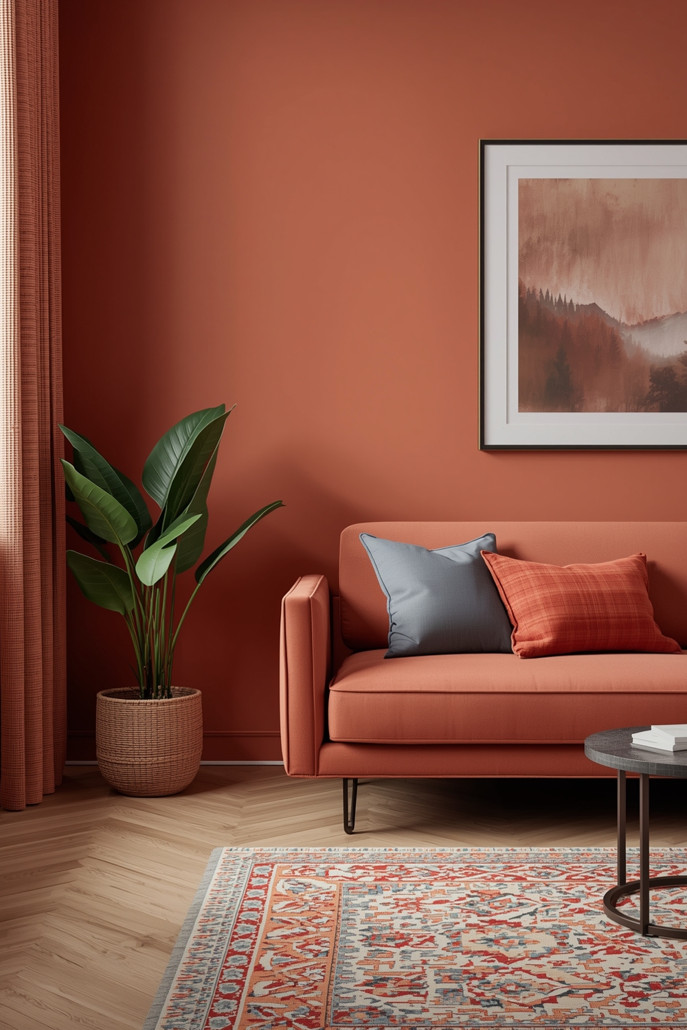
Color Harmony Palette Mix Boards
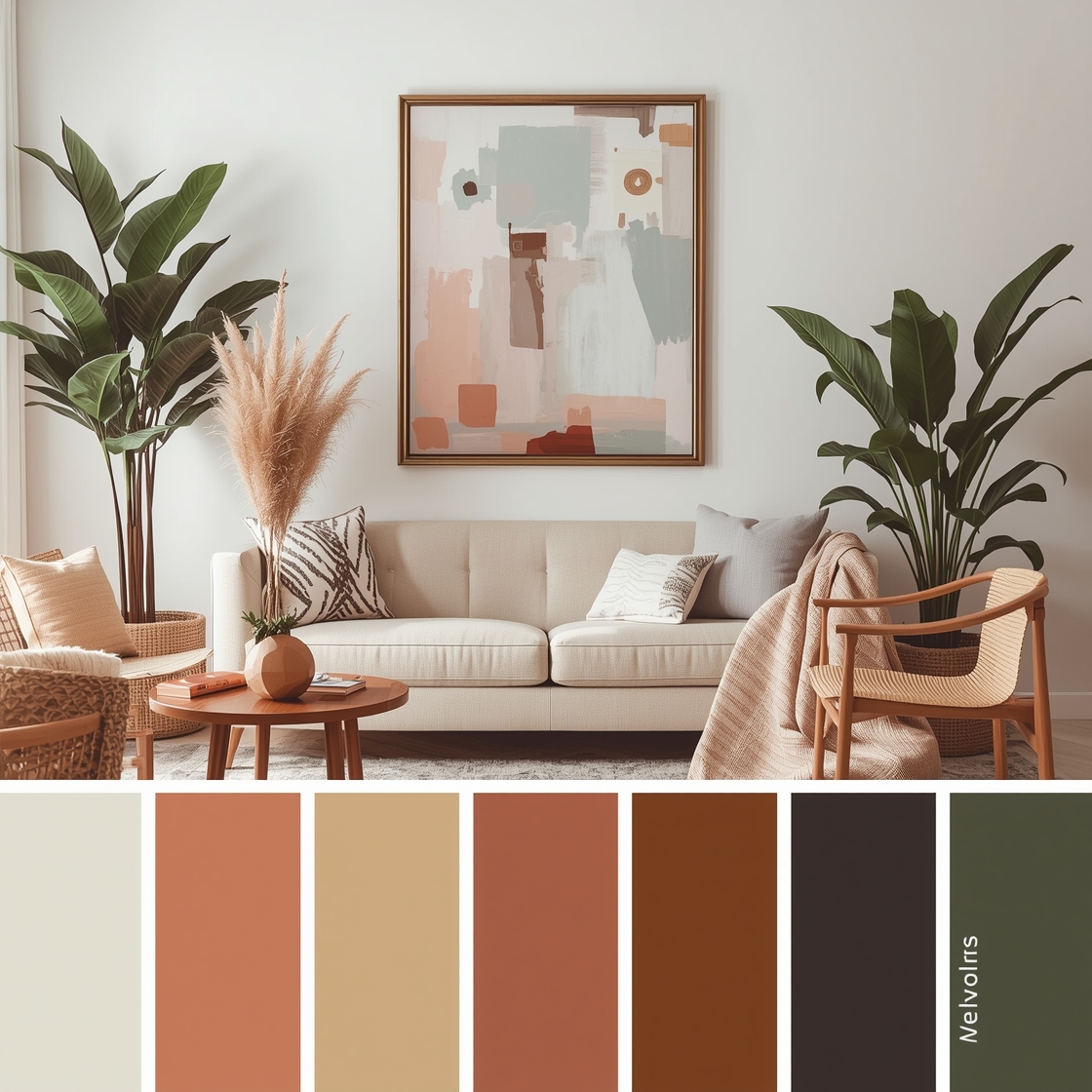
Creating stunning Color Harmony Palettes begins with understanding how different hues interact with each other. Mix boards serve as visual guides that showcase complementary, analogous, and triadic color schemes working together harmoniously. These curated boards demonstrate how warm tones blend with cool shades, creating depth and dimension. By exploring various color palette combinations, you’ll discover unexpected pairings that bring sophistication to your space. From soft pastels to bold jewel tones, mix boards provide the foundation for confident color decisions that reflect your personal style while maintaining visual cohesion throughout your home.
Modern Color Harmony Pairing Examples
Contemporary design embraces minimalist elegance through carefully selected color harmonies. Modern pairings often feature neutral bases enhanced with strategic accent colors that create focal points without overwhelming the space. Think charcoal grey paired with warm terracotta, or crisp white balanced with deep navy blue. These Color Harmony Palettes exemplify current trends while remaining adaptable to changing styles. The key lies in maintaining contrast ratios that provide visual interest while preserving the clean, uncluttered aesthetic that defines modern interiors.
Interior Color Coordination Concepts
Successful interior design relies on understanding color coordination principles that tie different rooms together. Establishing a cohesive flow requires selecting a dominant palette that serves as your home’s color story anchor. Color palette combinations should transition smoothly from room to room while allowing each space to maintain its unique character. Consider using the 60-30-10 rule: 60% dominant color, 30% secondary hue, and 10% accent shade for perfectly balanced coordination.
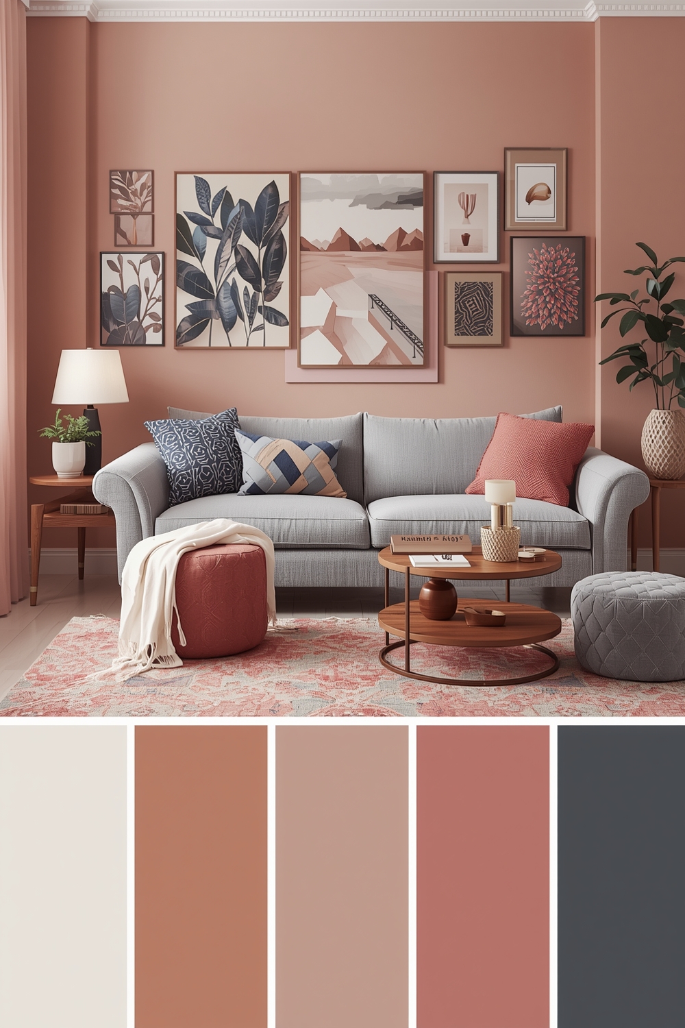
Fashionable Room Color Combination Inspirations
Fashion-forward interiors embrace bold experimentations while maintaining sophisticated restraint. Current trends favor unexpected juxtapositions like millennial pink with olive green, or mustard yellow paired with dusty mauve. These fashion-inspired Color Harmony Palettes bring runway energy into residential spaces. Drawing inspiration from seasonal fashion trends keeps your interior feeling fresh and contemporary without requiring complete redesigns.
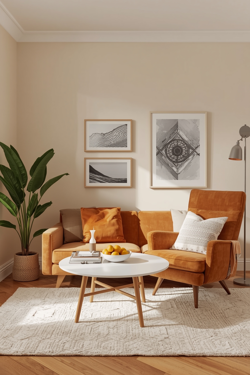
Neutral and Lively Color Idea Galleries
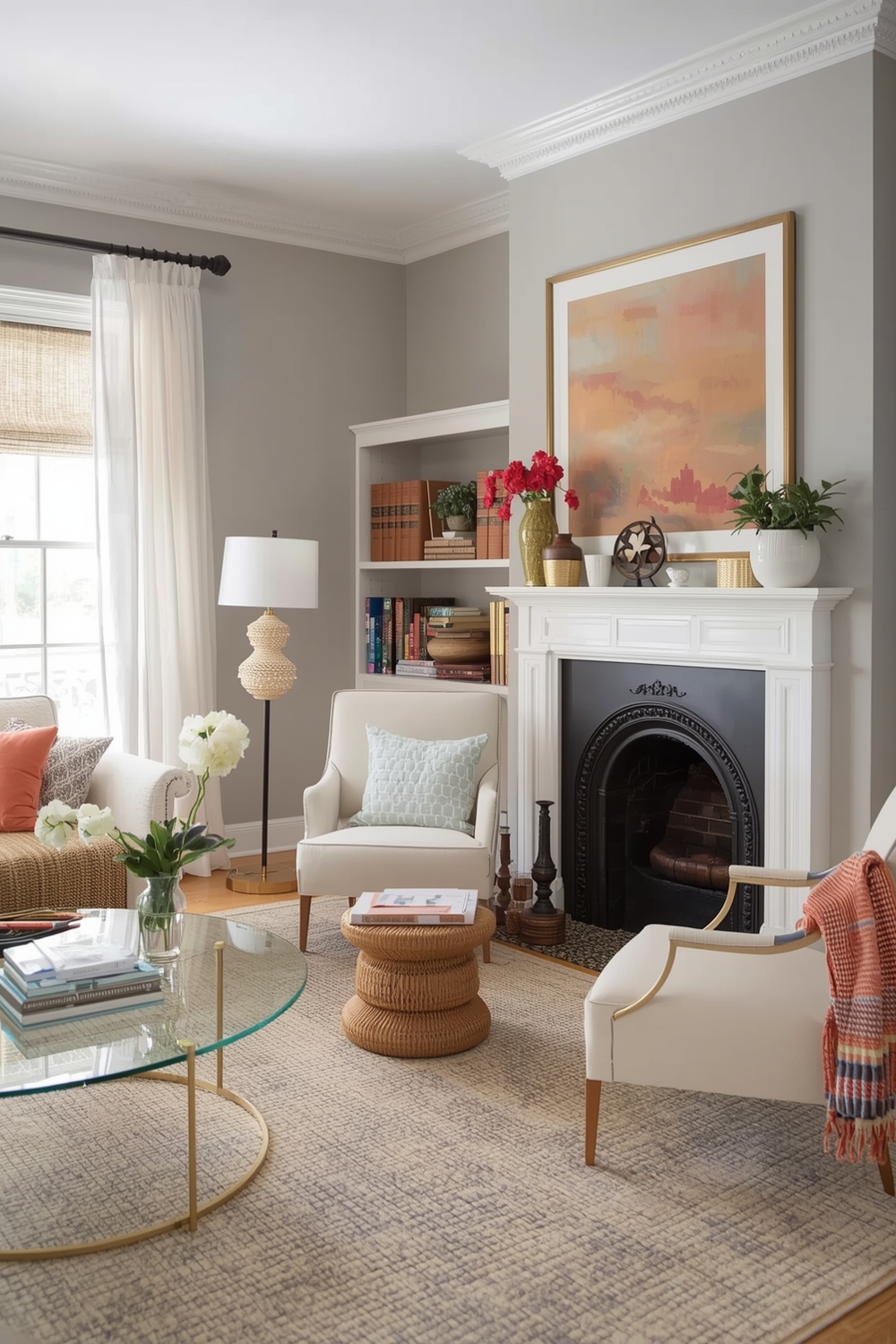
Balancing neutral foundations with lively accents creates versatile spaces that adapt to changing moods and seasons. Neutral bases—beiges, greys, taupes, and whites—provide timeless backdrops that never feel dated. Layer in lively accent colors through textiles, artwork, and accessories to inject personality and energy. This approach allows you to experiment with trendy color palette combinations without committing to permanent installations. Swap throw pillows, area rugs, or wall art to refresh your space seasonally while maintaining your neutral foundation for long-term stability and versatility.
Functional Color Harmony Layout Strategies
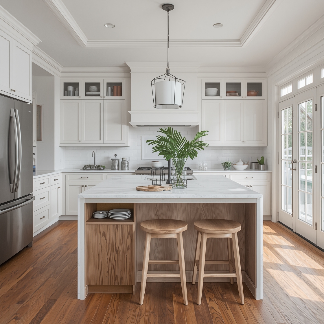
Strategic color placement affects how we perceive and use spaces. Lighter colors make small rooms feel larger, while darker shades create intimacy in expansive areas. Functional layouts consider traffic patterns, natural light sources, and room purposes when selecting Color Harmony Palettes. Energizing colors like coral and citrus work beautifully in kitchens and home offices, while calming blues and greens suit bedrooms and bathrooms.
Polished Room Color Pairing References
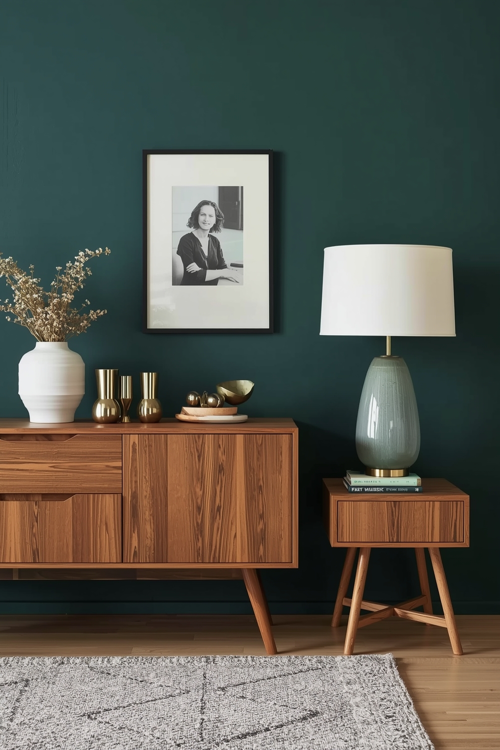
Achieving polished sophistication requires attention to undertones and saturation levels. Even neutral palettes contain warm or cool undertones that must align for cohesive results. Reference classic combinations like navy and gold, black and cream, or forest green with brass accents. These refined color palette combinations withstand design trends while projecting elegance and intentionality in every detail.
Essential Room Color Combination Examples
Certain color combinations prove essential across various design styles. The classic blue and white pairing works equally well in coastal, traditional, and modern farmhouse aesthetics. Similarly, grey and yellow creates cheerful sophistication, while black, white, and wood tones provide Scandinavian-inspired minimalism. Understanding these essential Color Harmony Palettes gives you reliable starting points that adapt to personal preferences. These foundational combinations serve as design anchors that you can customize through texture, pattern, and accent selections to create truly personalized spaces.
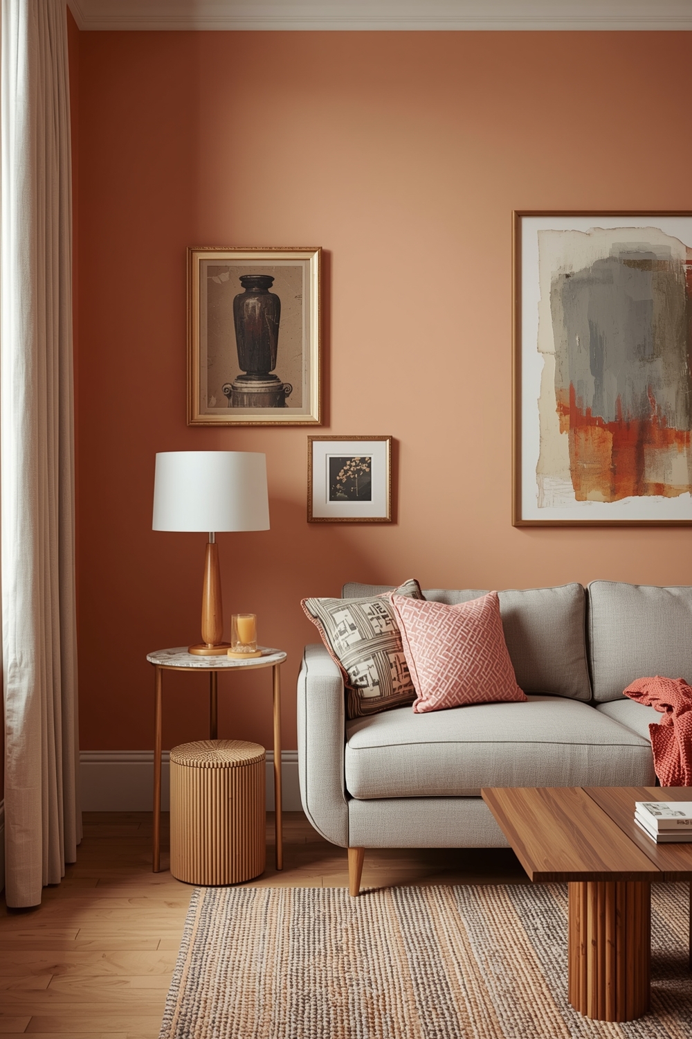
Current Color Harmony Palette Selections
Today’s design landscape embraces earthy terracottas, sage greens, and warm clay tones alongside bold jewel tones like emerald and sapphire. Current selections reflect growing environmental consciousness and biophilic design principles. These nature-inspired color palette combinations bring outdoor serenity indoors while maintaining contemporary relevance. Staying current doesn’t mean following every trend—it means selecting palettes that resonate personally while feeling fresh and intentional.
Room Color Balance Idea Galleries
Achieving perfect color balance requires distributing hues thoughtfully throughout your space. Visual weight matters as much as actual placement when creating balanced environments. Balance warm and cool tones, light and dark values, and saturated colors with neutral rests. These balanced approaches to Color Harmony Palettes prevent visual fatigue while maintaining interest across every sightline in your room.
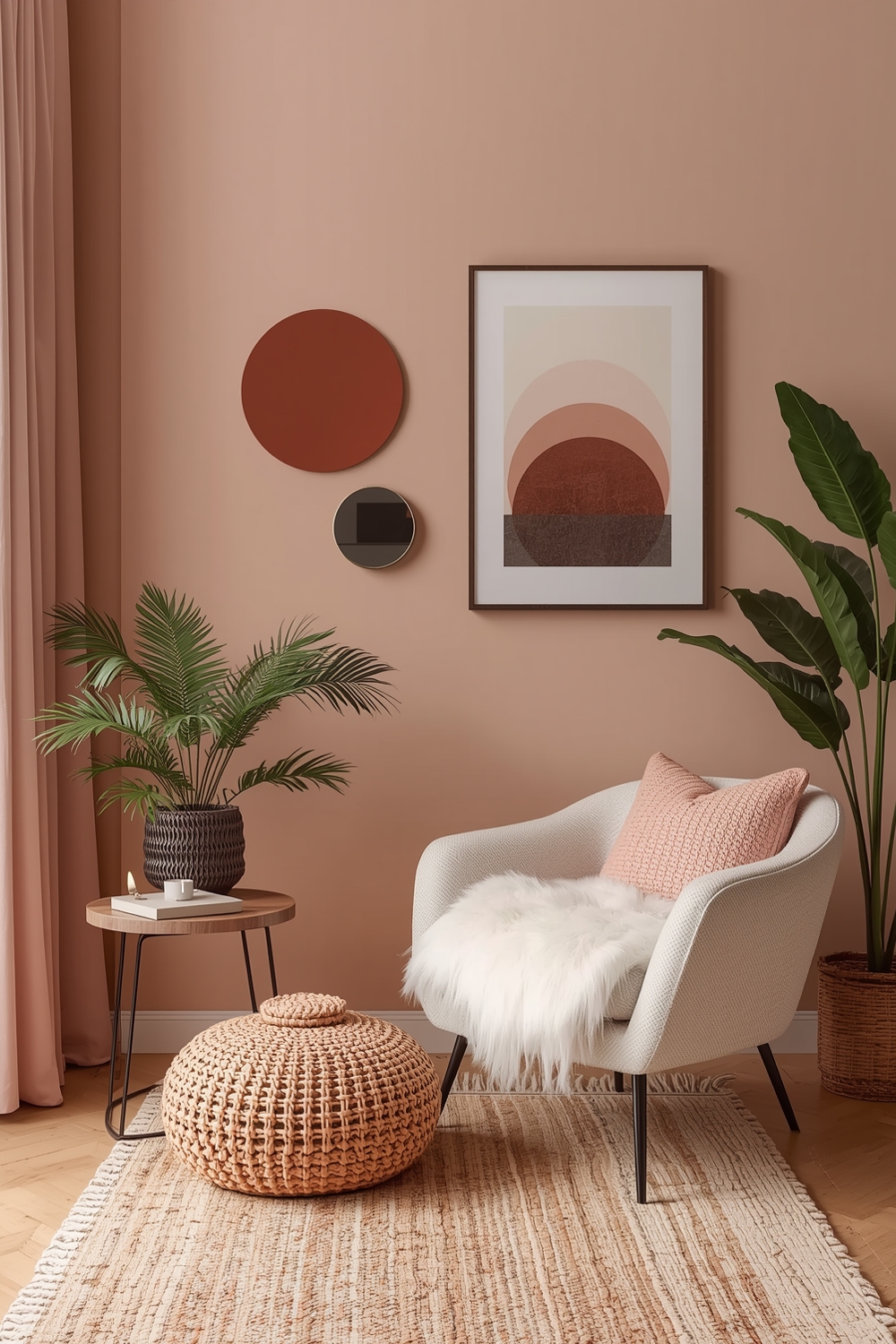
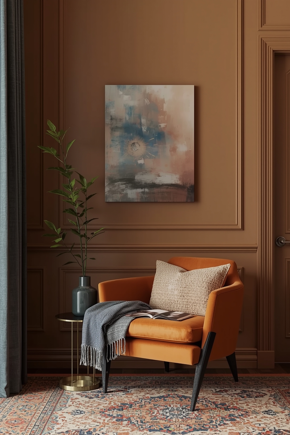
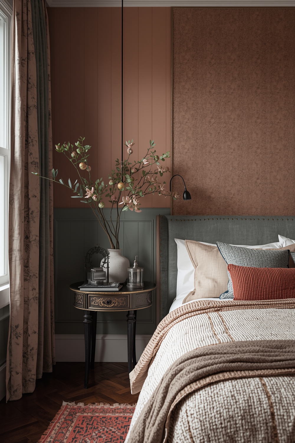
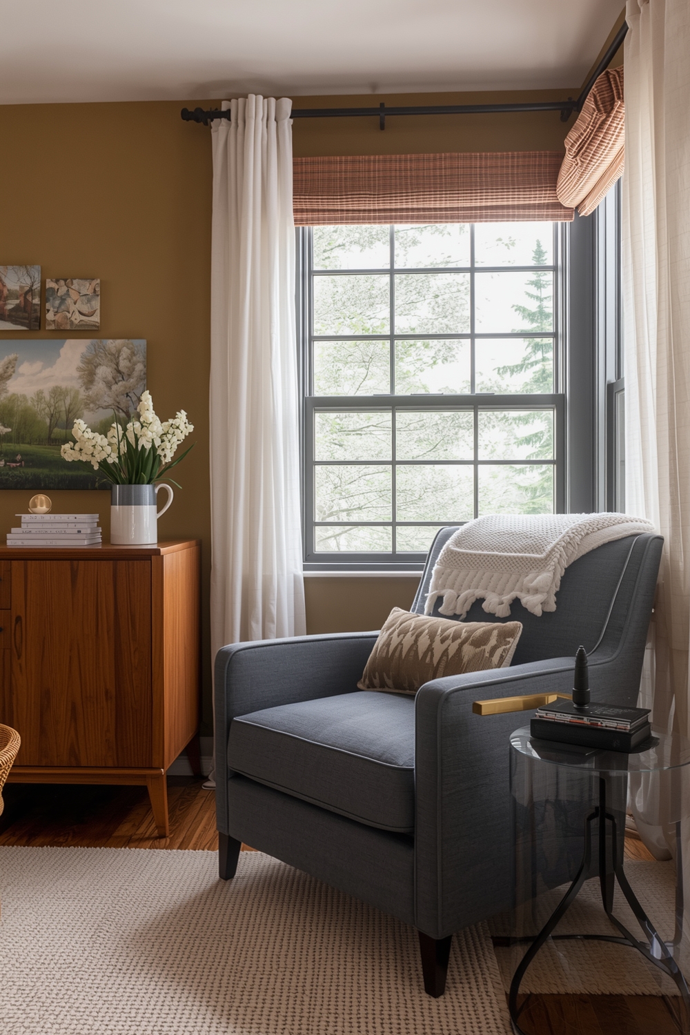
Snug Color Harmony Layout Concepts
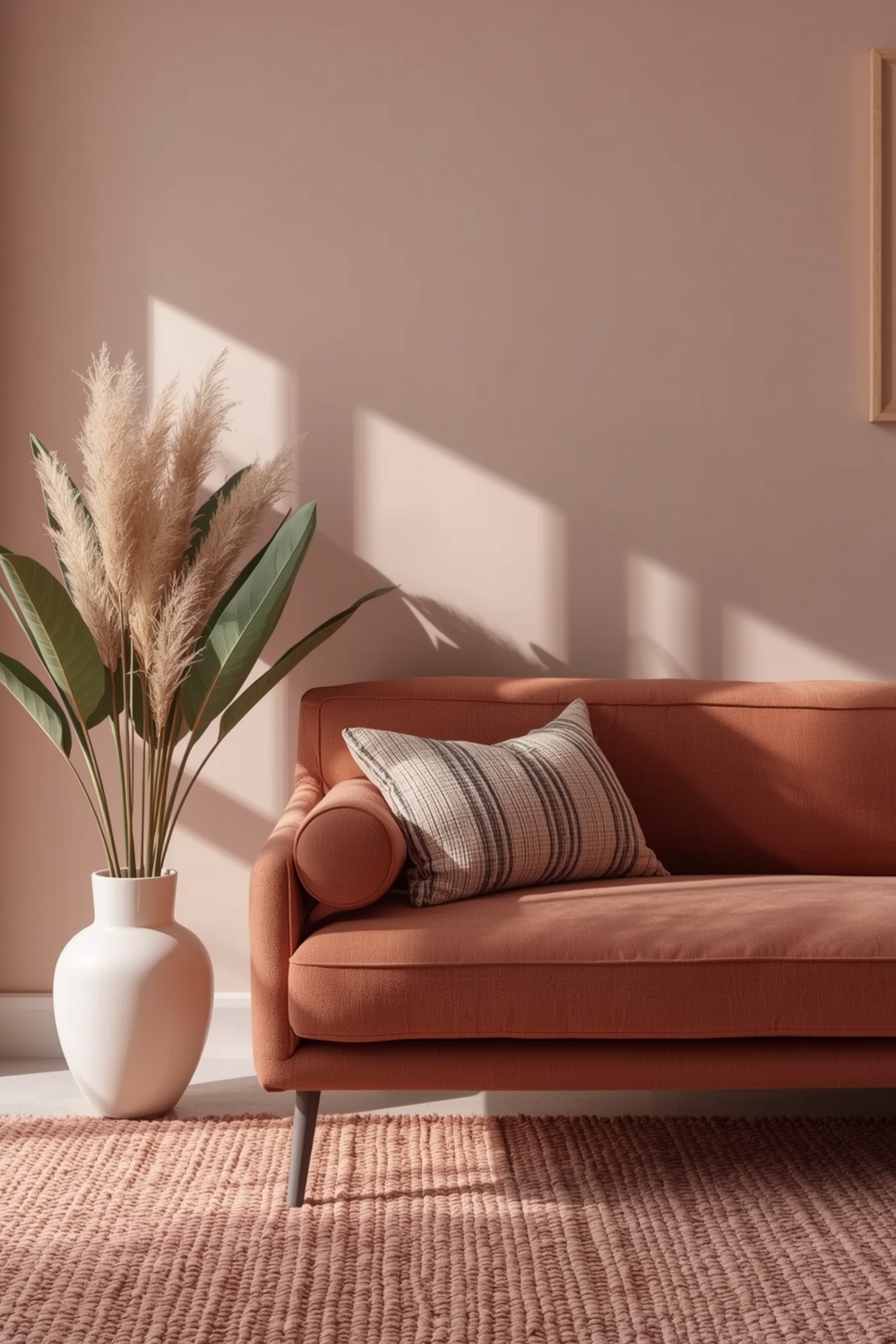
Creating cozy, inviting spaces relies on warm color harmonies that embrace rather than energize. Deep burgundies, warm chocolates, burnt oranges, and golden yellows generate snug atmospheres perfect for relaxation. Layer these comforting hues through textiles, lighting, and architectural elements to envelop your space in warmth. Snug color palette combinations work especially well in reading nooks, bedrooms, and family rooms where comfort takes priority. The key is building richness without darkness by incorporating adequate lighting and balancing deep tones with lighter accent shades.
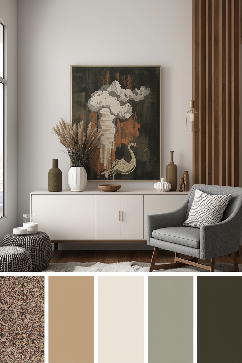
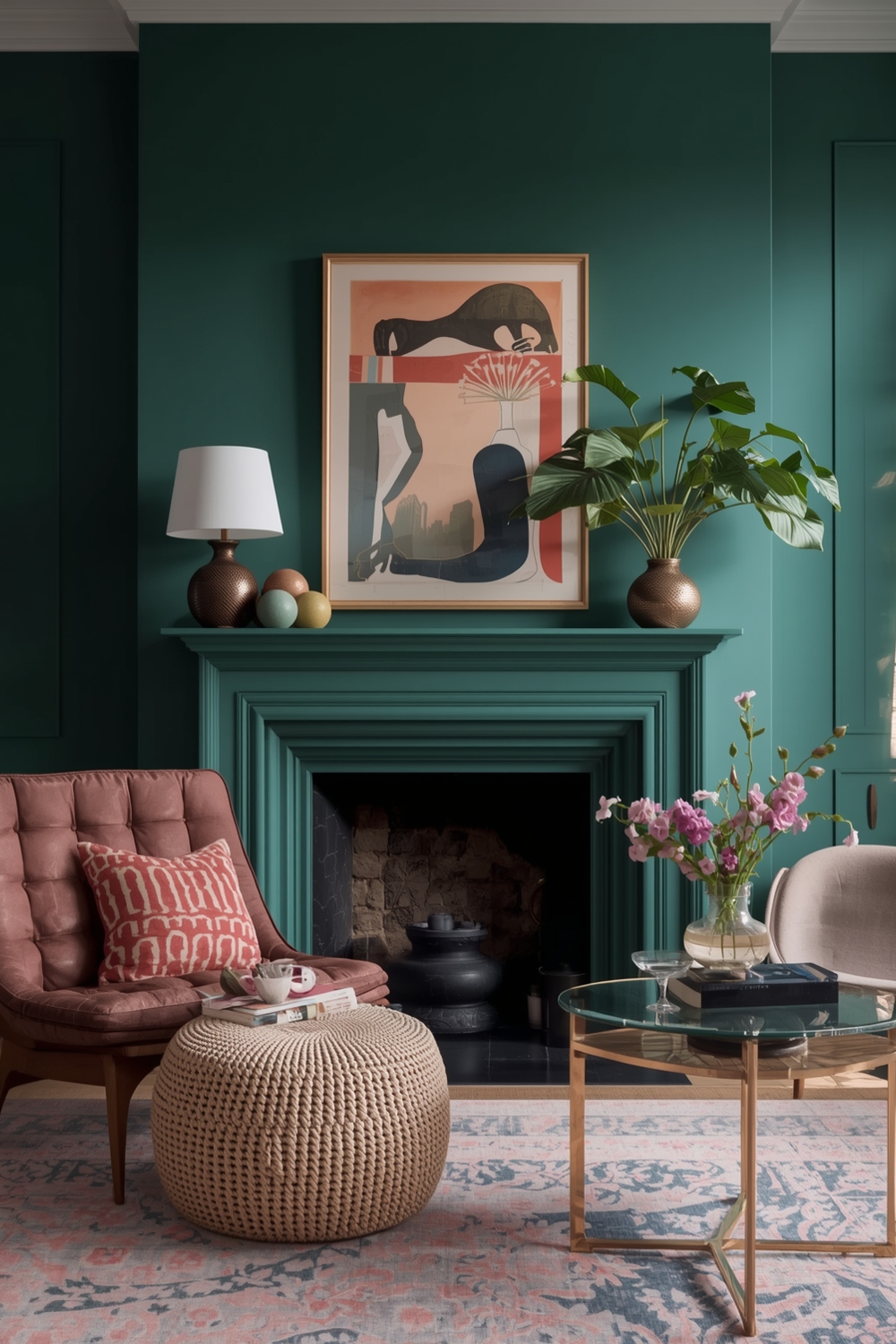
Accent Color Harmony Inspiration Boards
Accent colors transform neutral spaces from bland to beautiful through strategic pops of vibrant hues. Inspiration boards help visualize how accent colors interact with dominant palettes before committing to purchases. Experiment with various accent intensities—from subtle blush tones to electric cobalt blues—to discover your comfort level. These Color Harmony Palettes demonstrate how accent colors guide the eye, create focal points, and inject personality into otherwise subdued spaces. Remember that accent colors typically occupy the smallest percentage of your palette but deliver the biggest impact.
Color Harmony Ideas for Great Rooms
Great rooms require versatile palettes that define different functional zones while maintaining cohesion. Open-concept spaces benefit from monochromatic schemes with varied saturations or analogous colors that naturally flow together. Consider how your palette transitions from kitchen to dining to living areas within one great room. Strategic color palette combinations can subtly delineate spaces without walls or partitions.
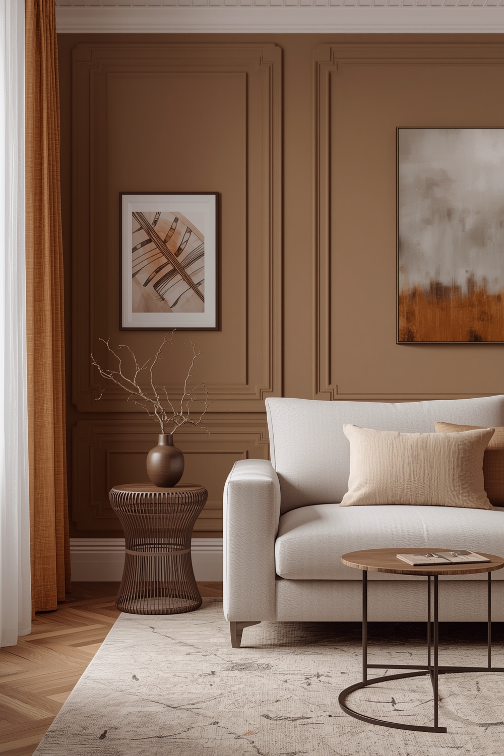
Timeless Color Harmony Combination References
Some color combinations transcend trends, delivering enduring beauty across decades. White and wood tones, navy and cream, or various shades of grey provide timeless foundations that never look dated. These classic references offer safe starting points for conservative designers while providing sophisticated backdrops for bolder accent choices. Timeless Color Harmony Palettes protect your investment by remaining relevant regardless of changing design trends.
Room Color Harmony Visualization Guides
Visualizing color harmonies before implementation prevents costly mistakes. Digital tools, physical paint samples, and mood boards help you see how colors interact under your specific lighting conditions. Test samples on multiple walls, observing how natural and artificial light affects appearance throughout the day. Proper visualization of color palette combinations eliminates guesswork and builds confidence in your selections. Consider how colors appear against your existing furniture, flooring, and architectural features before making final decisions for truly harmonious results.
How This Idea Improves Your Space
Implementing well-planned color harmonies dramatically enhances your home’s aesthetic appeal and emotional atmosphere. Cohesive palettes create visual flow that makes spaces feel larger, more intentional, and professionally designed. Beyond aesthetics, appropriate color selections influence mood, productivity, and relaxation—directly impacting your quality of life. Strategic color choices also increase property value by appealing to broader audiences when selling.
Budget-Friendly Tips
Start with paint—the most affordable transformation tool available. Focus accent colors in small, changeable elements like throw pillows, artwork, and accessories rather than expensive furniture pieces. Shop secondhand for accent pieces you can easily replace as your palette evolves without significant financial investment.
Conclusion
Mastering color palette combinations empowers you to create beautifully coordinated spaces that reflect your personal style while maintaining design sophistication. These 15 contemporary color harmony approaches provide versatile starting points for any room transformation. Begin with one palette that resonates with you, implement it thoughtfully, and watch your space transform into the harmonious haven you’ve always envisioned.
FAQs
Q: How many colors should I include in a room palette? A: Limit your palette to 3-5 colors for cohesion—one dominant color, one or two supporting shades, and one or two accent colors following the 60-30-10 rule for balanced distribution. Q: Can I mix warm and cool tones in one palette? A: Absolutely! Mixing temperatures adds depth and prevents monotony. The key is maintaining intentional balance so neither temperature overwhelms the other, creating visual tension rather than harmony. Q: How do I choose accent colors? A: Select accent colors that complement your dominant palette while providing sufficient contrast to draw attention. Use the color wheel to identify complementary or triadic relationships for foolproof selections. Q: Should every room have the same color palette? A: Not necessarily. While maintaining cohesion through shared accent colors or similar tones helps flow, each room can have unique palettes that reflect its specific function and desired atmosphere. Q: How often should I update my color palette? A: Update accent colors seasonally or yearly through accessories, while maintaining foundational palette colors for 5-7 years. This approach keeps spaces feeling fresh without requiring expensive renovations.